A react emoji package by svg.
- Customize all styles
- Customize all svg emoji
- support language in futures
npm install react-svg-emoji --save-dev
import ReactSvgEmoji from "react-svg-emoji/es5/index";

const { Emoji, parseToEmoji, insertStr, getCursortPosition } = ReactSvgEmoji;


onSelect(text, key, data) {
  // insert emoji string to input ele's value
  var index = getCursortPosition(document.querySelector('#input'))
  var value = insertStr(this.state.value, index, text)
  // parse emoji string to dom string for rendering
  var html = parseToEmoji(value)

  this.setState({
    value: value,
    html: html,
  })
}

onChange(e) {
  var html = parseToEmoji(e.target.value)
  this.setState({
    value: e.target.value,
    html: html,
  })
}


render(){

  const style={
    // root style
    root: {},
    // enterance icon style
    icon: {},
    pop: {
      //when emoji list pop hide style
      ...,
      hover: {
        //when emoji list pop show style
        ...
      }
    },
    // single emoji style in pop list
    item: {},

  }

  return (
    <>

     <Emoji
        // emoji size in pop list
        width={24}
        height={24}
        // enterance icon size
        iconWidth={20}
        iconHeight={20}
        // more detail Customize styles
        style={style}
        // callback when picker one emoji
        onSelect={this.onSelect.bind(this)}
      />

      <!-- input to enter some emoji string -->
      <input id="input" value={this.state.value} onChange={this.onChange.bind(this)} />

      <!-- parse emojistring to dom and render -->
      <div dangerouslySetInnerHTML={{ __html: this.state.html }} />
    </>
  )
}
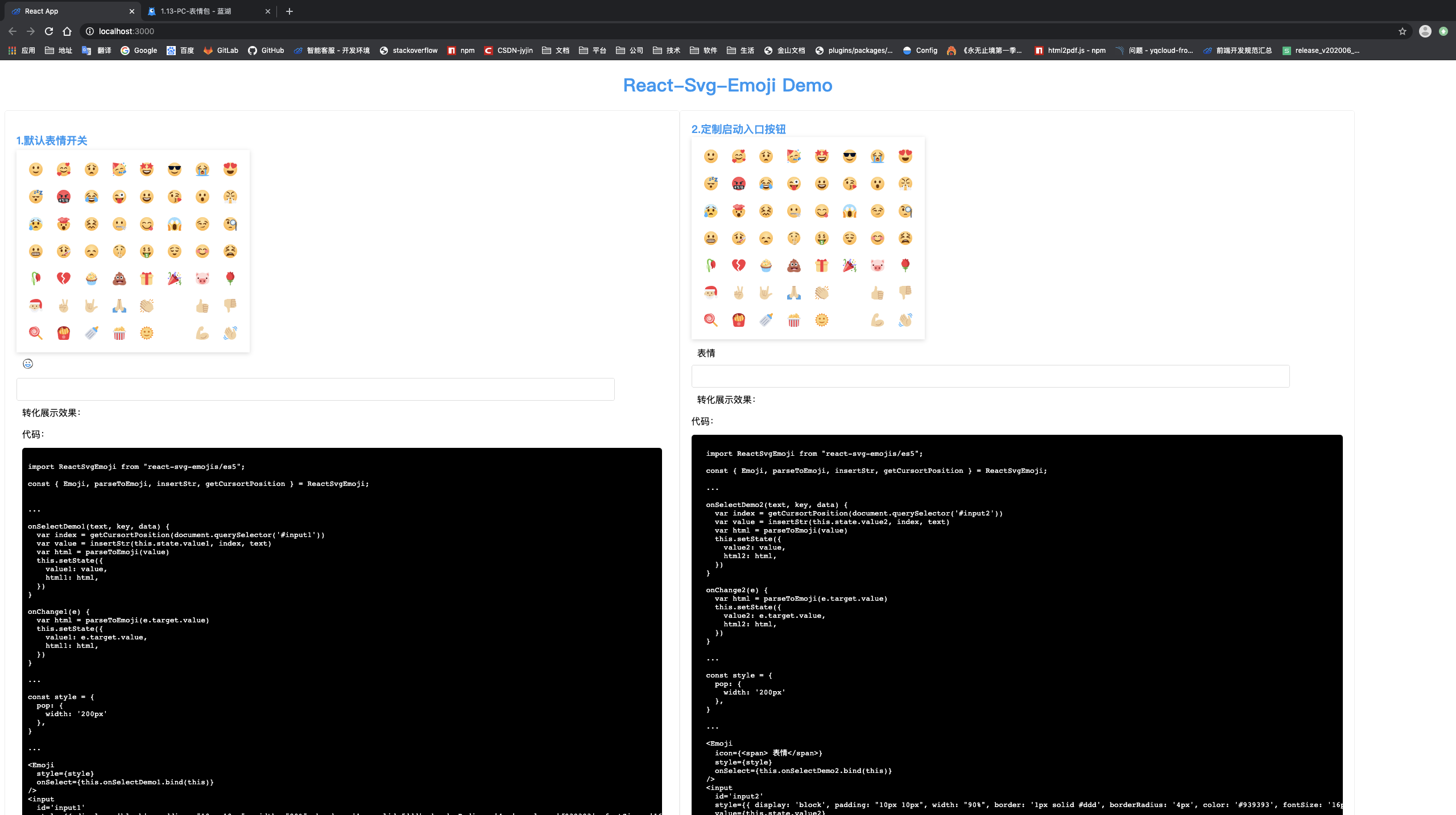
import ReactSvgEmoji from "react-svg-emoji/es5";
const { Emoji, parseToEmoji, insertStr, getCursortPosition } = ReactSvgEmoji;
...
onSelectDemo1(text, key, data) {
var index = getCursortPosition(document.querySelector('#input1'))
var value = insertStr(this.state.value1, index, text)
var html = parseToEmoji(value)
this.setState({
value1: value,
html1: html,
})
}
onChange1(e) {
var html = parseToEmoji(e.target.value)
this.setState({
value1: e.target.value,
html1: html,
})
}
...
const style = {
pop: {
width: '200px'
},
}
...
<Emoji
style={style}
onSelect={this.onSelectDemo1.bind(this)}
/>
<input
id='input1'
style={{ display: 'block', padding: "10px 10px", width: "90%", border: '1px solid #ddd', borderRadius: '4px', color: '#939393', fontSize: '16px' }}
value={this.state.value1}
onChange={this.onChange1.bind(this)}
></input>
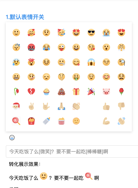
<div style={{ margin: '10px' }} >
转化展示效果:
<p dangerouslySetInnerHTML={{ __html: this.state.html1 }} />
</div>
效果
eg. Customize entrance with a button
import ReactSvgEmoji from "react-svg-emoji/es5";
const { Emoji, parseToEmoji, insertStr, getCursortPosition } = ReactSvgEmoji;
...
onSelectDemo2(text, key, data) {
var index = getCursortPosition(document.querySelector('#input2'))
var value = insertStr(this.state.value2, index, text)
var html = parseToEmoji(value)
this.setState({
value2: value,
html2: html,
})
}
onChange2(e) {
var html = parseToEmoji(e.target.value)
this.setState({
value2: e.target.value,
html2: html,
})
}
...
const style = {
pop: {
width: '200px'
},
}
...
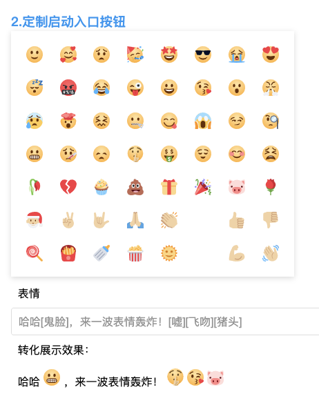
<Emoji
icon={<span> 表情</span>}
style={style}
onSelect={this.onSelectDemo2.bind(this)}
/>
<input
id='input2'
style={{ display: 'block', padding: "10px 10px", width: "90%", border: '1px solid #ddd', borderRadius: '4px', color: '#939393', fontSize: '16px' }}
value={this.state.value2}
onChange={this.onChange2.bind(this)}
></input>
<div style={{ margin: '10px' }} >
转化展示效果:
<p dangerouslySetInnerHTML={{ __html: this.state.html2 }} />
</div>
效果
eg.change icon size, emoji size, and list width
import ReactSvgEmoji from "react-svg-emoji/es5";
const { Emoji, parseToEmoji, insertStr, getCursortPosition } = ReactSvgEmoji;
...
onSelectDemo3(text, key, data) {
var index = getCursortPosition(document.querySelector('#input3'))
var value = insertStr(this.state.value3, index, text)
var html = parseToEmoji(value)
this.setState({
value3: value,
html3: html,
})
}
onChange3(e) {
var html = parseToEmoji(e.target.value)
this.setState({
value3: e.target.value,
html3: html,
})
}
...
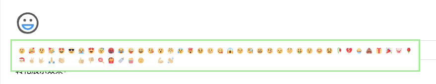
const style = {
icon: {
width: '50px',
height: '50px',
},
pop: {
position: 'absolute',
padding: '10px',
width: '800px',
top: '25px',
hover: {
display: 'flex',
flexWrap: 'wrap',
justifyContent: 'flex-start',
boxShadow: 'none',
border:'3px solid lightgreen'
}
},
item: {
width: '12px',
height: '12px',
margin: '2px',
}
}
...
<Emoji
style={style}
width={"12px"}
height={"12px"}
iconWidth={"50px"}
iconHeight={"50px"}
onSelect={this.onSelectDemo3.bind(this)}
/>
<input
id='input3'
style={{ display: 'block', padding: "10px 10px", width: "90%", border: '1px solid #ddd', borderRadius: '4px', color: '#939393', fontSize: '16px' }}
value={this.state.value3}
onChange={this.onChange3.bind(this)}
></input>
<div style={{ margin: '10px' }} >
转化展示效果:
<p dangerouslySetInnerHTML={{ __html: this.state.html3 }} />
</div>
效果
import ReactSvgEmoji from "react-svg-emoji/es5";
const { Emoji, parseToEmoji, insertStr, getCursortPosition } = ReactSvgEmoji;
...
onSelectDemo4(text, key, data) {
var index = getCursortPosition(document.querySelector('#input2'))
var value = insertStr(this.state.value4, index, text)
var html = parseToEmoji(value)
this.setState({
value4: value,
html4: html,
})
}
onChange4(e) {
var html = parseToEmoji(e.target.value)
this.setState({
value4: e.target.value,
html4: html,
})
}
...
const style = {
pop: {
position: 'relative',
padding: '10px',
width: '400px',
hover: {
display: 'flex',
flexWrap: 'wrap',
justifyContent: 'flex-start',
boxShadow: 'none',
border: '1px solid lightgreen'
}
},
}
...
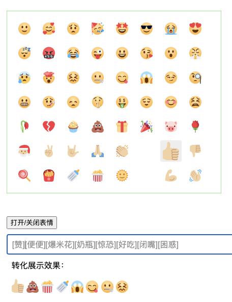
<Emoji
model="manual"
visible={!!this.state.visible}
style={style4}
onSelect={this.onSelectDemo4.bind(this)}
/>
<button onClick={()=>{
this.setState({
visible: !this.state.visible
})
}}>打开、关闭表情</button>
<input
id='input4'
style={{ display: 'block', padding: "10px 10px", width: "90%", border: '1px solid #ddd', borderRadius: '4px', color: '#939393', fontSize: '16px' }}
value={this.state.value4}
onChange={this.onChange4.bind(this)}
></input>
Effect pic
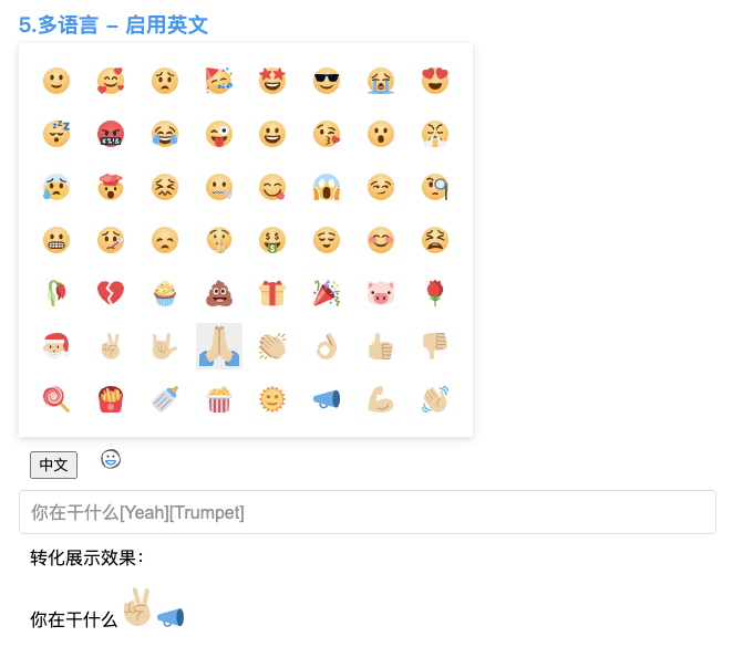
import ReactSvgEmoji from "react-svg-emoji/es5";

const { Emoji, parseToEmoji, insertStr, getCursortPosition } = ReactSvgEmoji;

...

state = {
  lang: 'zh_CN'
}

...

onSelect(text, key, data) {
  var index = getCursortPosition(document.querySelector('#input'))
  var value = insertStr(this.state.value, index, text)
  var html = parseToEmoji(value, null, this.state.lang)
  this.setState({
    value: value,
    html: html,
  })
}

onChange(e) {
  var html = parseToEmoji(e.target.value)
  this.setState({
    value: e.target.value,
    html: html,
  })
}


...

<Emoji
  lang={this.state.lang}
  onSelect={this.onSelect.bind(this)}
/>

<button style={{ margin: '10px' }}
onClick={() => {
  this.setState({
    lang: this.state.lang === 'zh_CN' ? 'en_US' : 'zh_CN'
  })
}}>{this.state.lang === 'zh_CN' ? 'English' : '中文'}</button>

<input
  id='input'
  style={{ display: 'block', padding: "10px 10px", width: "90%", border: '1px solid #ddd', borderRadius: '4px', color: '#939393', fontSize: '16px' }}
  value={this.state.value}
  onChange={this.onChange.bind(this)}>
</input>
效果
| Name | Type | Desc |
|---|---|---|
| lang | String, default is 'zh_CN' (so far only support[zh_CN,en_US]) |
you can set language with this prop |
| icon | DOM element, default is a SVG element |
you can Customize the enterance by this |
| onSelect | Function, (text, key, data)=>{...} |
callback when select a emoji. text is emoji text desc, key is the unique key, data is {key, text} |
| width | String, default is 24px |
emoji item size |
| height | String, default is 24px |
emoji item size |
| iconWidth | String, default is 20px |
emoji icon enterance size |
| iconHeight | String, default is 20px |
emoji icon enterance size |
| style | Object, default see follows |
rewrite the style by this |
| style.root | Object, style={root:{your style}} |
root element style |
| style.icon | Object, style={icon:{your style}} |
emoji list style, style.emoji single emoji wrap style |
| style.pop | Object, style={pop:{your style}} |
emoji list style, style.emoji single emoji wrap style |
| style.item | Object, style={item:{your style}} |
emoji list style, style.emoji single emoji wrap style |
| Name | Type | Desc |
|---|---|---|
| insertStr | Function, (source , start, target) => { return [new String]} |
insert target to index of string |
getCursortPosition |
Function, (ele) => { return [index]} |
Get cursor postion for your element need insert the emoji. ele is a dom element, you can get by document.getElementXXX or document.querySelector(XXX) |
parseToEmoji |
Function, (sourceString, style, lang) => { return [DOM string]} |
Transform the string which contain some [text] emoji to DOM element string. sourceString is the target string need to tranform, style = {width, height} can set the size before you show emoji. lang set language when parsing, default is 'zh_CN' |
package default style
/**
 * 默认样式
 */
const defaultProps = {
  width: 24,
  height: 24,
  iconWidth: 20,
  iconHeight: 20,
  style: {
    // 根样式
    root: {
      position: 'relative',
      textAlign: 'left'

    },
    // 启动图标样式
    icon: {
      display: 'inline-block',
      margin: '10px',
      cursor: 'pointer',
      borderRadius: '2px',
      alignItems: 'center',
      justifyContent: 'center'
    },
    // 表情列表盒子pop框样式
    pop: {
      position: 'absolute',
      bottom: '35px',
      padding: '10px',
      display: 'none',
      background: '#fff',
      width: '390px',
      height: 'fit-content',
      hover: {
        display: 'flex',
        flexWrap: 'wrap',
        justifyContent: 'space-between',
        boxShadow: '0px 2px 8px 0px rgba(0,0,0,0.15)'
      }
    },
    // 单个表情盒子样式
    item: {
      display: 'flex',
      alignItems: 'center',
      justifyContent: 'center',
      padding: '2px',
      margin: '10px',
      cursor: 'pointer',
      borderRadius: '2px',
      alignItems: 'center',
      justifyContent: 'center',
      transition: 'all 0.1s linear',
    },

  }
}
Note
- You can rewrite all styles by
style - Single emoji hover style rewrite, please rewrite class
react-svg-emoji-item
You can see the example by download the repo react-svg-emoji, and run with follow steps
npm i

npm start
Or you want edit this code by watching
npm run watch
demo run like follow pic:
jyjin
-
1.1.7-beta - 1.1.9-beta 2020.07.02
Update by jyjin
bug fixed
- fixed propery duplicated error on ie11
- fix emoji height style on ie11
-
1.1.7 2020.07.01
Update by jyjin
publish
- 1.0.6-beta publish to release version
-
1.1.6-beta 2020.06.30
Update by jyjin
Improve style
- add element class name, better for user rewrite
-
1.1.3-beta - 1.1.5-beta 2020.06.29
Update by jyjin
Mobile compatible
- embed replace to img for rendering
-
1.1.2-beta 2020.06.29
Update by jyjin
bug fix + add fun
- fix ok trumpet svg
- extend i18n support
-
1.1.1
1.1.2 / 1.1.1-beta1.1.2-beta 2020.06.28Update by jyjin
Improve documention
- quote online picture
- fix github readme table
- ZH/EN doc switch
-
1.1.0 / 1.1.0-beta 2020.06.28
Update by jyjin
First release verson
- add icon api
- improve styl api
- bug fix
- improve README
-
1.0.0 - 1.0.5 / 1.0.0-beta - 1.0.5-beta 2020.06.23
Create by jyjin
-
frame create/ setting add
-
workflow coding
-
MIT