- Display simple blurry dialog popup
- Offer built-in themes
- Possibility to create you custom dialog
- Button click handler callbacks
- Customizable text
- Customizable barrier color and behavior
- Customize popup size
- Customizable layout LTR, RTL, Center
- Support arabic language
- Input popup option with keyboard type
- Customizable input style and input text style
- Password popup type with eye icon to view password
- Single item selector type
To use the blurry dialog package you need to add it in pubspec.yaml file
dependencies:
blurry: ^1.4.2///the dialog popup title, required in all blurry class constructors
final String title;
///the dialog description text
///required in all blurry class constructors
final String description;
///the cancel button text, by default it's 'Cancel'
final String cancelButtonText;
///the confirm button (primary button) text string
final String confirmButtonText;
///the dialog theme color
///will be applied on buttons and icon
///not available in default types constructors (info, error, warning, success)
late Color? themeColor;
///function invoked when the primary button is pressed
///required in all constructors
final Function onConfirmButtonPressed;
///the callback that will be invoked when pressing on cancel button
final Function? onCancelButtonPressed;
///the icon that will be rendered in the dialog
///required only when using the default constructor
late IconData? icon;
///title text style, by default it's null
final TextStyle? titleTextStyle;
///description text style, by default it's null
final TextStyle? descriptionTextStyle;
///button text style, by default it's null
final TextStyle? buttonTextStyle;
///the blurry dialog popup height
final double? popupHeight;
///indicate whether the cancel button will be rendered or not
///by default the cancel button is displayed
final bool displayCancelButton;
///indicates whether the popup dialog is dismissable or not
///by default [dismissable = true]
final bool dismissable;
///the color of the barrier of the burry dialog
///if it's null the barrier color will be the default color [Colors.black54]
final Color? barrierColor;
///the layout rendering type, LTR, RTL or center
///possible values
/// - ltr
/// - rtl
/// - center
/// by default is [LAYOUT_TYPE.ltr]
final LAYOUT_TYPE layoutType;
/// the input label string, required when using the input constructor
late String? inputLabel;
/// the input text field text controller
/// required when using the input constructor
late TextEditingController? inputTextController;
/// the input text style by default it's just black text
late TextStyle inputTextStyle;
/// the input label style by default it's just black text
late TextStyle inputLabelStyle;
/// text input type applied on input field
/// available only when using the input constructor
late TextInputType textInputType;
/// the design type of the popup, available when using input constructor
/// availabele options
/// {
/// info,
/// success,
/// error,
/// warning
/// }
/// ```
late BLURRY_TYPE? type;
/// indicate whether display visibility eye icon on password fields
/// available only when using `Blurry.password` constructor
/// by default it's 'true'
bool withVisibilityEye = true;
///list items that will be rendered in the single selector blurry popup type
///available only when using `singleChoiceSelector` constructor (should be not null and not empty)
late List<Widget>? items;
///invoked when pressing on item from the list
///available only when using `singleChoiceSelector`
///by default pressing an element from the list will close the popup
late Function(int)? onItemSelected;Info style blurry package
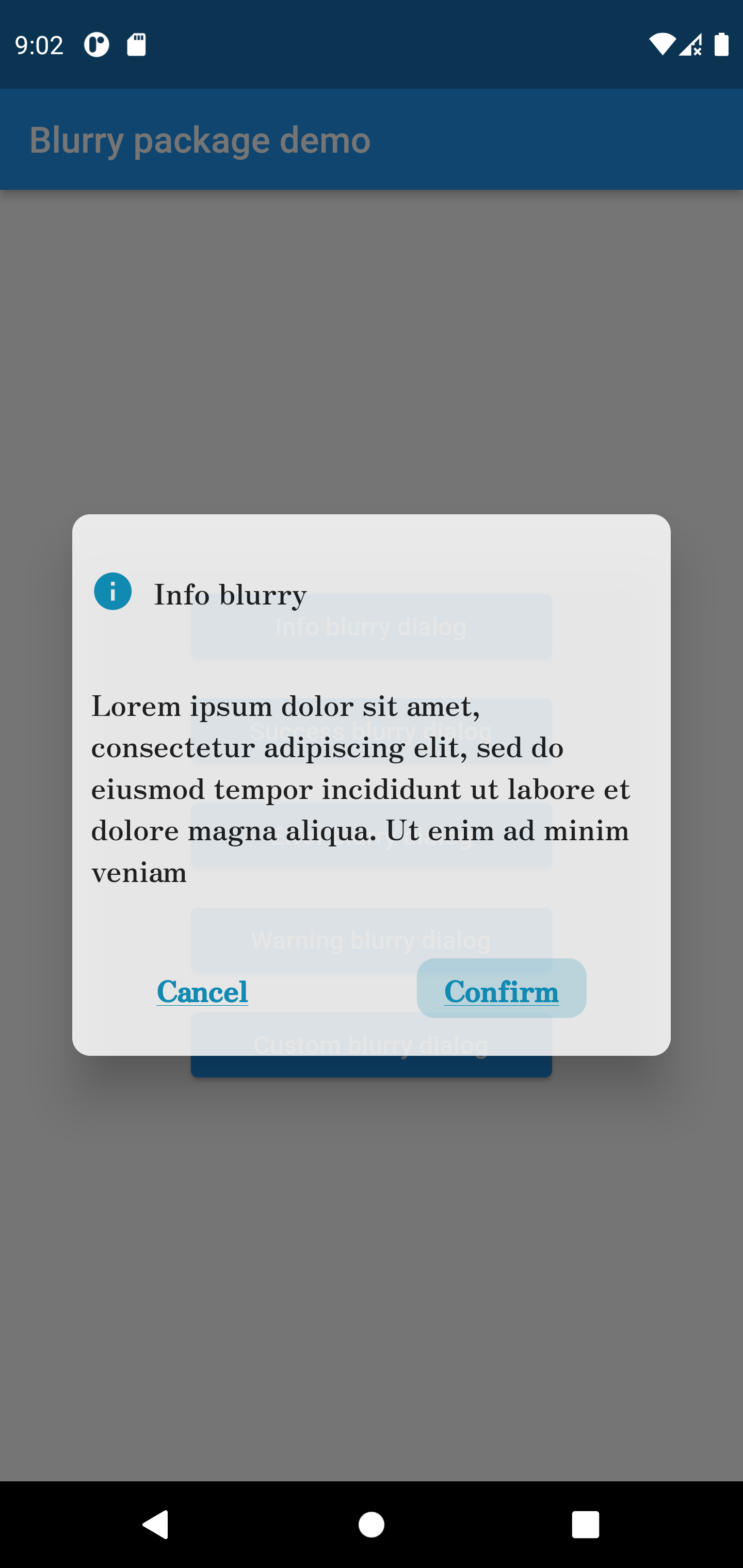
Blurry.info(
	title:  'Info blurry',
	description:'Lorem ipsum dolor sit amet, consectetur adipiscing elit, sed do eiusmod tempor incididuntut labore et dolore magna aliqua. Ut enim ad minim veniam',
	confirmButtonText:  'Confirm',
	titleTextStyle:  const TextStyle(fontFamily:  'Zen'),
	popupHeight:  300,
	buttonTextStyle:  const TextStyle(
		decoration: TextDecoration.underline,
		fontFamily:  'Zen'
	),
	descriptionTextStyle:  const TextStyle(fontFamily:  'Zen'),
	onConfirmButtonPressed: () {})
.show(context);
Success style blurry package
Blurry.success(
	title:  'Success blurry',
	description:
	'Lorem ipsum dolor sit amet, consectetur adipiscing elit, sed do eiusmod tempor incididunt ut labore et dolore magna aliqua. Ut enim ad minim veniam',
	confirmButtonText:  'Confirm',
	onConfirmButtonPressed: () {},
	barrierColor: Colors.white.withOpacity(0.7),
	dismissable:  false,
).show(context);

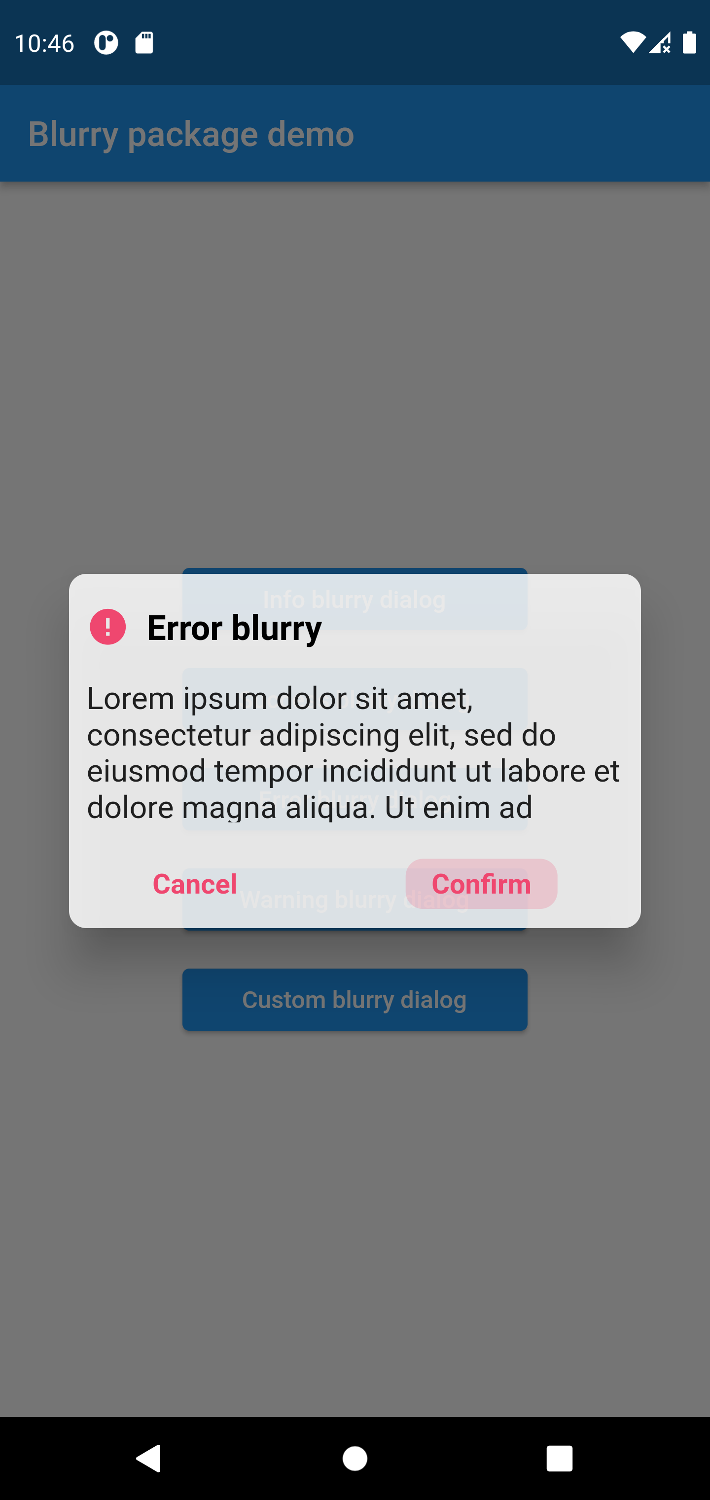
Error style blurry package
Blurry.error(
	title:  'Error blurry',
	description:'Lorem ipsum dolor sit amet, consectetur adipiscing elit, sed do eiusmod tempor incididun',
	confirmButtonText:  'Confirm',
	onConfirmButtonPressed: () {
		print('hello world');
	})
.show(context);
Warning style blurry package
Blurry.warning(
	title:  'Warning blurry',
	description:'Lorem ipsum dolor sit amet, consectetur adipiscing elit, sed do eiusmod tempor incididun',
	confirmButtonText:  'Confirm',
	onConfirmButtonPressed: () {
		print('hello world');
	})
.show(context);

Custom style blurry package
Blurry(
	icon: Icons.verified_user,
	themeColor: Colors.purple,
	title:  'Custom blurry',
	description:  'Lorem ipsum dolor sit amet, consectetur adipiscing elit',
	confirmButtonText:  'Confirm',
	onConfirmButtonPressed: () {})
.show(context);

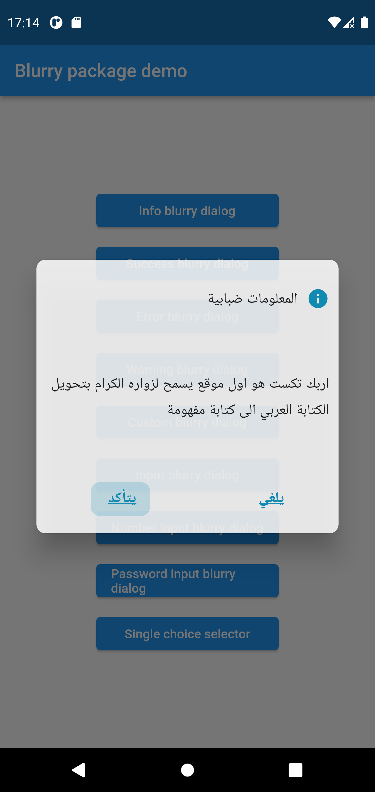
Arabic Blurry Popup with RTL layout
Blurry.info(
	layoutType: LAYOUT_TYPE.rtl,
	title:  'المعلومات ضبابية',
	description:'اربك تكست هو اول موقع يسمح لزواره الكرام بتحويل الكتابة العربي الى كتابة مفهومة',
	confirmButtonText:  'يتأكد',
	cancelButtonText:  'يلغي',
	titleTextStyle:  const TextStyle(fontFamily:  'Zen'),
	popupHeight:  300,
	buttonTextStyle:  const TextStyle(
		decoration: TextDecoration.underline,
		fontFamily:  'Zen'
	),
	descriptionTextStyle:  const TextStyle(fontFamily:  'Zen'),
	onConfirmButtonPressed: () {},
).show(context);
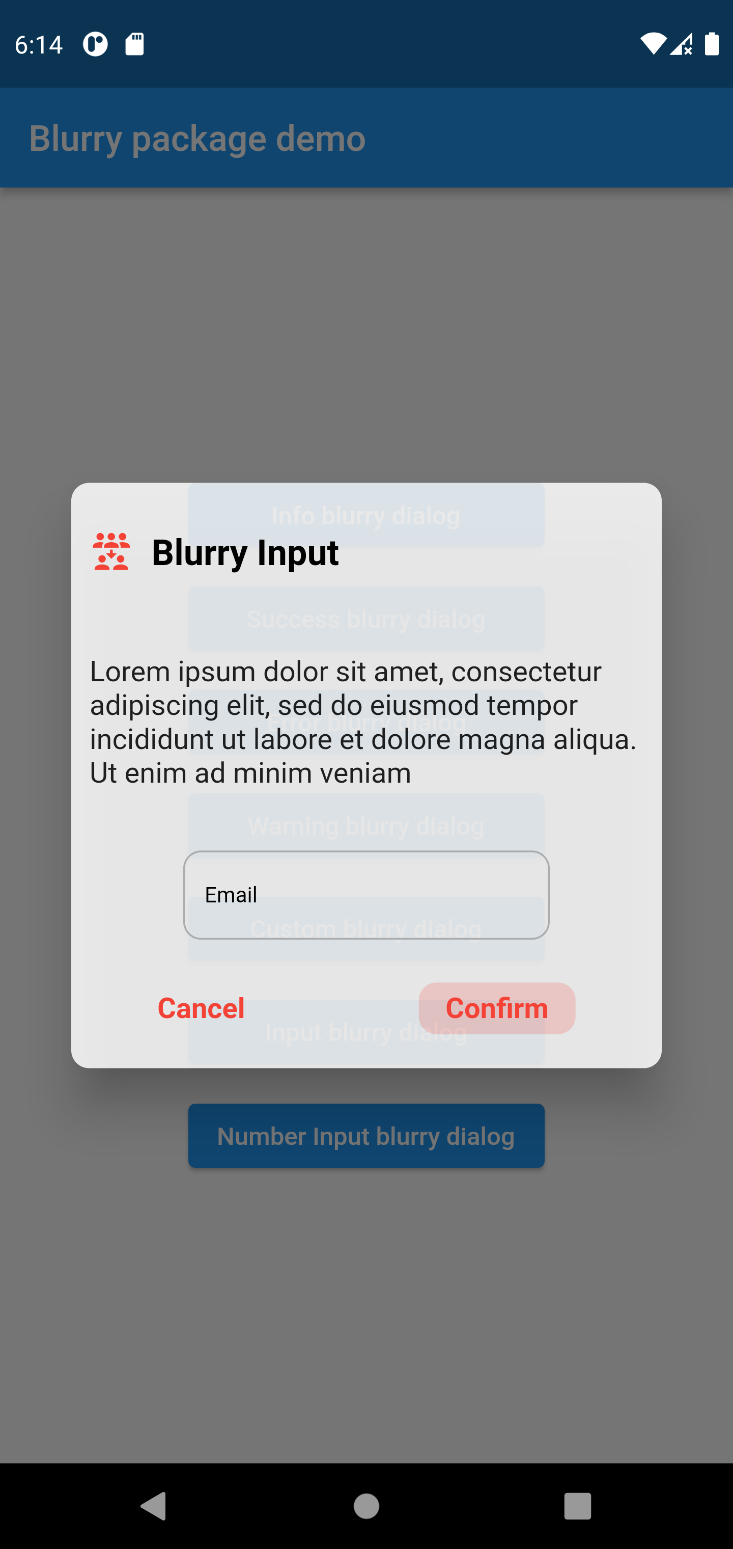
Input Type Example
Blurry.input(
	title:  'Blurry Input',
	description:'Lorem ipsum dolor sit amet, consectetur adipiscing elit',
	confirmButtonText:  'Confirm',
	onConfirmButtonPressed: () {},
	inputLabel:  'Email',
	themeColor: Colors.red,
	icon: Icons.reduce_capacity_outlined,
	inputTextController: TextEditingController(),
).show(context);
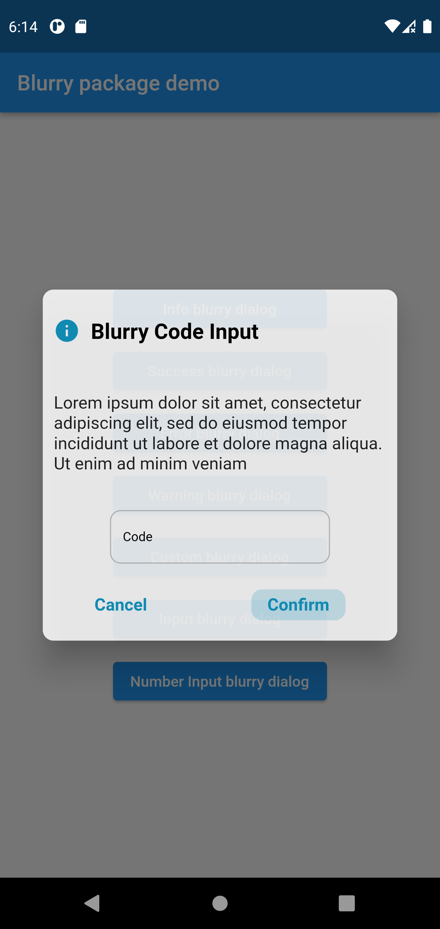
Number Input Example
Blurry.input(
	title:  'Blurry Code Input',
	description:'Lorem ipsum dolor sit amet, consectetur adipiscing elit',
	confirmButtonText:  'Confirm',
	onConfirmButtonPressed: () {},
	inputLabel:  'Code',
	type: BLURRY_TYPE.info,
	inputTextController: TextEditingController(),
	textInputType: TextInputType.number,
).show(context);
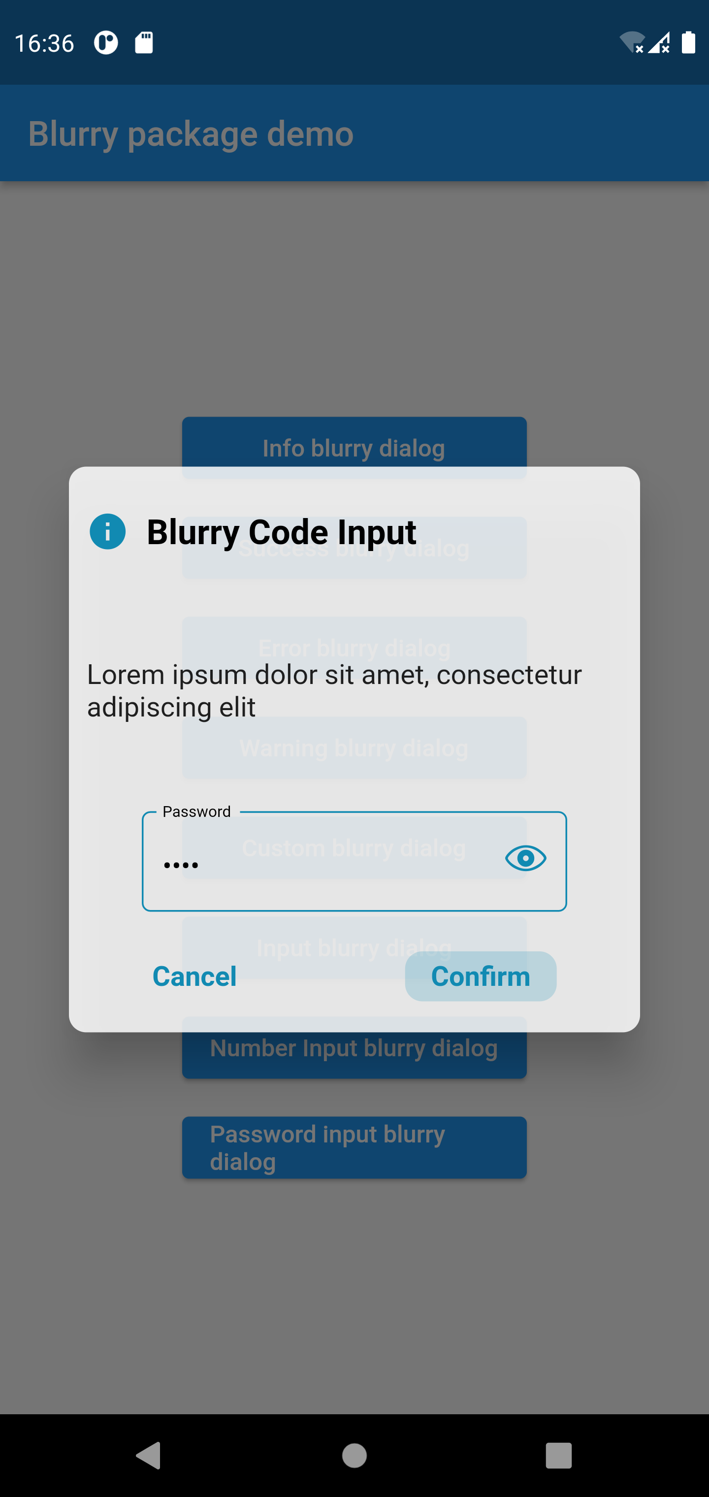
Password Input Example
Blurry.password(
	title:  'Blurry Code Input',
	description:'Lorem ipsum dolor sit amet, consectetur adipiscing elit',
	confirmButtonText:  'Confirm',
	onConfirmButtonPressed: () {},
	inputLabel:  'Password',
	type: BLURRY_TYPE.info,
	inputTextController: TextEditingController(),
).show(context);
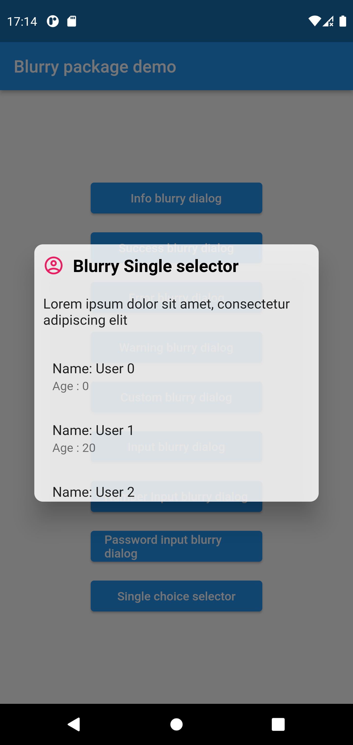
Single selector Example
Blurry.singleChoiceSelector(
	items:  List.generate(
		5,
		(index) =>  Padding(
			padding:  const  EdgeInsets.symmetric(
				horizontal:  5
			),
			child:  ListTile(
				title:  Text('Name: User $index'),
				subtitle:  Text('Age : ${index * 20}'),
			)
		),
	),
	title:  'Blurry Single selector',
	description:'Lorem ipsum dolor sit amet, consectetur adipiscing elit',
	themeColor:  Colors.pink,
	icon:  Icons.account_circle_outlined,
	popupHeight:  300,
).show(context);
Of course the project is open source, and you can contribute to it repository link
- If you found a bug, open an issue.
- If you have a feature request, open an issue.
- If you want to contribute, submit a pull request.