Hybrid Learning Library, Topics pages -- design alignment follow up to-dos #8563
Comments
|
Hi @marcellamaki, posting here some additional issues spotted after testing this 0.15 build so that you can sift through them and maybe disregard or create follow up to-dos: Major issues:
Minor issues:
|


|
In a channel, within the level 3 breakpoint, probably better to display 3 cards per row instead of 4
The number of cards that show per row in "Recent" and the cross-channel search results should be consistent with the cards within a channel. Right now it shows 3 per row even at the widest browser width
Sorry if this is already resolved somewhere else and/or we're not quite ready to do this yet (slack thread), but the "Classes" tab and "Library" action should be removed
Cards within a channel shouldn't have the channel thumbnail show in the top right corner. Also have some notes to make more room on the cards for longer titles
"View more" raised secondary button for more visual prominence in the search results
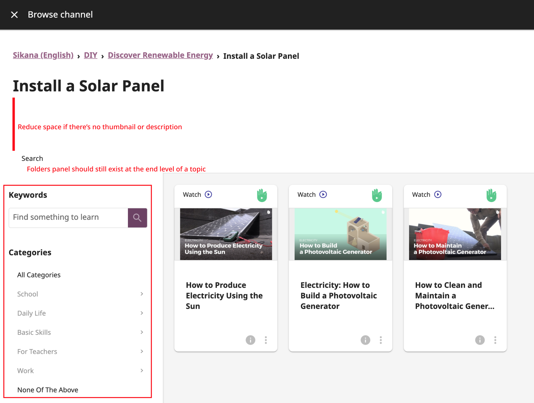
At the end level of a folder, we should keep the Folders panel even though it would only have one folder listed ("Install a Solar Panel" in this example).
And......... I do not have a solution at the moment but I realize how challenging the mobile experience will be and I will get back on a better experience here
|


Topics Page
Library page
Classes page
Bookmarks page
Search panel
Cards
The text was updated successfully, but these errors were encountered: