Multiple series options? #108
Comments
yes. you can see how @CrashLaker does it in #94
in what case would this distinction be important? what do you expect to do with this knowledge? |
In the current model, we have options to either have it connected/zero/ignored -- essentially should the line keep going if it hits a null, display as zero (but not when asked what the data is) or a whole in the graph |
|
reading your comments on This library is looking really good -- so much progress since I looked at it a few months ago! thank you @leeoniya |
|
the "zero" preference for missing data is nonsensical and misleading IMO...and i have some pretty strong opinions about poor charting practices :D...
[1] https://knowledge.ni.com/KnowledgeArticleDetails?id=kA00Z0000019YLKSA2&l=en-US |
agree 😸 I am really pushing on this to figure out what maps easily and what changes we would need to make to things designed long long ago. |
|
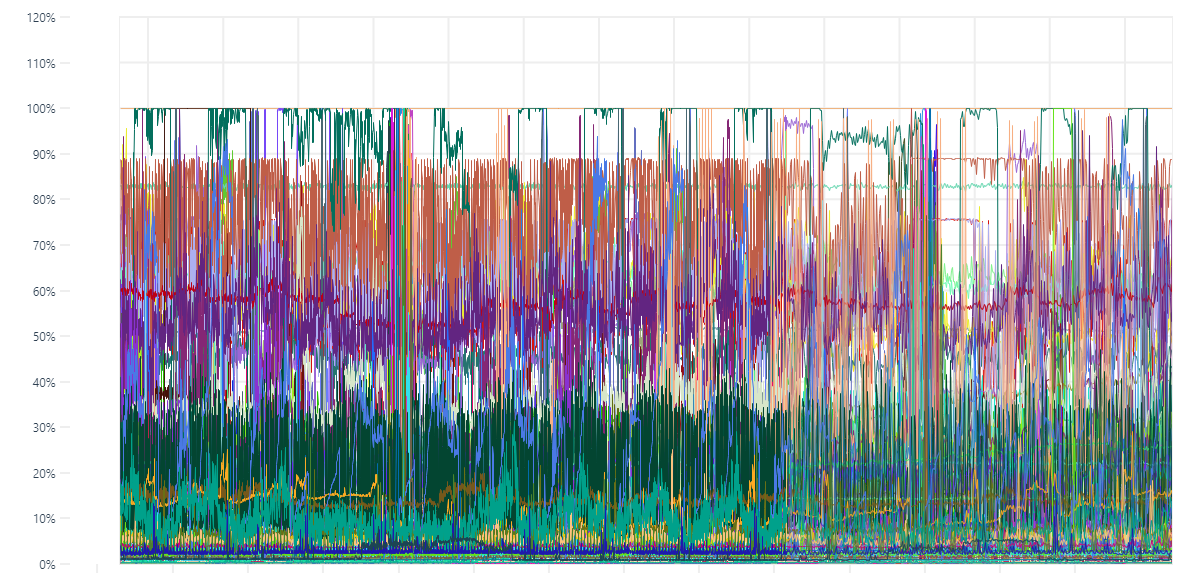
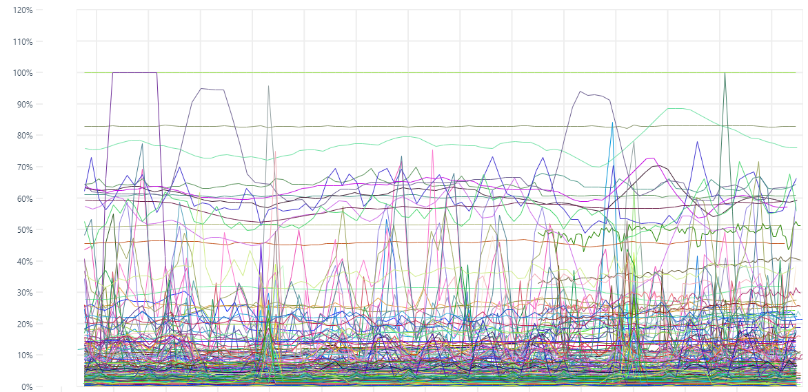
@ryantxu It would be awesome to see uPlot in Grafana. I often use Grafana + SimpleJson plugin to visualize data from many custom/unsupported datasources. a little hook on misleading data I agree with you @leeoniya but sometimes too much precision is just too much noise. whenever i want to see trends or fast insights on data I tend to smooth it (https://github.com/leeoniya/uPlot#non-features) to facilitate visual perception. stack could be of use too when aggregating # of calls to a single machine. for instance i can't tell much about the plot below: then I could catch some more information after smoothing it. |
no argument there. but something like dygraph's roll periods (moving avg) can be done in a pre-processing step. http://dygraphs.com/gallery/#g/temperature-sf-ny it's very easy to override and re-implement the native zoom (via setSelect) to support a case for re-fetching, re-aggregation (on server or client), followed by a |
|
I also totally agree that this processing does not need to happen in the visualization library -- there are many ways to pre-process data and that problem does not need to be linked to the charting library. |
I am looking at how we could possibly use uPlot in grafana. I have a working example:
https://github.com/ryantxu/grafana-uPlot-panel
It looks like a pretty reasonable path for integration aside from one major difference in data model. In uPlot, it looks like everything needs to be in a single columnar table -- ie, all points need to line up.
In grafana, we a list of table results -- different visualizations handle this differently, but the graph panel (currently flot) creates independent [time,value] arrays for each series. This works well when the points do not necessarily align.
Any thoughts on how to best approach this? Do we need to pre-process so everything aligns, filling with null/undefined where necessary? If we do that, how do we distinguish from null/undefined in the actual data?
The text was updated successfully, but these errors were encountered: