Recommendation for UI Change #369
Comments
|
I know this could be a better logical design, but the problem is there's no other page that has "2 columns" in it. So if one went to the General tab, the page will suddenly widen to be able to fit 2 columns, then it will get suddenly narrower when going into any frontend's settings. |
|
More discussion through DMs and we agreed that we will start categorizing the side bar and will also do the same for the popup. |
|
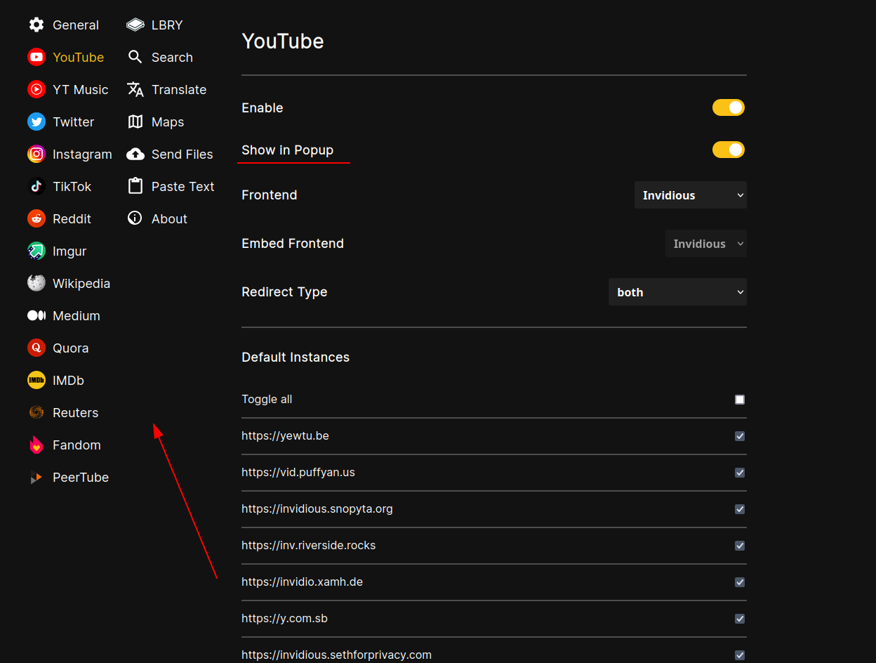
We agreed on not categorizing it :'D as it will make things more complex, but the sidebar will now be a multi column one. And the customize popup will be separated to each frontend's settings page: |
ManeraKai
added a commit
that referenced
this issue
Nov 1, 2022
CatCoder52
added a commit
to CatCoder52/extension_browser
that referenced
this issue
Jun 15, 2023
Sign up for free
to join this conversation on GitHub.
Already have an account?
Sign in to comment
As you see in the above image, The Space is wasted unnecessarily on Left, Removing that space and moving Customize popup there would be easier for usage.
When Moving Customize Popup to the Right, Split the Contents into Half divided by a Separator with the heading
Customize Popupin the center.Or as belows :
This way it is easier or better to do things instead of scrolling things long and long.
The text was updated successfully, but these errors were encountered: