[UI Enhancement]: Reduce size of modals (everywhere in the app) #464
Assignees

Labels
enhancement
Small enhancements to existing features
Comments
|
What do you want to change? |
1 task
|
This is part of the dialog specs: https://m3.material.io/components/dialogs/specs#6771d107-624e-47cc-b6d8-2b7b620ba2f1. |
|
Because of inactivity, I will close this issue. Feel free to create a new one if you need something or join the discord/matrix server. |
Sign up for free
to join this conversation on GitHub.
Already have an account?
Sign in to comment
Is your feature request related to a problem? Please describe
This is how it looks on my tab:
Other Options are hidden, I've to scroll down to discover hidden options
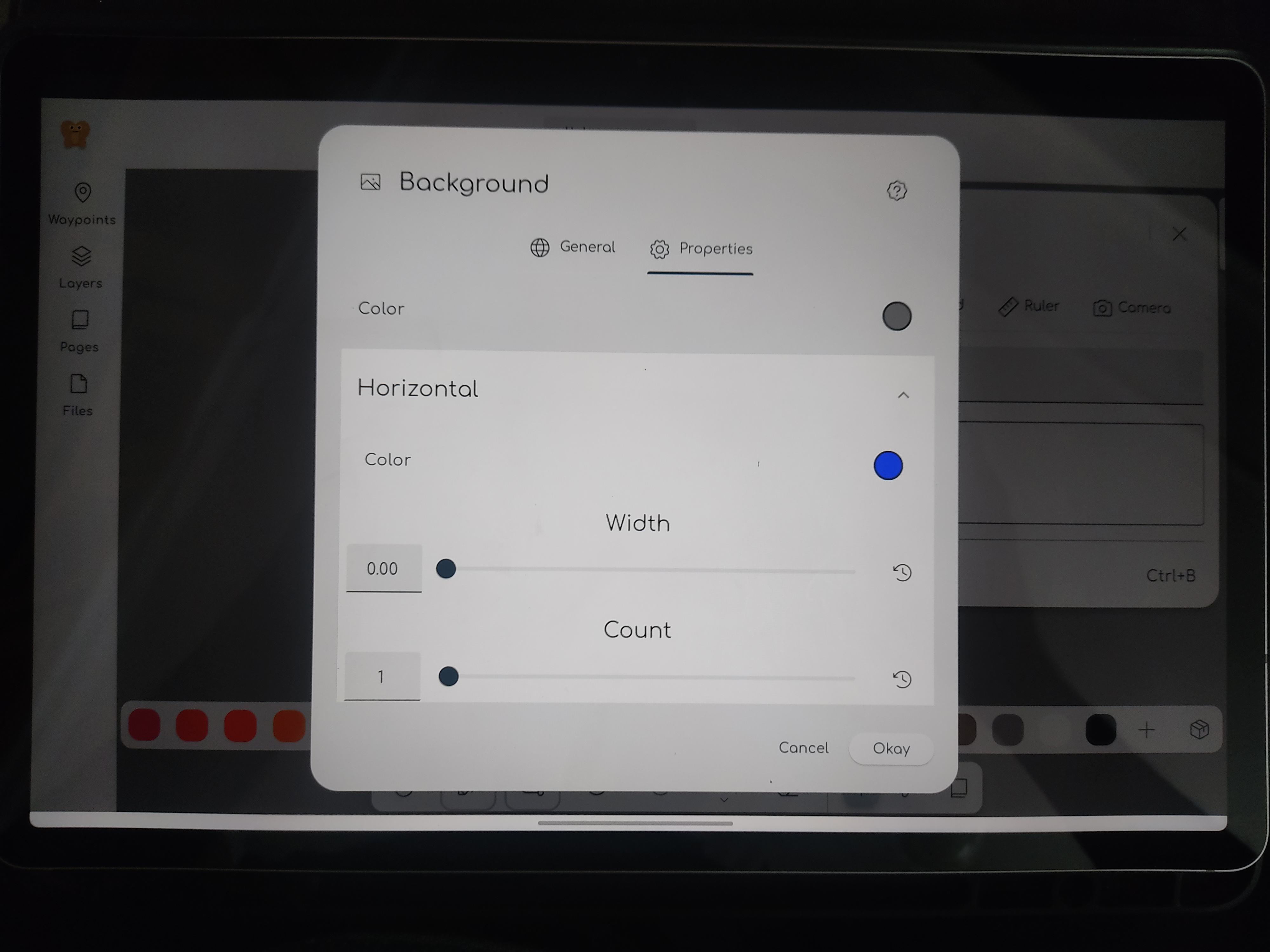
Its poor UI and Its makes the app look quite clunky.
Describe your feature request!
Reduce size of modals so that everything is visible on screen.
Users are used to working with clean and smaller UI elements on screen. We aren't adding any further value by making our App ui quite large.
Additional context
No response
Code of Conduct
The text was updated successfully, but these errors were encountered: