[Top App Bar] Make more clear, that top app bar is only colorized on scrolling #3200
Assignees

Labels
Comments
|
Thanks for the feedback, I agree it should say "on scroll" in a couple places on that Overview page. Will forward this to our design team. |
Sign up for free
to join this conversation on GitHub.
Already have an account?
Sign in to comment
I refer to the material3 components site: https://m3.material.io/components/top-app-bar/overview
Could you please adjust the documentation about the top bar component, so that is more clear that the color of the top app bar is always equal to the content, but gets a color fill on scrolling. It would be great if this gets highlighted somewhere because it is confusing to see a colorized top app bar directly on the first page of the component while one is expecting a white/black top app bar like it is promised and previewed by the
Theme Builder.I was wondering why Theme Builder shows a top app bar with a white or black (Surface color: Neutral 99) respectively, based on UI mode but material 3 site partially shows a colorized top app bar. Since background color and surface color are the same the color of the top app bar and the background color (and also the status bar color) always match, that's what the Theme Builder promises in the preview and also in the exported values.
It took some time to understand why some of the visuals on the material3 top app bar site are colorized, especially the one on the first page. It is confusing to see a colorized top app bar when entering the first page of top app bar, expecting something similar the Theme Builder offers.
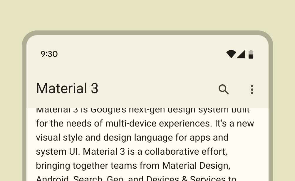
This is the visual on the first page.
It is only colorized because the content is scolled but this isn't clear on first glance. It would be great if this can be made more clear. Maybe don't use any visuals with a colorized top app bar until the Behavior section.
Under guidelines -> Behavior -> scrolling is stated that the color only changes when content is being scrolled, see https://m3.material.io/components/top-app-bar/guidelines#4eab4f50-4a3e-4189-bce2-a46514cde1da
The text was updated successfully, but these errors were encountered: