mpvue-photo
# 初始化项目
vue init mpvue/mpvue-quickstart myproject
cd myproject

# 安装依赖
yarn

# 开发时构建
npm dev

# 打包构建
npm build

# 指定平台的开发时构建(微信、百度、头条、支付宝)
npm dev:wx
npm dev:swan
npm dev:tt
npm dev:my

# 指定平台的打包构建
npm build:wx
npm build:swan
npm build:tt
npm build:my

# 生成 bundle 分析报告
npm run build --report
#项目中painter插件的使用方法
一个调色板首先需要给予一些整体属性
background: 可以是颜色值,也可以为网络图片的链接,默认为白色,支持渐变色
width: 宽度
height: 高度
borderRadius: 边框的圆角(该属性也同样适用于子 view)
views: 里面承载子 view
当我们把整体的调色板属性构建起来后,里面就可以添加子 View 来进行绘制了。
| type | 内容 | description | 自有css |
|---|---|---|---|
| image | url | 表示图片资源的地址,本地或网络 | 见 image 小节 |
| text | text | 文本的内容 | 见 text 小节 |
| rect | 无 | 矩形 | color: 颜色,支持渐变色 |
| qrcode | content | 画二维码 | background: 背景颜色(默认为透明色)color: 二维码颜色(默认黑色) |
Painter 的 image 可以设置成本地图片或者网络图片,注意本地图片请使用绝对路径。并且如果未设置 image 的长宽,则长宽的属性值会默认设为auto。若长宽均为auto则会使用图片本身的长宽来布局,大小为图片的像素值除以 pixelRatio 。
| 属性名称 | 说明 | 默认值 |
|---|---|---|
| width | image的宽度 | auto |
| height | image的高度 | auto |
| mode | 图片裁剪、缩放的模式 | aspectFill |
scaleToFill:不保持纵横比缩放图片,使图片的宽高完全拉伸至填满 image 元素
aspectFill:保持纵横比缩放图片,只保证图片的短边能完全显示出来。也就是说,图片通常只在水平或垂直方向是完整的,另一个方向将会发生截取。
注:mode 属性和小程序 image 的 mode 属性功能一致,只是支持的类型只有两种,且默认值不同。 当 width 或 height 属性设置为 auto 时,mode 属性失效

例子代码(点击展开)
export default class ImageExample {
  palette() {
    return ({
      width: '654rpx',
      height: '1000rpx',
      background: '#eee',
      views: [
        {
          type: 'image',
          url: '/palette/sky.jpg',
        },
        {
          type: 'text',
          text: '未设置height、width时',
          css: {
            right: '0rpx',
            top: '60rpx',
            fontSize: '30rpx',
          },
        },
        {
          type: 'image',
          url: '/palette/sky.jpg',
          css: {
            width: '200rpx',
            height: '200rpx',
            top: '230rpx',
          },
        },
        {
          type: 'text',
          text: "mode: 'aspectFill' 或 无",
          css: {
            left: '210rpx',
            fontSize: '30rpx',
            top: '290rpx',
          },
        },
        {
          type: 'image',
          url: '/palette/sky.jpg',
          css: {
            width: '200rpx',
            height: '200rpx',
            mode: 'scaleToFill',
            top: '500rpx',
          },
        },
        {
          type: 'text',
          text: "mode: 'scaleToFill'",
          css: {
            left: '210rpx',
            top: '560rpx',
            fontSize: '30rpx',
          },
        },
        {
          type: 'image',
          url: '/palette/sky.jpg',
          css: {
            width: '200rpx',
            height: 'auto',
            top: '750rpx',
          },
        },
        {
          type: 'text',
          text: '设置height为auto',
          css: {
            left: '210rpx',
            top: '780rpx',
            fontSize: '30rpx',
          },
        },
      ],
    });
  }
}
因为 text 的特殊性,此处对 text 进行单独说明。
| 属性名称 | 说明 | 默认值 |
|---|---|---|
| fontSize | 字体大小 | 20rpx |
| color | 字体颜色 | black |
| maxLines | 最大行数 | 不限,根据 width 来 |
| lineHeight | 行高(上下两行文字baseline的距离) | fontSize 大小 |
| fontWeight | 字体粗细。仅支持 normal, bold | normal |
| textDecoration | 文本修饰,支持 underline、 overline、 line-through,也可组合使用 | 无效果 |
| textStyle | fill: 填充样式,stroke:镂空样式 | fill |
| fontFamily | 字体,如需加载网络字体,前提前使用 wx.loadFontFace 进行加载(https://developers.weixin.qq.com/miniprogram/dev/api/media/font/wx.loadFontFace.html) | sans-serif |
| background | 文字背景颜色 | 无 |
| padding | 文字背景颜色边际与文字间距 | 0rpx |
| textAlign | 文字的对齐方式,分为 left, center, right,view 的对齐方式请看 align 属性 | left |
当文字设置 width 属性后,则文字布局的最大宽度不会超过该 width 。如果内容超过 width,则会进行换行,如果此时未设置 maxLines 属性,则会把所有内容进行换行处理,行数由内容和 width 决定。如果此时设置了 maxLines 属性,则最大展示所设置的行数,如果还有多余内容未展示出来,则后面会带上 ... 。
- 以下用个例子说下上述几个属性的用法
例子代码(点击展开)
export default class LastMayday {
palette() {
return ({
width: '654rpx',
height: '700rpx',
background: '#eee',
views: [
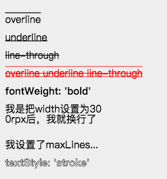
_textDecoration('overline', 0),
_textDecoration('underline', 1),
_textDecoration('line-through', 2),
_textDecoration('overline underline line-through', 3, 'red'),
{
type: 'text',
text: "fontWeight: 'bold'",
css: [{
top: `${startTop + 4 * gapSize}rpx`,
fontWeight: 'bold',
}, common],
},
{
type: 'text',
text: '我是把width设置为300rpx后,我就换行了',
css: [{
top: `${startTop + 5 * gapSize}rpx`,
width: '400rpx',
}, common],
},
{
type: 'text',
text: '我设置了maxLines为1,看看会产生什么效果',
css: [{
top: `${startTop + 7 * gapSize}rpx`,
width: '400rpx',
maxLines: 1,
}, common],
},
{
type: 'text',
text: "textStyle: 'stroke'",
css: [{
top: `${startTop + 8 * gapSize}rpx`,
textStyle: 'stroke',
fontWeight: 'bold',
}, common],
},
],
});
}
}
const startTop = 50;
const gapSize = 70;
const common = {
left: '20rpx',
fontSize: '40rpx',
};
function _textDecoration(decoration, index, color) {
return ({
type: 'text',
text: decoration,
css: [{
top: `${startTop + index * gapSize}rpx`,
color: color,
textDecoration: decoration,
}, common],
});
}
以上 View ,除去自己拥有的特别属性外,还有以下的通用布局属性
| 属性 | 说明 | 默认 |
|---|---|---|
| rotate | 旋转,按照顺时针旋转的度数 | 不旋转 |
| width、height | view 的宽度和高度,其中 image 和 text 可不设置 | |
| top、right、bottom、left | 如 css 中为 absolute 布局时的作用,可为 负值 | 默认 top 和 left 为 0 |

很多人有获得文本宽度的需求,因为文本宽度随着字数不同而动态变化,如果想在文本后面加个图标,那么我们就需要获得文本宽度。Painter 的解决方案如下:
1,首先你需要为检测长度的文本添加一个 id。如下
{
  id: 'my-text-id',
  type: 'text',

2,然后在后面的 view 中,你可以在 left 和 right 属性中使用这个id。如下
left: ['10rpx', 'my-text-id', 比例]
表示布局在距离左边(10rpx + 该text文本宽度 * 比例) 的距离,比例默认为 1,可省去,你也可以使用负数或小数来做计算,最终的 left 会加上文本宽度乘以该数的值。

注意:比例一定为一个 number
如果想获得高度,top 也支持上述用法,并且除文本外,你可以对任何 view 设置一个 id,然后使用上述方法进行相对布局。
注:相对布局的那个 view 代码一定需要在被相对的 view 的下面。
| 属性 | 说明 | 默认 |
|---|---|---|
| borderRadius | 边界圆角程度,如果是正方形布局,该属性为一半宽或高时,则为圆形 | 0 |
| borderWidth | 边界宽度,外边界 | 必设值,否则无边框效果 |
| borderColor | 边框颜色 | black |

Painter 的 align 类型与 css 中的 align 有些许不同。在 Painter 中 align 表示 view 本身的对齐方式,而不像 css 中表示对其子 view 的操作。align 可以作用在 Painter 支持的所有 view 上。它以设置的 left、top、right、bottom 的位置为基准,然后做不同的对齐操作。并且 align 在文字多行情况下,会影响多行文字的对齐方式。
注意:如果布局使用了 right 确定位置,则该 view 会默认右对齐布局,但此时文字还是从左边绘制。

例子代码(点击展开)
{
  width: '654rpx',
  height: '600rpx',
  background: '#eee',
  views: [
    {
      type: 'rect',
      css: {
        top: '40rpx',
        left: '327rpx',
        color: 'rgba(255, 0, 0, 0.5)',
        width: '5rpx',
        height: '500rpx',
      },
    },
    {
      type: 'image',
      url: '/palette/avatar.jpg',
      css: {
        top: '40rpx',
        left: '327rpx',
        width: '100rpx',
        height: '100rpx',
      },
    },
    {
      type: 'qrcode',
      content: '/palette/avatar.jpg',
      css: {
        top: '180rpx',
        left: '327rpx',
        width: '120rpx',
        height: '120rpx',
      },
    },
    {
      type: 'text',
      text: "align: 'left' 或者不写",
      css: {
        top: '320rpx',
        left: '327rpx',
        fontSize: '30rpx',
      },
    },
    {
      type: 'text',
      text: "align: 'right'",
      css: {
        top: '370rpx',
        left: '327rpx',
        align: 'right',
        fontSize: '30rpx',
      },
    },
    {
      type: 'text',
      text: "align: 'center'",
      css: {
        top: '420rpx',
        left: '327rpx',
        align: 'center',
        fontSize: '30rpx',
      },
    },
    {
      type: 'text',
      text: "在多行的情况下,align 会影响内部 text 的对齐,比如这边设置 align: 'center'",
      css: {
        top: '480rpx',
        right: '327rpx',
        width: '400rpx',
        align: 'center',
        fontSize: '30rpx',
      },
    },
  ],
}
Painter 中的 shadow 可以同时修饰 image、rect、text、qrcode 等 。在修饰 text 时则相当于 text-shadow;修饰 image 和 rect 时相当于 box-shadow;修饰 qrcode 时,则相当于二维码有效区域的投影。
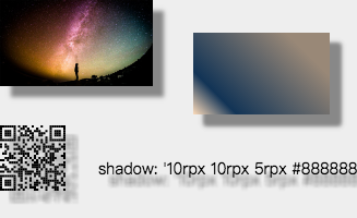
使用方法:
shadow: 'h-shadow v-shadow blur color';
h-shadow: 必需。水平阴影的位置。允许负值。
v-shadow: 必需。垂直阴影的位置。允许负值。
blur: 必需。模糊的距离。
color: 必需。阴影的颜色。
例子代码(点击展开)
export default class ShadowExample {
  palette() {
    return ({
      width: '654rpx',
      height: '400rpx',
      background: '#eee',
      views: [{
          type: 'image',
          url: '/palette/sky.jpg',
          css: {
            shadow: '10rpx 10rpx 5rpx #888888',
          }
        },
        {
          type: 'rect',
          css: {
            width: '250rpx',
            height: '150rpx',
            right: '50rpx',
            top: '60rpx',
            shadow: '10rpx 10rpx 5rpx #888888',
            color: 'linear-gradient(-135deg, #fedcba 0%, rgba(18, 52, 86, 1) 20%, #987 80%)',
          }
        },
        {
          type: 'qrcode',
          content: 'https://github.com/Kujiale-Mobile/Painter',
          css: {
            top: '230rpx',
            width: '120rpx',
            height: '120rpx',
            shadow: '10rpx 10rpx 5rpx #888888',
          },
        },
        {
          type: 'text',
          text: "shadow: '10rpx 10rpx 5rpx #888888'",
          css: {
            left: '180rpx',
            fontSize: '30rpx',
            shadow: '10rpx 10rpx 5rpx #888888',
            top: '290rpx',
          },
        },
      ],
    });
  }
}
你可以在画布的 background 属性或者 rect 的 color 属性中使用以下方式实现 css 3 的渐变色,其中 radial-gradient 渐变的圆心为 view 中点,半径为最长边,目前不支持自己设置。
linear-gradient(-135deg, blue 0%, rgba(18, 52, 86, 1) 20%, #987 80%)

radial-gradient(rgba(0, 0, 0, 0) 5%, #0ff 15%, #f0f 60%)
!!!注意:颜色后面的百分比一定得写。
因为 Painter 支持换行符,所以我们可以配合向字符之间插入换行符来达到竖排显示的效果,并且我们还能自由控制是从左到右或从右到左,如下图所示。

例子代码(点击展开)
const text = '锄禾日当午汗滴禾下土谁知盘中餐粒粒皆辛苦';
export default class ImageExample {
  palette() {
    const views = [];
    let tmpText = '';
    let index = 0;
    for (let i = 0; i < text.length; i++) {
      tmpText = `${tmpText}${text[i]}\n`;
      if (i % 5 === 4) {
        views.push({
          type: 'text',
          text: tmpText,
          css: {
            right: `${50 + index}rpx`,
            top: '60rpx',
            fontSize: '40rpx',
            lineHeight: '50rpx',
          },
        });
        index += 50;
        tmpText = '';
      }
    }
    return ({
      width: '654rpx',
      height: '500rpx',
      background: '#eee',
      views: views,
    });
  }
}
1,目前 Painter 中支持两种尺寸单位,px 和 rpx,代表的意思和小程序中一致,此处就不多说。
2,目前子 view 的 css 属性支持 object 或 array。所以意味着,你可以把几个子 view 共用的 css 属性提取出来。做到让 Palette 更加简洁。
3,因为我们的 palette 是以 js 承载的 json,所以意味着你可以在每一个属性中很方便的加上自己的逻辑。也可以把某些属性单独提取出来,让多个 palette 共用,做到模块化。
具体的使用方法,可以去该包的项目中去查看Painter 感谢酷家乐团队的开源 开源组件,希望大家去点个star,支持一下
For detailed explanation on how things work, checkout the guide and docs for vue-loader.