Skip to content
This repository has been archived by the owner on Apr 26, 2024. It is now read-only.

Recognize negative values? #594

Open
ruthpozuelo opened this issue Jun 29, 2021 · 11 comments
Open

Recognize negative values? #594

ruthpozuelo opened this issue Jun 29, 2021 · 11 comments

Comments

@ruthpozuelo
Copy link

Describe the bug
Don't know if this is a bug, a feature request or I simply don't know how to do it.

I am trying to create a diverging lollipop charts with positive and negative values. The negative values are plotted outside the plot segment and when I save the chart in power bi, they all get moved to the positive area (because they are plotted outside?).

To Reproduce
Steps to reproduce the behavior:

1

Expected behavior
I have tried to use a scale, different glyphs (that can be worked out, but it is not optimal), I would expect Charticulator to understand that there are negative values and plot them as such?

@zBritva
Copy link
Contributor

zBritva commented Jun 29, 2021

It's not bug. It's limitation of current workaround (rendering legend ax axis).

@ruthpozuelo
Copy link
Author

Thanks, so in order to plot the negative values we need to create two glyphs?

@zBritva
Copy link
Contributor

zBritva commented Jun 29, 2021

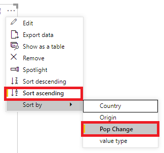
I think the Data Axis is better for now.

image

I used list(0) to constantly define 0 and bound bottom side of rect to this anchor point.

See chart file
CAT__VAL.chart.txt

@ruthpozuelo
Copy link
Author

Thanks, but how would that work when I want to do a lollipop chart?
My data:
data.csv.txt
Image of what i am trying to create:
diverging_lollipop_chart-1

@dm-p
Copy link
Contributor

dm-p commented Jul 5, 2021

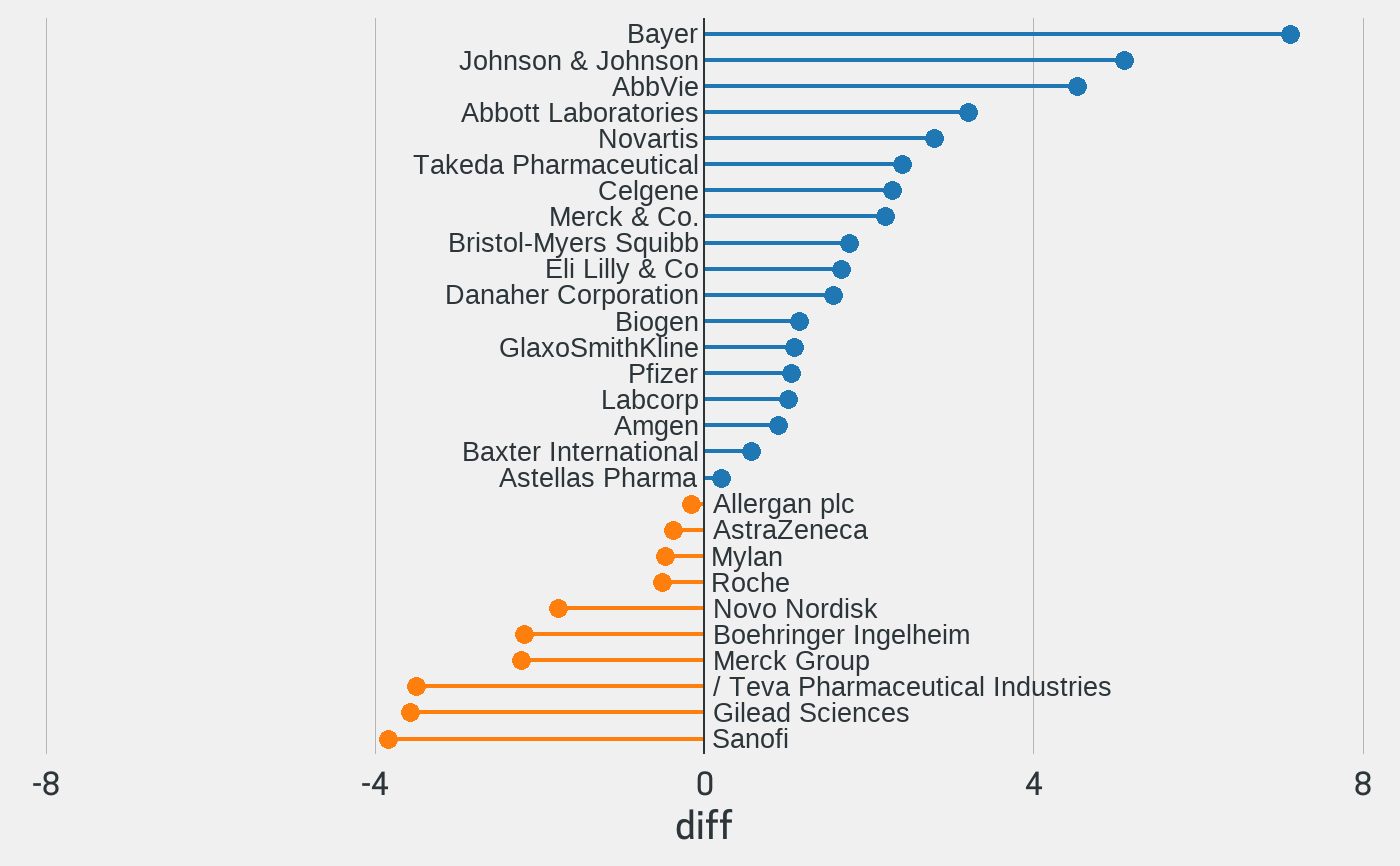
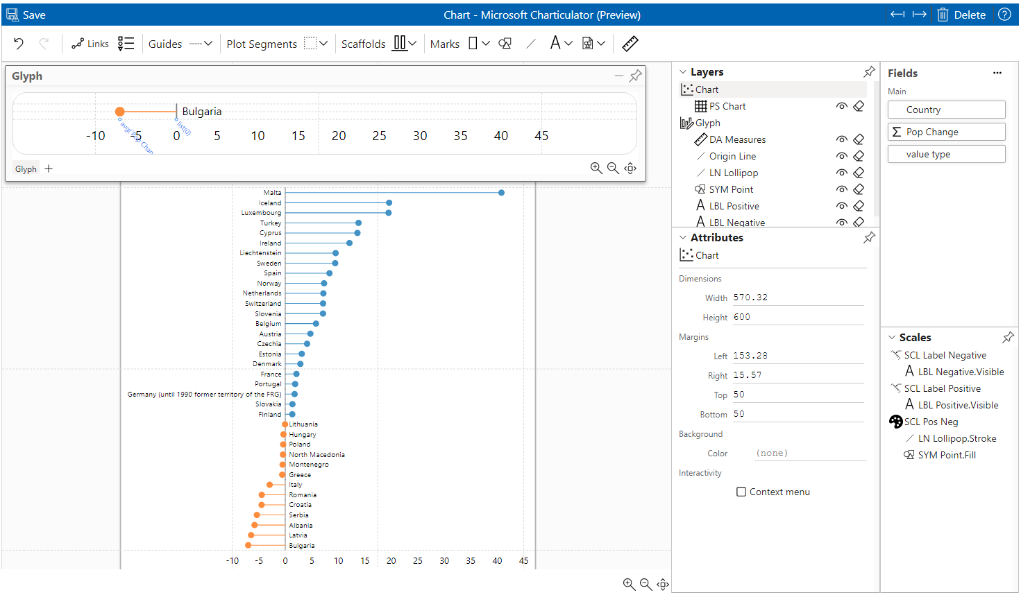
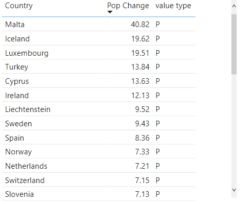
Hey @ruthpozuelo - this is not 100% perfect, but should get you on the right path:

image

Should be apparent from the screenshot, and I've also attached a .pbix (zipped), but here's how I solved using your data:

  1. I created a measure for Pop Change as sorting didn't work too well with the column, but dataset looks as you might expect:
    image

  2. Add Country & Value Type columns and Pop Change measures to Charticulator dataset.

  3. Sort data in visual header by Pop Change / Ascending:
    image

  4. Set plot segment to stack Y.

  5. Add data axis to glyph, across the whole width, and add Pop Change measure. Additionally, drag the Pop Change measure on again, and change this to list(0) measure, as per @zBritva's suggestion and add to axis e.g.:
    image
    image

(you could also create a measure or column called Origin or similar, with a fixed value of 0 and add that to the dataset, which was how I approached initially if the list(0) approach is not ideal for you)

  1. Add line, and set span from origin measure to Pop Change measure. This will ensure that for whatever direction of the origin, the line will be in the correct direction.

  2. Add symbol and snap to the Pop Change measure on data axis. Should now look roughly as follows:
    image

  3. Add text mark, bound to origin measure on data axis. Set Anchor X to Right and Anchor Y to Middle. Add Pop Change to visibility condition and set to 'P', so this only shows for glyphs with that value:
    image

  4. Repeat step 9, but set Anchor X to left. When you drag Value Type to visibility, HOLD SHIFT TO CREATE A NEW SCALE, otherwise it will share the same condition as the previous one and won't work as desired (doc link, under 'Reusing a Scale'). Set this to show on 'N':
    image

  5. I also added a vertical line, bound to the Origin measure and set Plot Segment gap to 0%, so that the 0 line runs all the way up, e.g.:
    image

@ruthpozuelo
Copy link
Author

Fab.u.lous!! You are a 🎇!

@ruthpozuelo
Copy link
Author

A million years later and I have finally tested your technique and it works as a charm, thanks @dm-p and zBritva.
In an attempt to understand how charticulator works, I have a question:
why do I have to set the zero baseline to make it work?

@dm-p
Copy link
Contributor

dm-p commented Aug 17, 2021

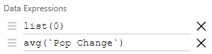
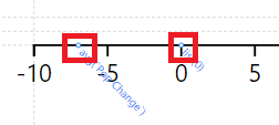
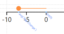
As the line needs a start and an end point, it's giving the line a consistent anchor for all series that serves as a (data-bound) guide. This baseline could easily be another measure (e.g. if you were designing a dumbbell chart) and could also be a measure or column hard-coded to 0.

@Prakash-PBI
Copy link

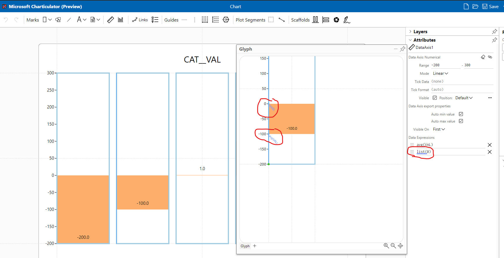
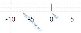
I have tried with list(0) to show negative bars but still its not working for me,

Could you please add some more content.
Thanks

@FShawky
Copy link

FShawky commented Jun 21, 2023

Make sure your scale values are not set to auto-update. I've found that when you hit save, it goes back to the values it originally had.

@zBritva
Copy link
Contributor

zBritva commented Jun 22, 2023

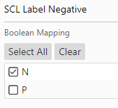
@FShawky It needs to uncheck Auto min value and Auto max value to keep axis with constant values:

image

Sign up for free to subscribe to this conversation on GitHub. Already have an account? Sign in.
Projects
None yet
Development

No branches or pull requests

6 participants