Dropdown component does not show tooltips for long options via keyboard navigation #11248
Comments
|
@rcasto We suggest not having such long text in your dropdown items - very long text that extends past the width of the Dropdown itself is not how Dropdown is intended to be used. So please shorten your dropdown items' text. |
 aneeshack4
added
Component: Dropdown
Resolution: By Design
and removed
Needs: Triage 🔍
labels
aneeshack4
added
Component: Dropdown
Resolution: By Design
and removed
Needs: Triage 🔍
labels
|
@aneeshack4 I work with @rcasto and figured I'd chime in. Even if we shorten the text, the title attributes of the items in the dropdown are still not keyboard accessible. Our first attempt to shorten the dropdown items' text did actually involve putting some extra information in the title property of the dropdown item, but we ran into the same bug where the title wasn't accessible. Here's the same codepen as above, modified to explicitly set the title property: https://codepen.io/raharri/pen/Exxrdrq As you can see, the extra information is available to mouse users but not to keyboard users. This doesn't seem to be by design. |
|
@smhigley FYI |
|
I agree those tooltips aren't accessible, though I think the solution is not to provide tooltips on dropdown options at all. I can't even imagine how it would be possible to make those meet the dismissable requirement of Content on Hover or Focus. |
|
Started an email thread offline to discuss this & get input from a11y experts. The work that it will take to fix this will likely be involved so adding this for backlog review. |
|
Options:
Looking around, Material goes with # 1 and just expands the select to fit the text....though after the input is bigger than the screen, you're out of luck
polaris also does # 1. Yes it follows what an html select does, but I can't say it's the best experience
spectrum on the other hand wrapps long dropdown options:
Ant is like us, they truncate and pass title in for standard 'onhover' html tooltip (wasn't able to screencap it thought)
|


|
Because this issue has not had activity for over 150 days, we're automatically closing it for house-keeping purposes. Still require assistance? Please, create a new issue with up-to date details. |
 msft-fluent-ui-bot
added
the
Resolution: Soft Close
msft-fluent-ui-bot
added
the
Resolution: Soft Close
Environment Information
Describe the issue:
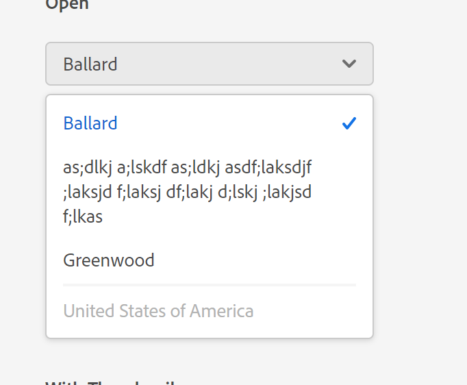
If a Dropdown component is given options that have text that extends past the width of the dropdown itself, then upon keyboard navigation of the options, keyboard users will not be able to read all of the text for the option or have it displayed in a tooltip. Mouse users can hover over the option itself and see a tooltip, keyboard users do not have this.
Please provide a reproduction of the issue in a codepen:
https://codepen.io/rcasto/pen/YzzBawV
Use the keyboard to expand the dropdown and then up/down arrows to traverse selections.
Actual behavior:
When selecting the first option (the long option) from the list of options via keyboard. You don't see or get a preview of all the text for that option.
Expected behavior:
Keyboard users should be displayed a tooltip on navigation of dropdown options that extend the constraints of the dropdown dimensions.
Documentation describing expected behavior
Think I described this above, but long options that overflow the dropdown container should show a tooltip when accessed via keyboard in addition to accessed via mouse
The text was updated successfully, but these errors were encountered: