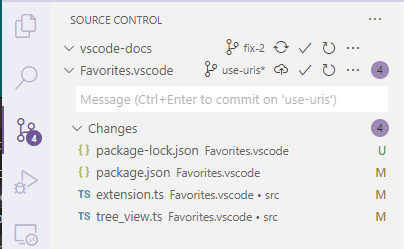
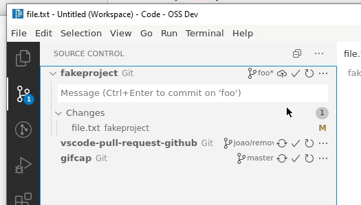
Changes view: harder for me to understand "clean" state for a repo #101103
Comments
|
From @gjsjohnmurray:
👍 |
|
In #101112 I wrote:
(examples cited are from screenshots in the other issue that compare 1.46 and 1.47 side by side) |
|
Adding the scm label I think would definitely help here:
|
|
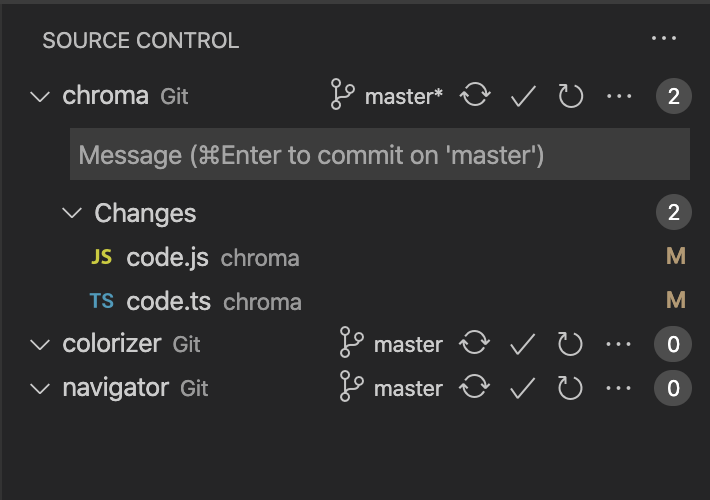
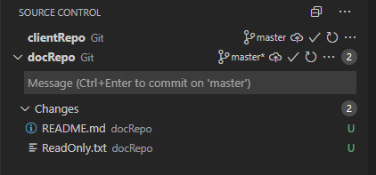
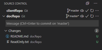
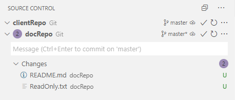
I've added the SCM label. I can't really hide the twistie if the repositories have no changes as it makes it even worse:
|
|
I kinda like this, will push it:
|
|
Even removing the twistie looks good:
What do you think? |
|
I would probably prefer a look that is in sync with our split views, e.g. a full border:
I would even think that bold could work for the first nodes? |

|
I thought the solid border was fine, I don't think we ever use a dashed border so this feels inconsistent. |
|
How about the proposal from elsewhere to drop the badge if its value is zero? |
|
@bpasero @misolori Using a full border will fool the user into thinking that it can be dragged, since now the core themes all render split views that very same way. This is something I've been trying to avoid since the beginning of this adventure. I'm just going to get an issue: can't resize SCM provider view. I'm really all up for more ideas, keep them coming, but I don't think aligning this with splitviews is a good idea. @gjsjohnmurray I tried that but didn't really like the fact that the actions wouldn't align with other repositories'. |
@joaomoreno how about styling the badge div as
|
|
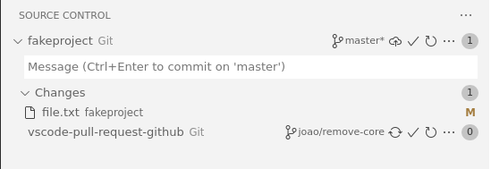
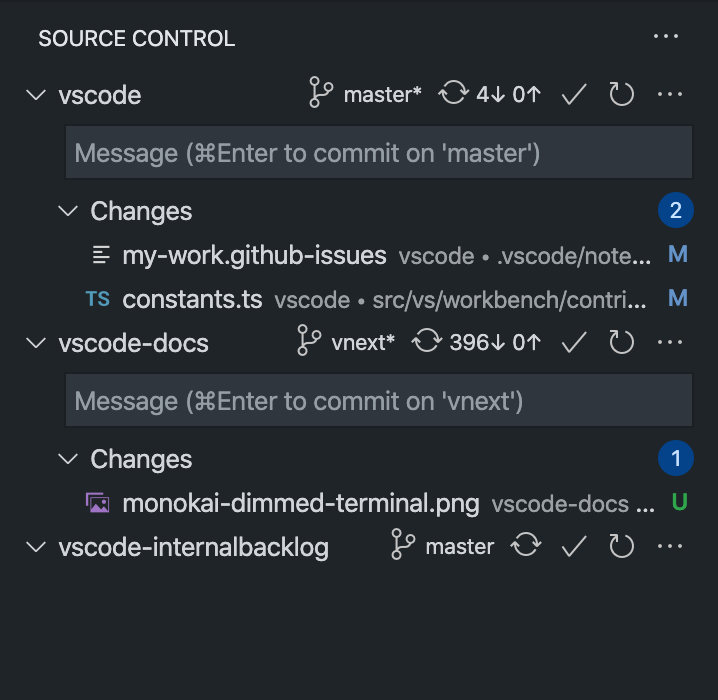
Do we really need the top level badges at the repo level? Feels like the changes one is the only important one and most of the time it just repeats itself. I think this would look better too:
|
|
Throwing in another idea: use different background colors for the repos. Compare with our keybindings editor:
This gives a nice separation between logical units in the list. Though arguably can only be a light change in background color given we have so many selection colors. |

|
@misolori Yeah I kinda like that. Though your screenshot shows the good case: you wanna see I'm also going to remove the dotted lines, they haven't grown nicely on me.
@bpasero That's also the style of the splitview for the other half of themes:
@gjsjohnmurray Good idea but I'll just get the bad layout in SCM view bug right after, since it looks broken. |
|
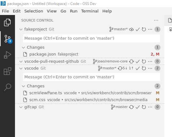
Latest exploration:
|
|
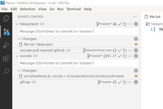
And one more iteration, now with a collapse/expand repositories action:
|
|
@joaomoreno I like the Collapse All, but I see you have also dropped the top level badges entirely. So after Collapse All the only clue about which rows have changes is the presence of absence of the collapse icon at the left end. I take your earlier point about folk reporting a suppressed 0-badge as a UI bug. How about an empty badge (i.e. no zero in it)? Or fade them? |
|
@gjsjohnmurray I'm thinking a setting to show/hide the badge, but maybe keep the default hidden. |
|
@joaomoreno a setting sounds like a good compromise. Maybe tri-state, so we can "hide", "show", and "hide if zero". Default to "hide", which has the benefit of leaving a but more space for command buttons and branch name. |
|
@gjsjohnmurray Will push a |
|
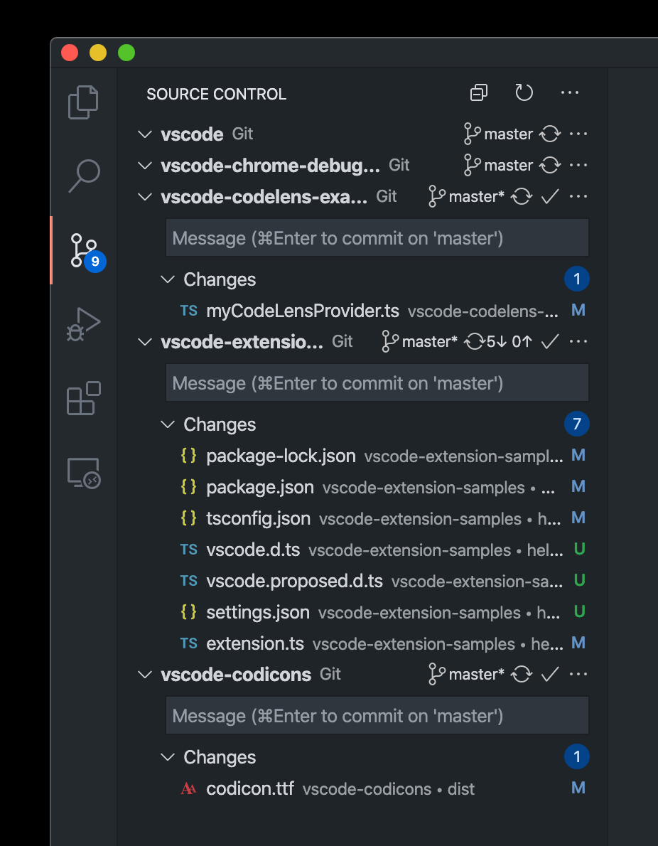
I want to share my thoughts about the new design. The "check" button used to be visible only if the corresponding repository's view is expanded, rather than showing all the time now. I wonder who would use this button without seeing what's actually changed/stage? So I tried to move it into the view itself. From this starting point, I also came with the menu refinement ideas.
I also thought that maybe hovering on the counting badge will show the |
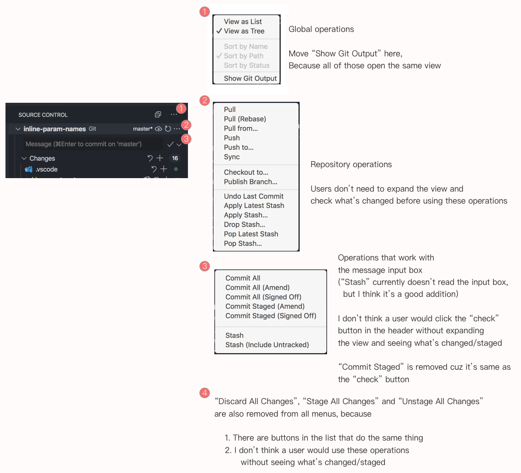
|
Surprise! There are two more operations when right-clicking the header
For discoverability maybe they should also be in the header ... menu. |
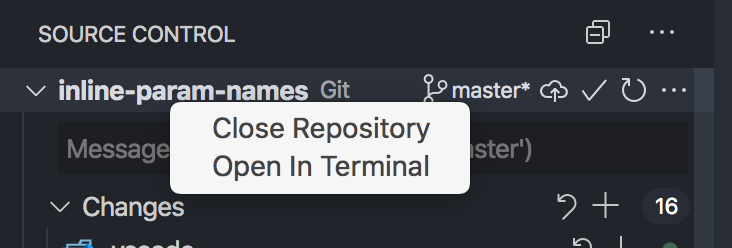
|
@yume-chan I really like your ideas. Having multiple "..." menus solves the problem of the very long Git context menu without us having to wait for submenu support for extensions. Maybe the menu button at (3) should be a "..." rather than an "expand down", for better consistency. As for the surprise "Close Repository" and "Open in Terminal" context menu, maybe replicate them on menu (2). I don't think they could go alongside "collapse all" because they apply to a single repo. |
I want to make it a "button with menu". For example in mail apps usually there is a Reply | ▼ button. Clicking on "Reply" will do one thing, clicking the down arrow will show more operations that relates to the label. But yes I didn't see this pattern in Code.
You are right. The explorer can have "New File" and "New Folder" alongside "Collapse All" is because its item can have focus, can't apply to the scm view. |
@joaomoreno thanks for this, but for auto mode maybe use
rather than the
And I suggest default should be 'auto' so people discover the most sophisticated form of the badge feature at this level in the new UX (first screenshot above). Then if they don't like/want these badges they can find the setting and pick 'hidden'.
And if the white space to the right of the "..." disturbs them they can pick 'visible'.
|

I don't think that's a good idea, since we'd be wasting precious space. Especially if no repository has changes: there would just be an empty column. That is exactly the compromise with |
Maybe make auto smart enough only to use Are you going to keep the default of |
This will make thing jump around in all repositories if one repository changes.
Yes that's the idea. The hypothesis is that most users don't even care. And the power users have the setting. Trying to stay lightweight here. |
|
Can you add option to hide action buttons from provider line? They takes too much space +
And look at #102080 . I think it was a mistake. thank you. |
|
Throwing out a few suggestions here:
|
We can't really do this since if you have many repositories, refreshing them all is a potentially expensive operation.
This can be interesting yes.
Yeah that will be the fix of #102108
Yeah, let me push that already. |
@joaomoreno for bonus points maybe try moving the optional repo-level count badges to the start of the row instead of the end. I think having badges there will help, particularly with |
|
With providerCountBadge set to auto and moved to the left, plus small increases to indents of the tree descendants.
And with the changed repo collapsed:
Without my tweaks:
and collapsed:
|


|
Honestly, I prefer the badge count on the right. Maybe my eyes are trained to search for info on the right side but I find the repo names all properly left aligned to be more pleasing and easier to read |
|
Yes, I'm really not convinced to move the badge to the left, since it would remove the badge alignment. |
|
I still think provider count badges on the left may be helpful to users who are finding it hard to spot where the changed files of one repo end and the title of the next repo starts. Personally I find the duplication of counts aligned on the right a bit unsatisfactory. When a provider section is collapsed I like to know how many changes it contains, but once I expand it and get subhead counts it's those I want to focus on, and the top-level count is distracting. How about offering On a related topic, is there any telemetry on the SCM view that would give data on how many providers users have there? |
|
We've always had badge counts on the right and moving it to the left would make it inconsistent.
|


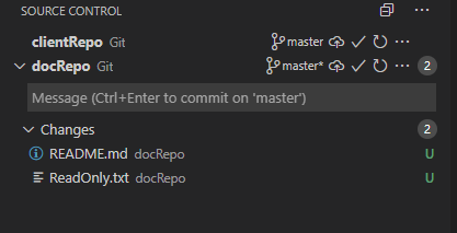
One thing I am not so happy about the new changes UX is that I often think that the other repos are dirty changes I need to review:
I wonder if there is anyway to distinguish changes (= files) more from other repos. Of course this is harder for me where file icons are turned off.
//cc @misolori
The text was updated successfully, but these errors were encountered: