Improve heading spacing on Markdown preview #102036
Assignees

Labels
help wanted
Issues identified as good community contribution opportunities
insiders-released
Patch has been released in VS Code Insiders
markdown
Markdown support issues
verification-needed
Verification of issue is requested
verified
Verification succeeded
Milestone
Comments
|
Yes that is the correct file to change. Try updating the css rules to adjust the heading spacing. You can also quickly prototype changes using your own css in the markdown preview |
This was referenced Jul 10, 2020
mjbvz
pushed a commit
that referenced
this issue
Jul 14, 2020
Charles-Gagnon
pushed a commit
to Charles-Gagnon/vscode
that referenced
this issue
Jul 14, 2020
…oft#102427)

* updating styling to make headings look better

* be consistent and use em
Sign up for free
to subscribe to this conversation on GitHub.
Already have an account?
Sign in.
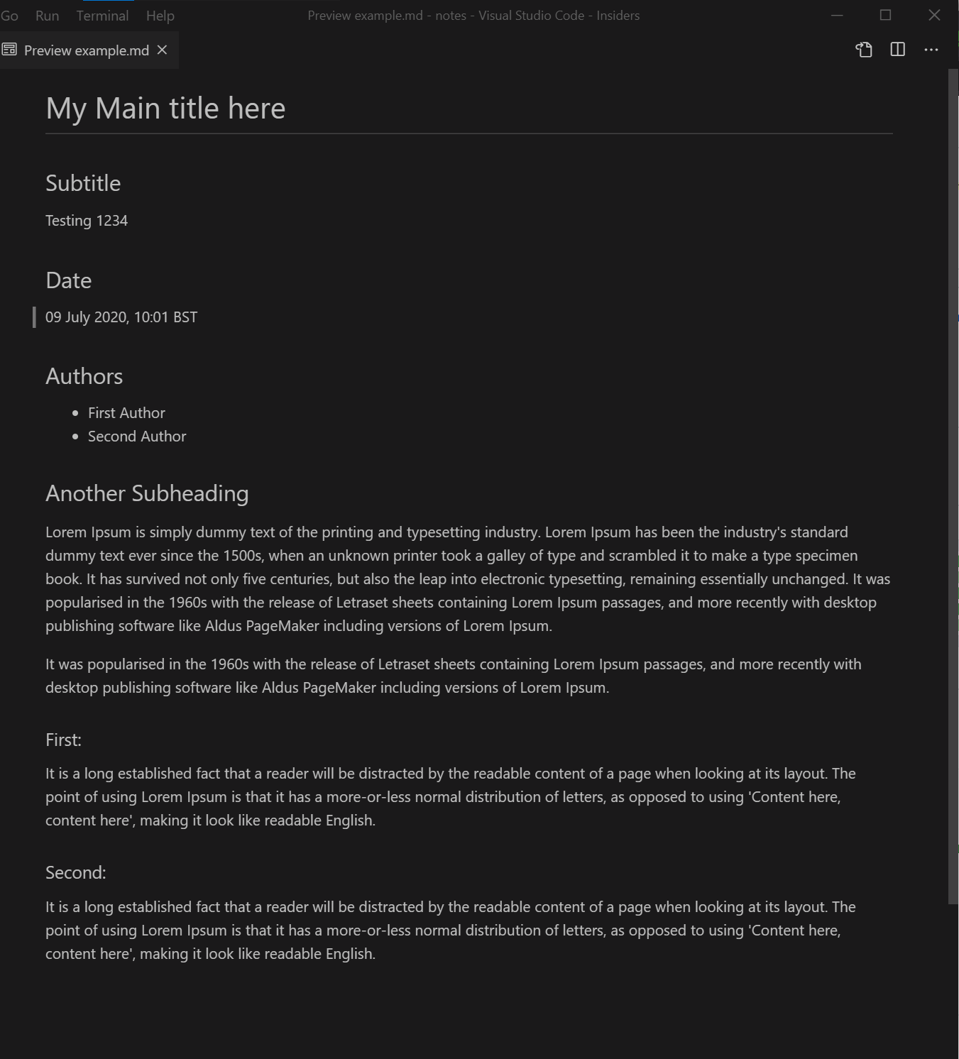
The spacing on markdown preview has headings (h2,h3) in the middle between text, but they should be spaced less with the content underneath so it looks like a section. Right now the spacing looks even with the content below and above.
Here is an example (using grey matter theme):

I've adjusted on photoshop what it should look like:
It's only slight but the bottom one brings the heading down slightly so its more together.
I looked into doing this but i could only find https://github.com/microsoft/vscode/blob/06f85af581281a3f45783329d375ecc7694930b4/extensions/markdown-language-features/media/markdown.css
@mjbvz
The text was updated successfully, but these errors were encountered: