Skip to content
New issue

Have a question about this project? Sign up for a free GitHub account to open an issue and contact its maintainers and the community.

By clicking “Sign up for GitHub”, you agree to our terms of service and privacy statement. We’ll occasionally send you account related emails.

Already on GitHub? Sign in to your account

Notifications UX feedback #91446

Closed
isidorn opened this issue Feb 25, 2020 · 6 comments
Closed

Notifications UX feedback #91446

isidorn opened this issue Feb 25, 2020 · 6 comments
Assignees
Labels
polish Cleanup and polish issue ux User experience issues workbench-notifications Notification widget issues
Milestone

Comments

@isidorn
Copy link
Contributor

isidorn commented Feb 25, 2020

Refs: #91163

There are some things which I dislike about the notifications UX:

  1. Top level hide uses the Escape icon, same as the icon per notification which has a stronger meaning. Suggestion -> we should use a different icon for the top level action
  2. The difference between an unread and a hidden notification is not very clear to me and I think it can be confusing to our users. When do I actually see a badge in the notification bell? Since I do not see it if I just hide all my notificaitons with ESC. Do you treat them as read then?
  3. There should be clearer UX indication that the top level actions are run on everything, Currently that is not the case as they look tied to the top level notification.
@bpasero bpasero added polish Cleanup and polish issue ux User experience issues workbench-notifications Notification widget issues labels Feb 26, 2020
@bpasero
Copy link
Member

bpasero commented Feb 26, 2020

Top level hide uses the Escape icon, same as the icon per notification which has a stronger meaning. Suggestion -> we should use a different icon for the top level action

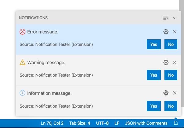
@isidorn to clarify, you mean that the top level X just closes the center while the notification X deletes it. I think one suggestion was to use the arrow down icon from the panel:

image

When do I actually see a badge in the notification bell? Since I do not see it if I just hide all my notificaitons with ESC. Do you treat them as read then?

No, pressing ESC or waiting until the toast is removed does not mark it as read. The reasoning is that ESC can be pressed accidentally without paying attention to notifications and since the hide after timeout, we also do not know if they were read. This is consistent with what Windows does for notifications afaik.

There should be clearer UX indication that the top level actions are run on everything, Currently that is not the case as they look tied to the top level notification.

I think the icon for dismissing all notifications is consistent with other places like search results. I am not sure what you mean with the X icon running on everything, that one simply closes the notification center. Please clarify.

@bpasero bpasero added the info-needed Issue requires more information from poster label Feb 26, 2020
@miguelsolorio
Copy link
Contributor

I’d be in favor of using the down chevron to hide the notification center (pretty sure we’ve discussed this before)

@bpasero bpasero added this to the February 2020 milestone Feb 26, 2020
@bpasero
Copy link
Member

bpasero commented Feb 26, 2020

I can do that change for Feb if we think it is the right way.

@isidorn
Copy link
Contributor Author

isidorn commented Feb 26, 2020

  1. Yes I mean the top level x. Using the chevron makes more sense here, agree
  2. Ok. This makes sense, issue Notification bell with badge and "no notifications" hover #91444 was confusing me
  3. I meant that it is a global action and visually it looks more tied to the top most notification than to the whole notification center. I believe the top level actions need some more ux polish to make them look more global.

@bpasero
Copy link
Member

bpasero commented Feb 26, 2020

Fixed the close icon to show like this:

image

As for making the actions look more global I am open for suggestions. Maybe you can bring it up at the next UX call with ideas if you have any.

@bpasero bpasero removed the info-needed Issue requires more information from poster label Feb 26, 2020
@isidorn
Copy link
Contributor Author

isidorn commented Feb 26, 2020

My idea is to use the border left and right around notification such that they look like they are floating in the Notifications area.
The top bar and this border woul use the same darker background color.

Yeah the chevron works much better.

@github-actions github-actions bot locked and limited conversation to collaborators Apr 11, 2020
Sign up for free to subscribe to this conversation on GitHub. Already have an account? Sign in.
Labels
polish Cleanup and polish issue ux User experience issues workbench-notifications Notification widget issues
Projects
None yet
Development

No branches or pull requests

3 participants