


A modern JavaScript charting library to build interactive charts and visualizations with simple API.

<script src="https://cdn.jsdelivr.net/npm/apexcharts"></script>Integrate easily with 3rd party frameworks
- vue-apexcharts
- react-apexcharts
- [angular-apexcharts] - (not released yet)
import ApexCharts from 'apexcharts'To create a basic bar chart with minimal configuration, write as follows:
var options = {
  chart: {
    type: 'bar'
  },
  series: [{
    name: 'sales',
    data: [30, 40, 35, 50, 49, 60, 70, 91, 125]
  }],
  xaxis: {
    categories: [1991, 1992, 1993, 1994, 1995, 1996, 1997, 1998, 1999]
  }
}

var chart = new ApexCharts(document.querySelector("#chart"), options);
chart.render();
This will render the following chart

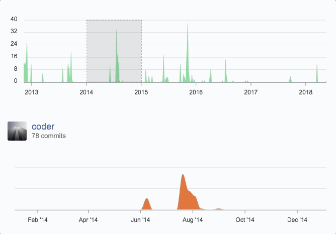
You can create a combination of different charts, sync them and give your desired look with unlimited possibilities. Below is an example of synchronized charts with github style.
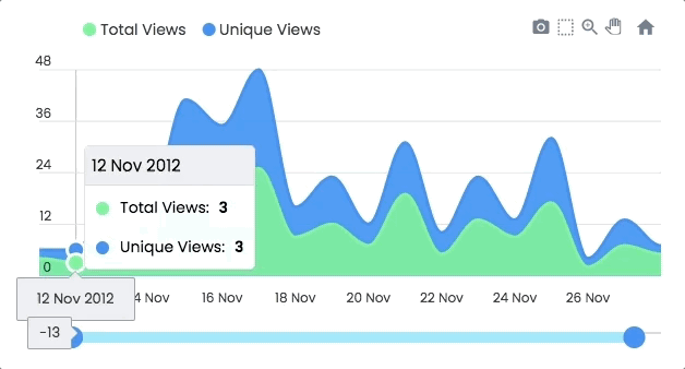
Zoom, Pan, Scroll through data. Make selections and load other charts using those selections. An example showing some interactivity
Another approach to Drill down charts where one selection updates the data of other charts. An example of loading dynamic series into charts is shown below
Annotations allows you to write custom text on specific values or on axes values. Valuable to expand the visual appeal of your chart and make it more informative.

You can combine more than one chart type to create a combo/mixed chart. Possible combinations can be line/area/column together in a single chart. Each chart-type can have it's own y-axis.

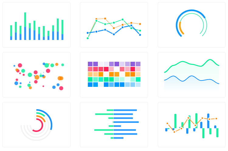
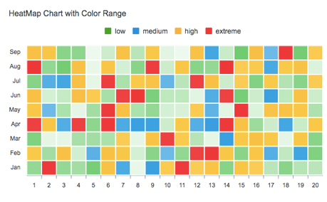
Use Heatmaps to represent data through colors and shades. Frequently used with bigger data collections, they are valuable for recognizing patterns and area of focus.
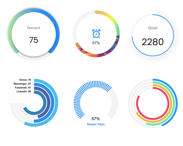
The tiny gauges are an important part of a dashboard and are useful in displaying single series data. A demo of these gauges:
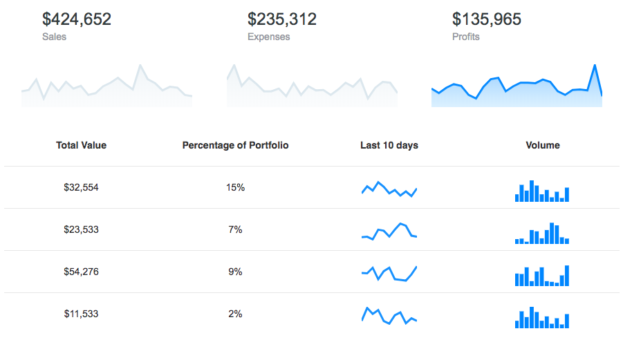
Utilize sparklines to indicate trends in data, for example, occasional increments or declines, monetary cycles, or to feature most extreme and least values:
The download bundle includes the following files and directories providing a minified single file in the dist folder. Every asset including icon/css is bundled in the js itself to avoid loading multiple files.
apexcharts/
├── dist/
│   └── apexcharts.min.js
├── src/
│   ├── assets/
│   ├── charts/
│   ├── modules/
│   ├── utils/
│   └── apexcharts.js
└── samples/
npm install
npm run start
This will start the webpack watch and any changes you make to src folder will auto-compile and output will be produced in the dist folder.
npm run buildHead over to the documentation section to read more about how to use different kinds of charts and explore all options.
Email: info@apexcharts.com
Twitter: @apexcharts
Facebook: fb.com/apexcharts
ApexCharts uses SVG.js for drawing shapes, animations, applying svg filters and a lot more under the hood. The library is bundled in the final build file, so you don't need to include it.
ApexCharts is released under MIT license. You are free to use, modify and distribute this software, as long as the copyright header is left intact.