-
-
- web page authors used elements to group together related elements
- Authors used class or id attributes to indicate the role of the element in the structure of the page.
- web page authors used
-
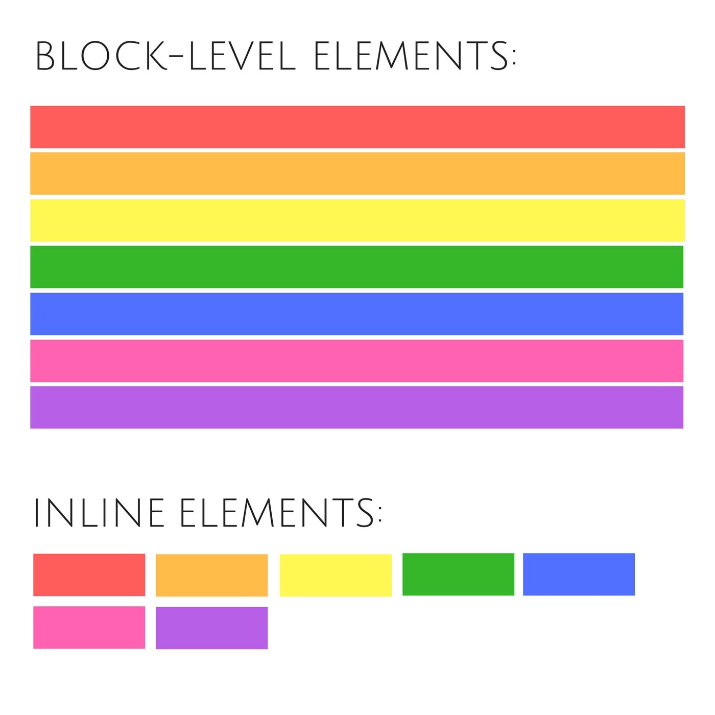
- HTML5 introduces a new set of elements that allow you to divide up the parts of a page. The names of these elements indicate the kind of content you will find in them. They are still subject to change, but that has not stopped many web page authors using them already.
- figre below show html5 layout elements
- The new HTML5 elements indicate the purpose of different parts of a web page and help to describe its structure.
- The new elements provide clearer code (compared with using multiple elements).
- Older browsers that do not understand HTML5 elements need to be told which elements are block-level elements.
- To make HTML5 elements work in Internet Explorer 8 (and older versions of IE), extra JavaScript is needed, which is available free from Google.
-


- CSS treats each HTML element as if it is in its own box. This box will either be a block-level box or an inline box.
-
If one block-level element sits inside another block-level element then the outer box is known as the containing or parent element.
-
-
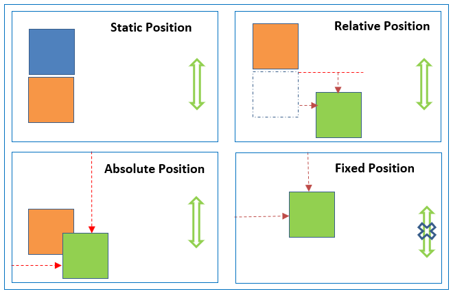
1- Normal flow(static) : Every block-level element appears on a new line, causing each item to appear lower down the page than the previous one.
-
2- Relative Positioning : This moves an element from the position it would be in normal flow, shifting it to the top, right, bottom, or left of where it would have been placed.
-
3- Absolute positioning : This positions the elementin relation to its containing element. It is taken out of normal flow. Absolutely positioned elements move as users scroll up and down the page.
-
4- Fixed Positioning : This is a form of absolute positioning that positions the element in relation to the browser window, as opposed to the containing element.
-
-
- it is properties to tell the browser how far from the top or bottom and left or right it should be placed.
-
- 1- Floating Elements : Floating an element allows you to take that element out of normal flow and position it to the far left or right of a containing box.
- The clear property allows you to say that no element (within the same containing element) should touch the left or righthand sides of a box.
- 2- Overlaping Elements When you use relative, fixed, or absolute positioning, boxes can overlap. If boxes do overlap, the elements that appear later in the HTML code sit on top of those that are earlier in the page. If you want to control which element sits on top, you can use the z-index property. Its value is a number, and the higher the number the closer that element is to the front.
- 1- Floating Elements : Floating an element allows you to take that element out of normal flow and position it to the far left or right of a containing box.
-
- Different visitors to your site will have different sized screens that show different amounts of information, so your design needs to be able to work on a range of different sized screens.
-
- Resolution refers to the number of dots a screen shows per inch. Some devices have a higher resolution than desktop computers and most operating systems allow users to adjust the resolution of their screens.
-
- Because screen sizes and display resolutions vary so much, web designers often try to create pages of around 960-1000 pixels wide (since most users will be able to see designs this wide on their screens).
-
- Fixed width layout designs do not change size as the user increases or decreases the size of their browser window. Measurements tend to be given in pixels.
-
- Liquid layout designs stretch and contract as the user increases or decreases the size of their browser window. They tend to use percentages.
- Liquid layout designs stretch and contract as the user increases or decreases the size of their browser window. They tend to use percentages.