[SelectField][material-next] Introduce new component #21782
Comments
 pqr
added
the
status: waiting for maintainer
pqr
added
the
status: waiting for maintainer
|
That looks fine to me. It's more of an issue with how overloaded the Tree-shaking is working or otherwise you'd see a lot more components. You can verify this by just importing the |
 eps1lon
added
discussion
performance
and removed
status: waiting for maintainer
eps1lon
added
discussion
performance
and removed
status: waiting for maintainer
@eps1lon While we have been discussing (or even agreed) on moving the select use case outside of the TextField, with a new SelectField component. I'm not aware we have a dedicated issue for. What about we use this one for the purpose? It seems to match perfectly (the difference is that the author didn't realize the whole dependency chain of TextField that is quite large) If we do so, we can reopen until fixed :). |
 oliviertassinari
added
the
component: text field
oliviertassinari
added
the
component: text field
|
This issue is about tree-shaking. Why is it so important to re-purpose that? What is that solving that a new issue can't? |
|
@pqr wants his app to only include the code he needs. In his bundle size analysis
he noticed a lot of components with no clear relation to displaying an input. He went on assuming that it's because tree shaking is broken. Wrong. So from what I understand, we are covering the same root pain point with the SelectField component proposal. It's only the interpretation of the origin of the pain from the author that is wrong, the underlying issue is still present: text field shouldn't bundle select. The proposed solution is: -<TextField select />
+<SelectField /> |
 oliviertassinari
added
component: select
oliviertassinari
changed the title
oliviertassinari
added
new feature
oliviertassinari
added
component: select
oliviertassinari
changed the title
oliviertassinari
added
new feature
|
Our team was also really caught off guard by this. We noticed the bundle sizes for our form pages were really bloated despite us only using text fields and buttons from material-ui. Spent ages trying to track down where the bundler was getting confused and importing Selects and Modals, only to find that TextField includes Select, Modal, and their many dependencies by default. For any other devs stumbling across this issue, here's a bandaid solution that you can use to greatly reduce the size of TextFields while material-ui works on an official fix. This custom component simply follows the structure of material-ui's TextField component but removes any references to Select and requires that the variant component is provided as a prop (This way, only the variant type you use will be included in your bundle, rather than all 3 standard, outlined, and filled variant components being included by default): ComposableTextField.tsx import React from "react";
import { InputProps } from "@material-ui/core/Input";
import { TextFieldProps } from "@material-ui/core/TextField";
import FormControl from "@material-ui/core/FormControl";
import InputLabel from "@material-ui/core/InputLabel";
import FormHelperText from "@material-ui/core/FormHelperText";
interface ComposableTextFieldProps
extends Omit<TextFieldProps, "select" | "SelectProps" | "children"> {
InputComponent: React.ComponentType<InputProps>;
}
const ComposableTextField = React.forwardRef(
(props: ComposableTextFieldProps, ref: React.Ref<HTMLDivElement>): JSX.Element => {
const { InputComponent, ...textFieldProps } = props;
const {
autoComplete,
autoFocus = false,
className,
color = "primary",
defaultValue,
disabled = false,
error = false,
FormHelperTextProps,
fullWidth = false,
helperText,
id,
InputLabelProps,
inputProps,
InputProps,
inputRef,
label,
maxRows,
minRows,
multiline = false,
name,
onBlur,
onChange,
onFocus,
placeholder,
required = false,
rows,
type,
value,
variant = "outlined",
...other
} = textFieldProps;
if (!InputComponent) {
return null;
}
const InputMore: Record<string, unknown> = {};
if (variant === "outlined") {
if (InputLabelProps && typeof InputLabelProps.shrink !== "undefined") {
InputMore.notched = InputLabelProps.shrink;
}
if (label) {
const displayRequired = InputLabelProps?.required ?? required;
InputMore.label = (
<>
{label}
{displayRequired && "\u00a0*"}
</>
);
}
}
const helperTextId = helperText && id ? `${id}-helper-text` : undefined;
const inputLabelId = label && id ? `${id}-label` : undefined;
return (
<FormControl
className={["MuiTextField-root", className].filter(Boolean).join(" ")}
disabled={disabled}
error={error}
fullWidth={fullWidth}
ref={ref}
required={required}
color={color}
variant={variant}
{...other}
>
{label && (
<InputLabel htmlFor={id} id={inputLabelId} {...InputLabelProps}>
{label}
</InputLabel>
)}
<InputComponent
aria-describedby={helperTextId}
autoComplete={autoComplete}
autoFocus={autoFocus}
defaultValue={defaultValue}
fullWidth={fullWidth}
multiline={multiline}
name={name}
rows={rows}
maxRows={maxRows}
minRows={minRows}
type={type}
value={value}
id={id}
inputRef={inputRef}
onBlur={onBlur}
onChange={onChange}
onFocus={onFocus}
placeholder={placeholder}
inputProps={inputProps}
{...InputMore}
{...InputProps}
/>
{helperText && (
<FormHelperText id={helperTextId} {...FormHelperTextProps}>
{helperText}
</FormHelperText>
)}
</FormControl>
);
}
);
export default ComposableTextField;Simply replace any references to TextField with this ComposableTextField component instead. And make sure to pass in the InputComponent variant you'd like to use: Replace this: <TextField label="Outlined" variant="outlined" />With this: <ComposableTextField label="Outlined" variant="outlined" InputComponent={OutlinedInput} />As a side note, the material-ui Text Fields documentation does mention that you can use the lower level components to better customize your TextFields, but perhaps it would also be worth mentioning that you can use these lower level components to reduce your bundle size in the Minimizing Your Bundle Size documentation. |
 mj12albert
added
v6.x
and removed
package: lab
mj12albert
added
v6.x
and removed
package: lab
|
Added this to the v6 milestone, most of the heavy lifting seems done in #38374 and #38972 which are already in progress CC @DiegoAndai |
mj12albert
changed the title
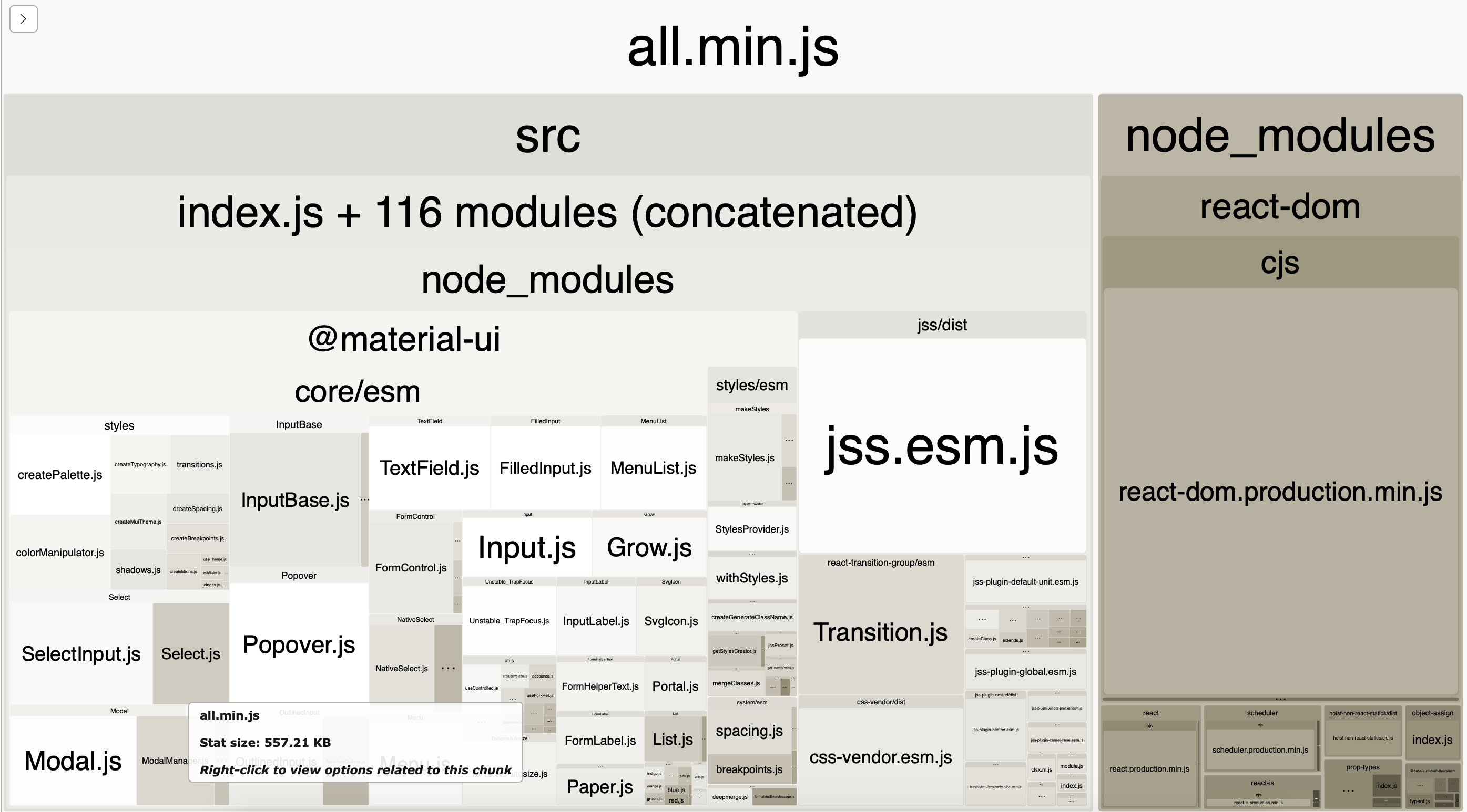
Minimum example of React Material-UI with the only TextField component imported - result bundle size is 250Kb!
https://github.com/pqr/react-mui-treeshake-does-not-work
webpack-bundle-analyzer shows everything is imported, nothing is tree shaked.
According to documentation https://material-ui.com/guides/minimizing-bundle-size/ tree-shaking should work, quote:
But as shown in this minimum example it does not work out of the box.
I did several experiments, read through issues and StackOverflow and failed to find a solution.
Current Behavior 😯
Bundle size of minimum app with the only TextField imported is about 250Kb, everything is included into bundle (analized with webpack-bundle-analyzer
Expected Behavior 🤔
Bundle should not contain any code not related to the only imported TextField, tree shake to be working
Steps to Reproduce 🕹
Your Environment 🌎
The text was updated successfully, but these errors were encountered: