Skip to content
New issue

Have a question about this project? Sign up for a free GitHub account to open an issue and contact its maintainers and the community.

By clicking “Sign up for GitHub”, you agree to our terms of service and privacy statement. We’ll occasionally send you account related emails.

Already on GitHub? Sign in to your account

Support for indeterminate checkboxes #4828

Closed
tgoldenberg opened this issue Jul 25, 2016 · 24 comments
Closed

Support for indeterminate checkboxes #4828

tgoldenberg opened this issue Jul 25, 2016 · 24 comments
Labels
component: checkbox This is the name of the generic UI component, not the React module! good first issue Great for first contributions. Enable to learn the contribution process. new feature New feature or request

Comments

@tgoldenberg
Copy link

Description

It would be great to be able to set indeterminate={true} on the <Checkbox/> components. Any suggestions for this, or is there a plan to include this?

Thank you!

Images & references

-->

@oliviertassinari
Copy link
Member

@tgoldenberg I'm not sure to understand. What's the use case?

@nathanmarks
Copy link
Member

@tgoldenberg

You can target it with css using the :indeterminate selector: https://developer.mozilla.org/en-US/docs/Web/CSS/:indeterminate

@nathanmarks
Copy link
Member

nathanmarks commented Jul 25, 2016

And you should be able to access the DOM element with refs (edit - via our component) to set the property.

@nathanmarks
Copy link
Member

@tgoldenberg
Copy link
Author

yeah, I tried using refs via this.checkbox.refs.enhancedToggle.refs... but haven't gotten it to work yet. I'll try to post an example if I get it working.

@nathanmarks
Copy link
Member

@tgoldenberg What happens? does the DOM property reset after you change it?

@tgoldenberg
Copy link
Author

@nathanmarks Nothing happens. Nothing.

screen shot 2016-07-26 at 2 25 00 pm
screen shot 2016-07-26 at 2 25 07 pm

@nathanmarks
Copy link
Member

@tgoldenberg Did you add any :indeterminate styling? It's a visual only property. It looks like it's being set to true from your console.log output there.

@nathanmarks
Copy link
Member

nathanmarks commented Jul 26, 2016

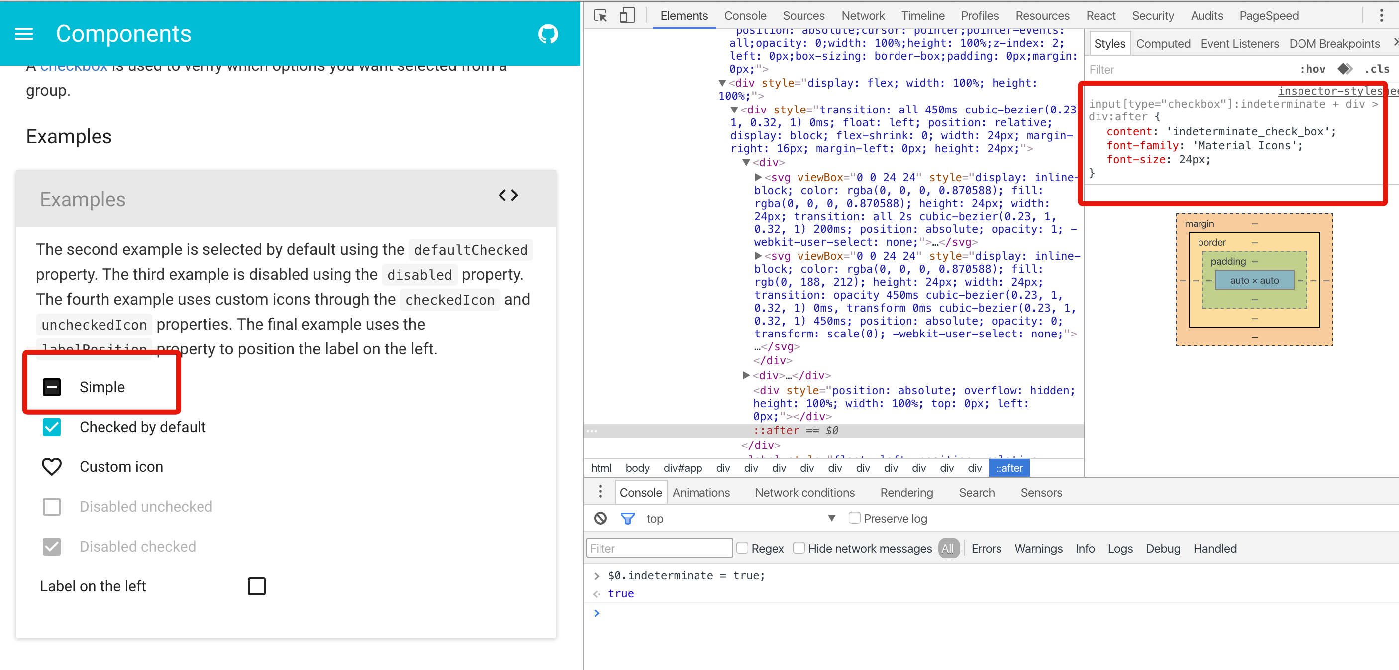
@tgoldenberg Just having a play with it now. I see the difficulty you're having here even with the property set. All I have right now with the current setup is something slightly hacky:

input[type="checkbox"]:indeterminate + div > div:after {
  content: 'indeterminate_check_box';
  font-family: 'Material Icons';
  font-size: 24px;
}

image

@nathanmarks
Copy link
Member

I'll look into supporting this better in the next branch.

@nathanmarks nathanmarks added this to the 0.16.0 Release milestone Jul 26, 2016
@nathanmarks nathanmarks self-assigned this Jul 26, 2016
@oliviertassinari oliviertassinari added the component: checkbox This is the name of the generic UI component, not the React module! label Dec 18, 2016
@Alxandr
Copy link

Alxandr commented Apr 27, 2017

Just my 2 cents. One way to support this (that I would prefer) is to allow checked to be either true, false or 'indeterminate' (or explicitly null - not undefined). Instead of adding a new attribute. A check box is a system with 3 states, the input should reflect this IMHO.

@oliviertassinari
Copy link
Member

oliviertassinari commented Apr 28, 2017

@Alxandr I like the idea of keeping everything under one property as put a hard constraint. The state can't be 'indeterminate' and true or false at the same time => simplicity.

@Alxandr
Copy link

Alxandr commented Apr 29, 2017

Yeah. I seem to recall (from WPF in .NET or something similar) that checkboxes checked state was typed as a bool? (that is, either true, false or null). That made a lot of sense to me. Problem in javascript thought is that since it's untyped, using null has a tendency to be equated to undefined and false. But still, I think this makes sense:

const Test = () => (
  <div>
    <Checkbox /> // unchecked
    <Checkbox checked />  // checked
    <Checkbox checked={null} /> // indeterminate
  </div>
);

I think this is sufficiently explicit, though on the other hand it might be safer to do 'indeterminate'. But I still think it's better than adding a new prop nontheless.

@mbrookes mbrookes added next new feature New feature or request labels Apr 29, 2017
@oliviertassinari oliviertassinari added the good first issue Great for first contributions. Enable to learn the contribution process. label May 29, 2017
@gulderov
Copy link
Contributor

gulderov commented Jun 9, 2017

There is some trouble with null. If you initially pass null to component. It will be "uncontrolled". Once you play with component it will bring to "controlled".

SwitchBase is changing a controlled input of type checkbox to be uncontrolled. Input elements should not switch from controlled to uncontrolled (or vice versa). Decide between using a controlled or uncontrolled input element for the lifetime of the component. More info: https://fb.me/react-controlled-components.

React itself does not support indeterminate checkboxes facebook/react#1798.

https://www.w3.org/TR/2014/WD-html51-20140617/forms.html#checkbox-state-(type=checkbox) says:

The control is never a true tri-state control, even if the element's indeterminate IDL attribute is set to true. The indeterminate IDL attribute only gives the appearance of a third state.

It can be better to set separate prop for it.

@oliviertassinari
Copy link
Member

oliviertassinari commented Jun 9, 2017

It can be better to set separate prop for it.

@gulderov Yes, I agree. After benchmarking what other libraries are doing, I believe that blueprintjs is handling the problem very well. I would be awesome if we could do the same.

indeterminate boolean
Whether this checkbox is indeterminate, or "partially checked." The checkbox will appear with a small dash instead of a tick to indicate that the value is not exactly true or false.

@Alxandr
Copy link

Alxandr commented Jun 9, 2017

@gulderov There is no reason material-ui can't create a better abstraction on top of the one provided by React itself though. And sure, null might be problematic (didn't think about controlled vs uncontrolled), but a tri-state could be implemented as something like this (without any stying etc, ofcause):

const Checkbox = ({ checked }) => {
  const checkedState = checked === null
    ? null
    : checked === 'indeterminate' : true ? false;
  const indeterminate = checked === 'indeterminate';
  return <checkbox checked={checkedState} indeterminate={indeterminate} />
}

@oliviertassinari
Copy link
Member

oliviertassinari commented Jun 9, 2017

@Alxandr Don't we lose an extra information? Isn't the point to notify that the value is mostly true of false but not completely? Let's say it's used in a regular Form, what's the value sent to the server?

@Alxandr
Copy link

Alxandr commented Jun 9, 2017

Lose information? We lose no information.

A checkbox can be in one of 4 states technically:

  • checked
  • unchecked
  • checked - indeterminate
  • unchecked - indeterminate

If you change it to use only one prop, the only one you can't describe is unckeced - indeterminate, so then the question is does that make sense? I don't think it makes sense, hence I don't think we lose any information.

@oliviertassinari oliviertassinari removed this from the v1.0.0-prerelease milestone Jul 4, 2017
@Parthchokshi
Copy link

An indeterminate checkbox should have different styling I feel. I like how primeng does it.
https://www.primefaces.org/primeng/#/tristatecheckbox

@oliviertassinari
Copy link
Member

@Parthchokshi The styling is different:
capture d ecran 2018-04-26 a 21 42 41

@Parthchokshi
Copy link

Parthchokshi commented Apr 26, 2018

I meant, we don't have a tristate checkbox, it just toggles the color when I click on that. We can have it change icon when user click on it. The initial indeterminate state should be blank. And then yes/no should be tick/cross icons.

This should be really useful in RSVP UI's, where user can say:

  • coming
  • not coming
  • haven't said anything yet.

May be a new component all by itself or extend Checkbox.

@veronicaerick
Copy link

veronicaerick commented Jul 25, 2019

Is there an update on how to create an unchecked indeterminate state that's blank rather than with a grey/secondary color in the background of the checkbox? I've tried pulling in different checkbox icons from MUIs selection (i.e. IndeterminateCheckBoxOutlined.js ) and added styles with the classes object to achieve what I want... but haven't had any luck going from unchecked indeterminate as an empty checkbox, to checked indeterminate using the default IndeterminateCheckBox icon/style

unchecked indeterminate
Screen Shot 2019-07-24 at 5 00 57 PM

checked indeterminate
Screen Shot 2019-07-24 at 5 00 15 PM

@oliviertassinari
Copy link
Member

oliviertassinari commented Jul 25, 2019

@veronicaerick Please submit questions like this on StackOverflow next time. People answers on GitHub don't compound as much. I would try something like this:

import React from 'react';
import Checkbox from '@material-ui/core/Checkbox';
import CheckBoxOutlineBlank from '@material-ui/icons/CheckBoxOutlineBlank';

export default function Checkboxes() {
  const [state, setState] = React.useState({
    checkedF: true,
  });

  const handleChange = (name: string) => (event: React.ChangeEvent<HTMLInputElement>) => {
    setState({ ...state, [name]: event.target.checked });
  };

  return (
    <Checkbox
      checked={state.checkedF}
      indeterminateIcon={state.checkedF ? undefined : <CheckBoxOutlineBlank />}
      onChange={handleChange('checkedF')}
      value="checkedF"
      indeterminate
      inputProps={{
        'aria-label': 'indeterminate checkbox',
      }}
    />
  );
}

https://codesandbox.io/s/material-demo-t8w8r

@veronicaerick
Copy link

will do, thank you so much for the response this works perfectly! 👍

Sign up for free to join this conversation on GitHub. Already have an account? Sign in to comment
Labels
component: checkbox This is the name of the generic UI component, not the React module! good first issue Great for first contributions. Enable to learn the contribution process. new feature New feature or request
Projects
None yet
Development

No branches or pull requests

8 participants