[system] styled should accept sx syntax
#28678
Comments
 eric-burel
added
the
status: waiting for maintainer
eric-burel
added
the
status: waiting for maintainer
 siriwatknp
added
package: system
siriwatknp
added
package: system
|
@mnajdova I also have the same feeling here (after using a lot of I think it seems possible to accept |
siriwatknp
changed the title
styled should accept sx syntax
|
Thanks for the feedback. The downside I see with supporting this API, is that we are no longer compatible with other frameworks' On the other hand, the I would propose we wait and see how this resonates with the community. I would be happy to change how |
|
Yeah I understand, I was indeed wondering whether "margin: 1" would add 1px, or spacing(1). It could indeed require a new API, for instance, exporting an // sx would be a thin wrapper converting the input and calling `styled` under the hood
const WrapperPaper = sx(Paper)({
margin: 1; // behaves as sx prop, so 1 => theme.spacing(1) (and not 1px)
})Edit: also there might be smth wrong in the typings, because I may try to send a PR to the documentation. Another slightly related question: it's not documented how you pass props to styled("div")({
backgroundColor: props => props.myColorProps
})While makeStyles((theme, props) => ({
backgroundColor: props.myColorProps
})and Material UI makeStyles({
backgroundColor: props => props.myColorProps
})and finally, sx={{
backgroundColor: props.myColorProps
}}That's a source of confusion when migrating :) we broke one of our component due to this. It would be worth documenting as well imo, I could take the occasion to PR that as well. |
|
@eric-burel thanks for the feedback. Would be great if you can propose a PR with the pain points you had, it would help a lot 🙏 We can discuss the details on the PR. |
|
An // hoc with syntax similar to styled but accepting sx styles
const sx = (C) => (sxStyle) => (props) => {
return <C sx={typeof sxStyle === "function" ? sxStyle(props) : sxStyle} {...props} />
}
// usage
const StyledFooBasic= sx(Foo)({ mx: 1, backgroundColor: "red", padding: theme => theme.spacing(1) })
)
const StyledFooWithProps = sx(Foo)(
props => ({ mx: 1, backgroundColor: props.myCustomColor, padding: theme => theme.spacing(1) })
) That's very draftish and lacks typings, but I think this could be done already in user-land. I haven't yet switched my main project to mui v5 but I might give this a shot later on. |
|
Note also that the |
|
I came back to this again after reading a post yesterday about how developers really like the import * as React from "react";
import {
unstable_styleFunctionSx as styleFunctionSx,
SxProps
} from "@mui/system";
import { styled, Theme, CSSObject } from "@mui/material/styles";
const sx = (styles: SxProps<Theme>, theme: Theme) => {
return styleFunctionSx({ sx: styles, theme }) as CSSObject;
};
const Button = styled("button")(({ theme }) =>
sx(
{
bgcolor: "primary.dark",
color: "common.white",
borderRadius: 1,
border: "none",
p: 1
},
theme
)
);
export default function App() {
return <Button>Isn't this awesome?</Button>;
}Another option would be to export a util Note: This works only with CSS object syntax. cc @siriwatknp @oliviertassinari what are your thoughts? |
|
@mnajdova Regarding the API, I can think of 2 options:
// I believe that this is the function we export, right?
const sx = (styles: SxProps<Theme>) => ({ theme: Theme }) => {
  return styleFunctionSx({ sx: styles, theme }) as CSSObject;
};

// This is how developer use the function.
const Button = styled("button")(
  sx({
    bgcolor: "primary.dark",
    color: "common.white",
    borderRadius: 1,
    border: "none",
    p: 1
  })
);
I don't have to get the theme and pass it to the Also, what I suggest should work with all of these scenarios: const Button = styled("button")(
sx({
bgcolor: "primary.dark",
color: "common.white",
borderRadius: 1,
border: "none",
p: 1
})
);
const Button = styled("button")(
sx(({ theme }) => ({
bgcolor: "primary.dark",
color: "common.white",
borderRadius: 1,
border: "none",
p: 1
}))
);
const Button = styled("button")(
({ theme }) => sx({
bgcolor: "primary.dark",
color: "common.white",
borderRadius: 1,
border: "none",
p: 1
}) // emotion & styled-components support function inside a function, so this is safe.
);
import { styled } from '@mui/material/styles';

const Button = styled('button')(({ sx }) => (
  sx({
    bgcolor: "primary.dark",
    color: "common.white",
    borderRadius: 1,
    border: "none",
    p: 1
  })
))
Is the second option possible? |
Will need to check to see how this could work.
I would try to keep the API to minimum, I would say the first and last APIs are enough.
Yes, but there would be the conflict between the |
|
One other advantage of exporting the |
Summary 💡
styledandsxshould accept the same set of props.Examples 🌈
The
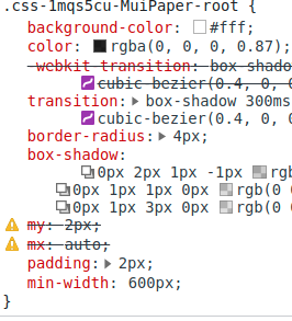
WrapperPapercomponent doesn't seem to apply the shortcutsTypeScript accepts those
mxandmyprops though in thestyledcall, they are simply not translated afterward. Thesxversion works fine, but leads to code duplication in my use case.Motivation 🔦
I'd expect both to have the same API.
The text was updated successfully, but these errors were encountered: