[feat]: Default sort order for chart labels isn't the most useful #579
Comments
|
@shyamvalsan this doesn't seem like a bug, but more like a feature request. |
|
@hugovalente-pm yeah sure - no worries. I put it here, because it didn't seem like feature level effort, but it is really an enhancement. I wonder if the reason we didn't do it this way was that with alphabetic order the labels will remain largely static while if you put it based on numeric sort order then it will be a lot more dynamic. Not sure if that's really a problem or not. |
since bugs is such an important KPI and we are doing a big effort to having it controlled, let's not inflate it just to try to cut the queue for deliver 😅 we should discuss those features we consider quick-wins in other way
Not really sure, but it is true that if you are in a section where dimensions are the same across all the charts having they sorted in some other way than alphabetical order they could be very different across charts. if we are considering the potential focus on troubleshooting use-case I would say that doesn't seem an issue - you want to see first where potential issues are |
|
@hugovalente-pm can we bring this one up for discussion - still think its a quick win and that it will be very useful for users. As a user I want to know which process is consuming the most CPU/Memory/Disk/etc by just looking at the chart and without having to hover or click anything. |
|
I guess it will depend on how we want to do it, if we want the default sorting to be sent by the collectors, which is what makes more sense, don't think it is such a quick-win we could give it a go to start the discussion of this async. @amalkov @ilyam8 @novykh @papazach @ralphm @sashwathn what is your opinion on this one? |
|
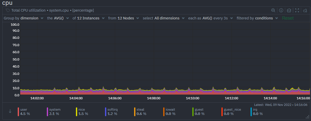
@hugovalente-pm My point about the quick win was this. There are a lot of charts where the dimension values are percentage values. For example the very first chart we see in Netdata
Sorting these dimensions in alphabetic order makes little sense to me. For percentage values, I would much rather we defaulted to sorting by Max-Min descending order - for all charts of this type.
IMO it should be the same for charts with numeric dimensions as well - everything else could remain with the current defaults for now. |

|
First, you can change the sorting from the button on the bottom left. The issue with auto-sorting will be the constant changing of the position of the legend items. But, I would love to hear, why sorting will make difference, since you can hover on timestamps and see the sorted dimensions in the popover - which makes sense since you are focused at that point. |
For percentage values yes could be a rule and simpler than based on contexts, etc. but still a rule to be kept on Cloud
Having this for all numeric dimensions not sure it is a good rule, one example that I see that I don't think fits here is Networks related charts where we have dimensions with numeric negative values (and I think there are a couple of more)
@novykh the only advantage I would see here is if you want to quickly filter for specific dimensions that have higher values which is different than just trying to spot the main offenders. |
|
Yes, hover and tooltip do exist and are useful. Just that it takes an extra bit of effort from users before they get value out :) Especially in the apps plugin charts where there's so many dims, the legend needs to scroll. |
|
this is available on context.js settings now |
Bug description
Chart labels are sorted alphabetically by default - in many cases such as Application CPU charts - there are likely dozens of entries and sorting alphabetically means we show entries of little relevance.
Expected behavior
In select scenarios such as the one above, sorting in descending order is more useful. Sorting from max-min in the above chart would give us the below which immediately tells us that nosql and sql are the main consumers of CPU.
Steps to reproduce
Screenshots
See above
Error Logs
N/A
Desktop
N/A
Additional context
No response
The text was updated successfully, but these errors were encountered: