Unable to Change "using" from "sum of ABS" #778
Comments
|
@donCarlosOne sorry for taking so long to pick this one up, somehow got lost.
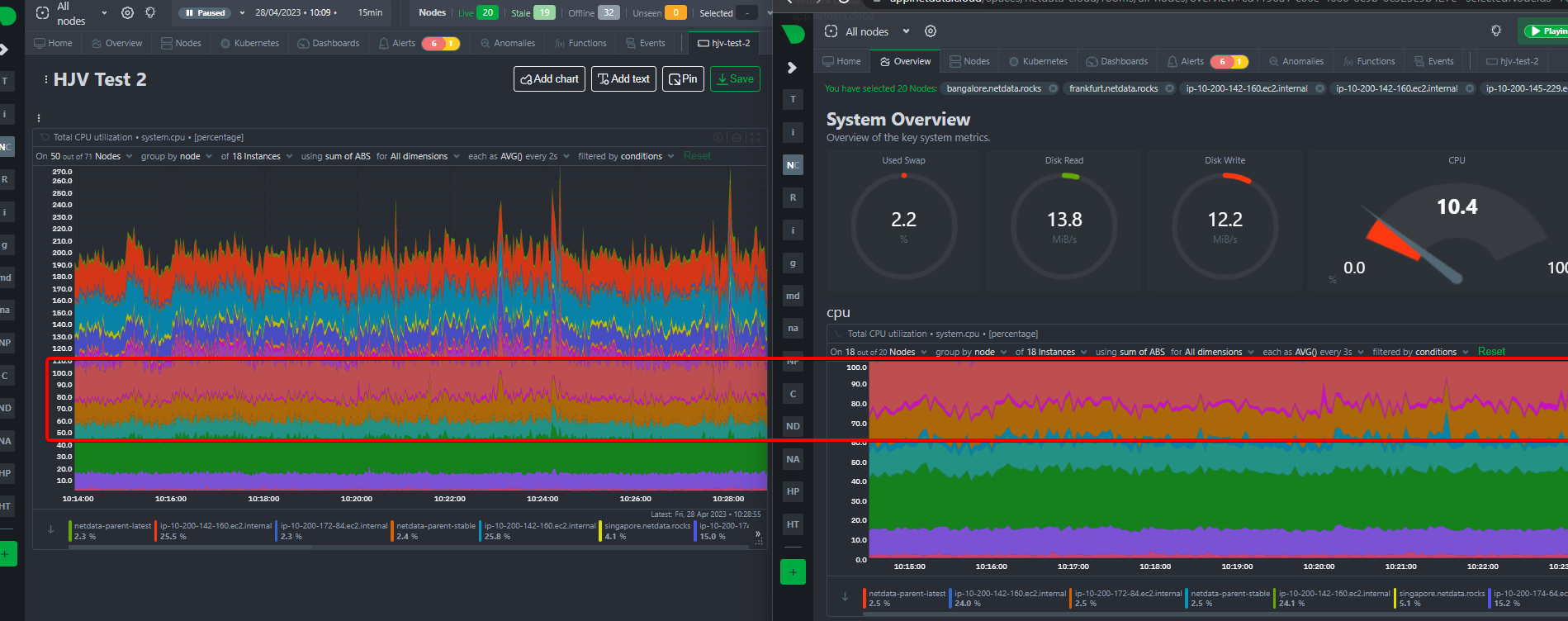
The fact is that on the Overview we have the CPU chart y-axis with a fixed limit to 100% and this limit isn't being applied on the custom dashboards. I tried to show this in a very rough way to compare If you sum the individual percentages of each node you will see that you get more than the 100% total This chart shows more than 100% because it is a stacked chart so if you change it to a line chart, for example, you get the proper individual node CPU value series without them being "stacked".
This is true and we are planning to solve this, there is already a feature request tracking this need #789
@ktsaou @novykh this hard limit on CPU charts as 100% shouldn't be restricted on the Overview screen if the data displayed there is above that. |


|
actually my last question is covered on this one #774 |
Bug description
I've created a custom dashboard to monitor CPU (and other metrics) from 4 different servers. When I change the grouping from dimension to node (or instance), the chart displays an aggregate sum of the 4 servers (400% rather than 100% as the max value) whereas the Overview page displays this correctly with 100% as the max value.
Expected behavior
It should display the same values in both the dashboard and the overview.
Steps to reproduce
Screenshots
Overview screen chart displaying correctly
Dashboard chart after changing group by to node:
Error Logs
No response
Desktop
OS: MacOS 13.2.1
Browser Edge
Browser Version latest
Additional context
It's not useful to see the aggregate sum of the 4 servers' CPUs, rather it is more important to see individual CPU values that I can in the Overview screen - and then It seems the only way to see the individual CPUs at a glance is to save a custom dashboard. Having to change the grouping from dimension to node every time the Overview screen is loaded (for EVERY metric on the screen) is extremely tedious. While the workaround to create a dashboard is useful, even that itself is tedious as each metric must be manually added to the dashboard - end then doesn't display the equivalent of the Overview screen anyway.
The text was updated successfully, but these errors were encountered: