Add custom class to Tabs - ngbTabTitleClass #1436
Comments
|
@PrimalZed could you please elaborate on your exact requirement? If you want to style the I'm not fan of adding customization capabilities like this one since:
Did you try already alternative methods I've mentioned? What is the exact requirement? Could you please start a plunker going so we can play with it and see how far we can get with the existing APIs / impl? If we are truly blocked we can add this class binding or alternative APIs. But we are not taking APIs lightly so I want to make sure that we are making the best decissions here. |
|
This looks doable currently: http://plnkr.co/edit/eiKPjKW0jTbbgFAH75SC?p=preview Maybe this could use a doc update with an example of custom styling here. Let us know if this doesn't meet your requirements for a particular reason. |
|
@pkozlowski-opensource @wesleycho I need to conditionally set styling on the tab button, not just the text. A background color, and maybe a border. If I could do a parent selector or "has child" type selector in CSS, I'd just do that. You can see the difference below.
I could add a component to call from the title template that takes an |

|
So in other words, you want to be able to use it like this, where the component instance used is the parent component: http://plnkr.co/edit/kIUpoUQXAKIe1TeLvTWY?p=preview |
|
I'm not quite sure what you're asking. I want to be able to conditionally add classes to the As I demonstrated, adding a class to the content of the The implementation in my pull request makes use of |
|
My suggestion is even more powerful - it would allow access to all properties/functions on your component instance and not limit usage to one specific directive. The goal is to make the library as extensible as possible, as we would like to avoid creating one-off configuration support when we can do better for users. |
|
So you're suggesting a way for developers to add any attribute to it? I'm not good enough with Angular to know what that implementation would look like. |
|
There is a way to do this actually, if you look at the ngb-tab object once it is created, the default ID is determined via it's index. using this you can either style it by using that generated ID, or set your own ID using the [id] property of ngbTab. |
|
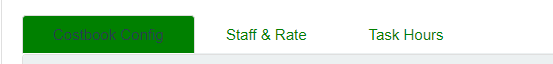
more info, and I have this SCSS created to show how I create the image below:
|

|
@Adondriel I know this is old but do you mind elaborating a bit on how you got this working? How did you set the id property of the ngbTab? Did you use component or global styling? Thanks! |
|
Similar to one of the examples, pasted here for your convenience: <ngb-tabset #t="ngbTabset">
<ngb-tab id="configTab" title="Simple">
<ng-template ngbTabContent>
<p>Raw denim you probably haven't heard of them jean shorts Austin. Nesciunt tofu stumptown aliqua, retro synth
master cleanse. Mustache cliche tempor, williamsburg carles vegan helvetica. Reprehenderit butcher retro keffiyeh
dreamcatcher synth. Cosby sweater eu banh mi, qui irure terry richardson ex squid. Aliquip placeat salvia cillum
iphone. Seitan aliquip quis cardigan american apparel, butcher voluptate nisi qui.</p>
</ng-template>
</ngb-tab>
<ngb-tab id="tab-selectbyid2">
<ng-template ngbTabTitle><b>Fancy</b> title</ng-template>
<ng-template ngbTabContent>Food truck fixie locavore, accusamus mcsweeney's marfa nulla single-origin coffee squid.
<p>Exercitation +1 labore velit, blog sartorial PBR leggings next level wes anderson artisan four loko farm-to-table
craft beer twee. Qui photo booth letterpress, commodo enim craft beer mlkshk aliquip jean shorts ullamco ad vinyl
cillum PBR. Homo nostrud organic, assumenda labore aesthetic magna delectus mollit. Keytar helvetica VHS salvia
yr, vero magna velit sapiente labore stumptown. Vegan fanny pack odio cillum wes anderson 8-bit, sustainable jean
shorts beard ut DIY ethical culpa terry richardson biodiesel. Art party scenester stumptown, tumblr butcher vero
sint qui sapiente accusamus tattooed echo park.</p>
</ng-template>
</ngb-tab>
</ngb-tabset>
<p>
<button class="btn btn-outline-primary" (click)="t.select('tab-selectbyid2')">Selected tab with "tab-selectbyid2" id</button>
</p>using the "id" property on the ngb-tab component, setting it to whatever Id you want, to then be able to style it accordingly, you just need to add the relevant CSS(I use SCSS because it is 1000x easier) class, using: #configTab,
#staffTab,
#taskHoursTab {
margin-right: 0.25em;
color: #fff;
background-color: #18BC9C;
border-color: #18BC9C;
&.active {
border-color: #18BC9C;
color: #18BC9C;
background-color: #fff;
}
}Where, #configTab, etc, all correspond with specific tabs that I named in the HTML file. I also have a version of this that just styles ALL tabs, with a generic style, that I can show you on monday. As my work laptop is at work at the moment. |
|
@Adondriel Thanks so much! One follow up question: did you apply the styling globally or in the component? When I try to replicate this it doesn't work at all for component styling. The all-tab styling would be great to see as well if its not too much of a hassle. |
|
it worked for me by mentioning style globally as given below. Its not working in component classes. .nav-tabs .nav-link:hover { |
|
I would like to add class "d-print-none" to stop the tabs from appearing while printing, while still displaying the content. For the moment I'm doing this: Which works fine just add the "d-print-none-tabs" class to tabs. |
|
I know I can change all the styiles in SCSS, but is there an option to simply add |
|
I shared in this frustration but then found that all my capacity to style tabs in ng-bootstrap is available from a global stylesheet I define in angular-cli.json. |
|
It seems you can't add a class to the generated <ul> element. |
|
Thanks to @Adondriel's example I came up with this little snippet: Just change the selector from Personally I would love to rant about how it's a disgrace that we need to resort to custom CSS selectors in |
|
Ah, nice find @codedmonkey. Yea, I think I did specific tabs, because I needed to color different tabs, different colors in the end. Also, I know this is SUPER late @georgejdanforth but yea, I think I had to apply it globally as well. |
|
For anyone who is still stuck after following @Adondriel's plunker, see below: Simply changing I believe in later posts this was fixed but the plunker still seems to use the former version. |
|
Is there still no way to add class to ul? I already have styles that works based on the class in ul. I don't want to rewrite the css again. |
|
Since version I suggest you migrate to it → https://ng-bootstrap.github.io/#/components/nav/overview |
Similar to #1349, I was handed a requirement that would be best solved by conditionally setting a class on the
<li>generated by ngbTab, using the same type options as ngClass:I'd expect this could be done by adding the input to ngbTabTitle and updating the ngbTabSet template:
The text was updated successfully, but these errors were encountered: