You can use the TOAST UI Grid's options to selectively assign filters to individual columns. Columns that have filters configured are distinguishable by the filter button in the header area, and the filter can be applied by clicking on said button. This feature can be used with v4.6.0 and above, and currently, only the client version is being offered. (Server Side filtering with the Data Source will be offered in the future.)
Each column can have its own filter, and text, number, select, and date built-in filters are available.
- String Type : Used if options do not need to be specified
- Object Type : Used if options need to be specified
const grid = new tui.Grid({
  el: document.getElementById('grid'),
  data: gridData,
  bodyHeight: 500,
  columns: [
    {
      header: 'Name',
      name: 'name',
      filter: 'text'
    },
    {
      header: 'Name',
      name: 'name',
      filter: {
        type: 'text',
        showApplyBtn: true,
        showClearBtn: true
      }
    }
  ]
});
Furthermore, there is a code that corresponds to each type. The following codes enable filters with different options, and are used with the filter() API which will be covered in later sections.
| option | code | type |
|---|---|---|
= |
eq | number |
> |
lt | number |
< |
gt | number |
>= |
lte | number |
<= |
gte | number |
!= |
ne | number |
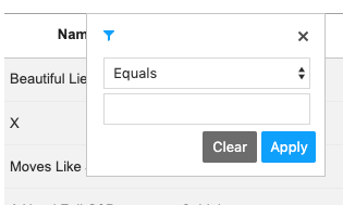
Equals |
eq | text |
Not equals |
ne | text |
Contains |
contain | text |
Starts with |
start | text |
Ends with |
end | text |
Equals |
eq | date |
Not equals |
ne | date |
After |
after | date |
After or Equal |
afterEq | date |
Before |
before | date |
Before or Equal |
beforeEq | date |
Three types, text, number, and date come with select and input included. The select displays the list of options in the table above, and you can input the corresponding values to find the target.
In order to use the date type, the TOAST UI DatePicker must be included in the program as a dependency, and refer to the DatePicker User's Manual for more information.
The select type, unlike the other three types mentioned above, is displayed as a list, and you can choose desired values using checkboxes.
The list can be searched, and the searched results can then be filtered.
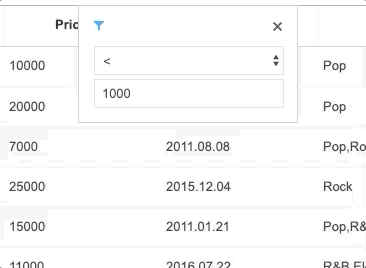
If you don't want the filter options to be applied immediately, you can set the showApplyBtn field to true, so that the filter is applied when the button has been pressed. Also, if you want a button to reset the filter that has already been applied, you can implement the showClearBtn.
const grid = new tui.Grid({
  el: document.getElementById('grid'),
  data,
  columns: [
    {
      header: 'Name',
      name: 'name',
      filter: {
        type: 'text',
        showApplyBtn: true,
        showClearBtn: true
      }
    }
    // ...,
  ]
});
The code above is executed as such.
The multi-option filter can be applied to the three of four types, text, number, and date, excluding select. You can also initialize the filter by setting the operator field to OR or AND.
const grid = new tui.Grid({
  el: document.getElementById('grid'),
  data,
  columns: [
    // ...,
    {
      header: 'Genre',
      name: 'genre',
      filter: {
        type: 'text',
        operator: 'OR'
      }
    }
  ]
});
The code above is executed as such.

The operator and the second filter are exposed if and when the first filter has been specified.
Activate the column's filter according to the state.
const state = {
  code: 'eq',
  value: 30
};

grid.filter(columnName, state);Unfilter removes the filter applied to the column.
grid.unfilter(columnName);getFilterState returns the column's filter state.
grid.getFilterState(columnName);
// {
//   columnName: 'columnName',
//   conditionFn: Function,
//   type: 'type'
//   state: [
//     {
//       code: 'code',
//       value: 'value'
//     }
//   ]
// }Filter option can be set for each column. Just like setting the filter for each column, the filterOpt can be applied as a string or as an object.
// const filterOpt = 'text'; // or
const filterOpt = {
  type: 'text',
  showApplyBtn: true,
  showClearBtn: false,
  operator: 'OR'
};

grid.setFilter(columnName, filterOpt);As for custom events, you can make it so that the filter event is emitted when the selected data have been filtered.
grid.on('filter', ev => {
  console.log(ev);
  // ev.instance - Current grid instance
  // ev.filterState - filterState
});More examples with the filter feature can be found here