TOAST UI Grid provides numerous options for users to configure the width and height of the Grid. Let's explore how different configurations affect the Grid differently.
The following are the options used to configure the resulting area.
- Individual Column Configuration
| Option Name | Type | Default Value |
|---|---|---|
columns[].width |
number |
|
columns[].minWidth |
number |
50 |
- General Column Configuration
| Option Name | Type | Default Value |
|---|---|---|
columnsOptions.minWidth |
number |
50 |
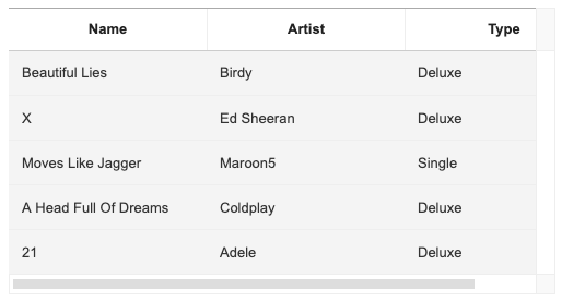
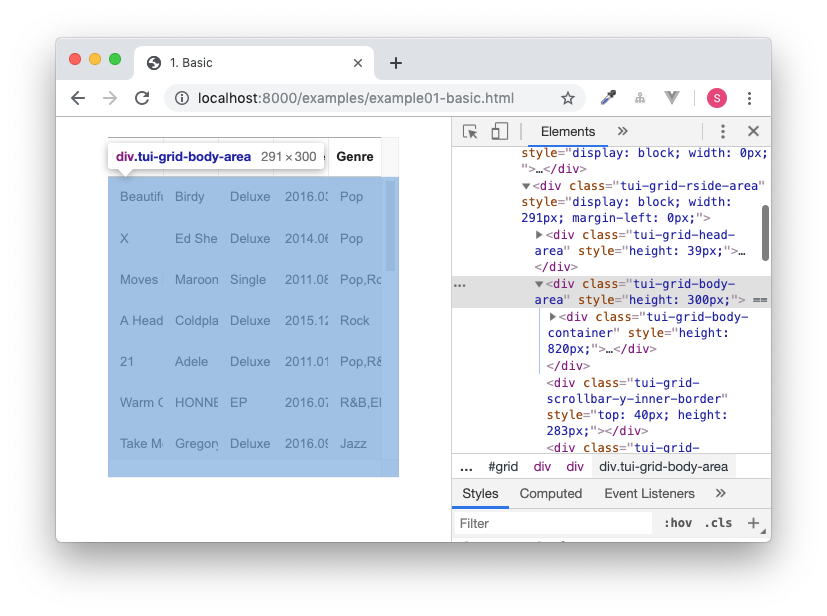
The area of each column encompassed in the Grid depends on the initial browser's viewport or on the parent element's size. The area is evenly distributed according to the number of columns except the scroll area (18px) on the Y-axis.
import Grid from 'tui-grid';

const grid = new Grid({
  // ...,
  columns: [
    {
      name: 'name'
    },
    {
      name: 'artist'
    },
    {
      name: 'type'
    }
  ]
});
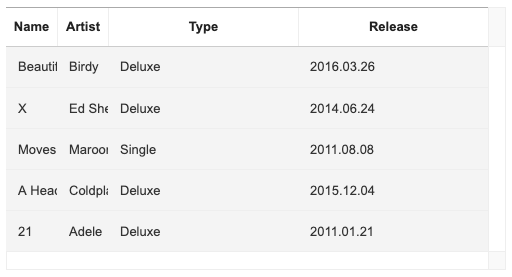
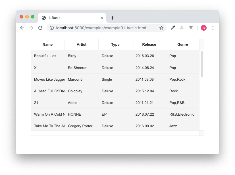
For eample, if the area of the container element in which to instantiate the Grid is set to 300px, the area of each column is set to a value that is less than 100px, as seen in the following snippet.
<div id="grid" style="width: 300px;"></div>
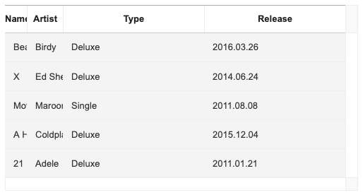
Individual columns can be assigned different widths by using the columns[].width option. The area of unconfigured columns are calculated by evenly distributing the value obtained from subtracting the total area of configured columns from the entire area of the Grid.
<div id="grid" style="width: 500px;"></div>const grid = new Grid({
// ...,
columns: [
{
name: 'name',
width: 50
},
{
name: 'artist',
width: 50
},
{
name: 'type'
},
{
name: 'release'
}
]
});
Although the minimum value for the columns[].width is set to be 50px, if a user wanted to manually configure the minimum value to be even smaller, columns[].minWidth option can be used to do so.
const grid = new Grid({
  // ...,
  columns: [
    {
      name: 'name',
      width: 30
      minWidth: 30
    },
    {
      name: 'artist',
      width: 50
    },
    {
      name: 'type'
    },
    {
      name: 'release'
    }
  ]
});
The columnOptions.minWidth option can be used to configure a general width for all columns. While the columnOptions.minWidth option has a default value of 50px, if a value that is bigger than 50px is used, all columns are fixed to the configured value.
<div id="grid" style="width: 500px;"></div>const grid = new Grid({
// ...,
columnOptions: {
minWidth: 180
},
columns: [
{
name: 'name'
},
{
name: 'artist'
},
{
name: 'type'
}
]
});
Following are the options used to configure the height.
- Row Height Configuration
| Option Name | Type | Default Value |
|---|---|---|
rowHeight |
number | 'auto' |
40 |
minRowHeight |
number |
40 |
- Viewport Area Height Configuration
| Option Name | Type | Default Value |
|---|---|---|
bodyHeight |
number | 'auto' | 'fitToParent' |
'auto' |
minBodyHeight |
number |
130 |
- Header Area Height Configuration
| Option Name | Type | Default Value |
|---|---|---|
header.height |
number |
40 |
- Summary Area Height Configuration
| Option Name | Type |
|---|---|
summary.height |
number |
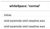
The height of columns represented on Grid viewport area is configured using the rowHeight option. If the rowHeight option is not otherwise defined, Grid will automatically configure the '40px' value internally. When we set the rowHeight value to be the default value or explicitly declare it 'auto' value, the height changes according to the embedded content, as in the example below.
const grid = new Grid({
  // ...,
  rowHeight: 'auto'
});
The height of the DOM when the row is actually being drawn is proportional to the height of the basic row internally configured within the Grid, and if the height of the DOM is bigger than the height of the row, each row's height is configured according to the DOM. Otherwise, the rows are set to have the default height of 40px.
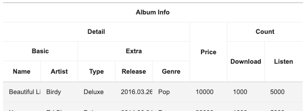
In the image below, the first row is set to have the default height value, and the rest has been reconfigured according to the DOM.

Setting the rowHeight to be some numerical value instead of 'auto' will fix the row to be of the provided value in pixels (px).
const grid = new Grid({
  // ...,
  rowHeight: 40
});
The aforementioned default row height internally set within the Grid is affected by the value of minRowHeight option. The default value of minRowHeight option is 40, and it is fixed at 40px when rowHeight: 'auto'. We can use the value of minRowHeight to manipulate the rowHeight, and when the value of minRowHeight is bigger than 40px, the row height is configured as in the example below.
const grid = new Grid({
  // ...,
  minRowHeight: 70
});
When trying to fix the rowHeight to a value that is smaller than the default row height value, we can do so by using the minRowHeight option. However, the minimum value of rowHeight is 9.
const grid = new Grid({
  // ...,
  rowHeight: 20,
  minRowHeight: 10
});
The Grid has a tabular form, and the body area that the rows are rendered upon is known as the viewport. The height of said viewport is configured using the bodyHeight option. The default value is 'auto', and the viewport area is automatically set to be the entire row height, and the its height is configured accordingly. When the bodyHeight option has not been specified, it will take the value of 'auto'.
const grid = new Grid({
  // ...,
  bodyHeight: 'auto'
});
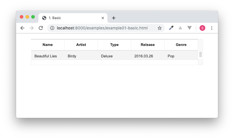
If a numerical value is given for the bodyHeight option, the height of the Grid viewport area is fixed. Here, the height value for the scroll on the X-axis (17px) is included, and if the height of all of the rows are bigger than the fixed height, a scroll will be created on the viewport's Y-axis.
const grid = new Grid({
  // ...,
  bodyHeight: 300
});
The bodyHeight option can also take the value of 'fitToParent', and this value works differently from the original specs. The viewport area is then configured according to the height value of the Grid constructring container element or other higher hierarchical elements
const grid = new Grid({
  // ...,
  bodyHeight: 'fitToParent'
});<div style="height: 300px;">
<div id="grid"></div>
</div>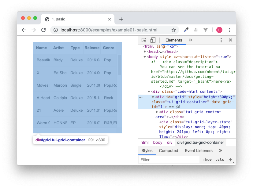
The minimum height of the viewport is 130px, and when trying to use an even smaller value, use the minBodyHeight option to do so. The value of minBodyHeight is the same as the value of minRowHeight.
const grid = new Grid({
  // ...,
  bodyHeight: 50,
  minBodyHeight: 50
});
The height for header area can be configured using the header.height. The default height value of header area is 40px, and when using complex columns, each rows in complex columns will be of an even distribution of the height value configured in constructing the complex columns.
const grid = new Grid({
  // ...,
  header: {
    height: 160
  }
});
The height for summary area can be configured using summary.height option. While there is no default value configured for the summary area, if the summary.height option is not configured, the height will automatically be 0.
const grid = new Grid({
  // ...,
  summary: {
    height: 60
  }
});
For more examples of configuring width and height, check here.