English | 简体中文
👉 https://nslogx.github.io/flutter_easyloading
将以下代码添加到您项目中的 pubspec.yaml 文件:
dependencies:
flutter_easyloading: ^latestimport 'package:flutter_easyloading/flutter_easyloading.dart';首先, 在MaterialApp/CupertinoApp中初始化FlutterEasyLoading:
class MyApp extends StatelessWidget {
  @override
  Widget build(BuildContext context) {
    return MaterialApp(
      title: 'Flutter EasyLoading',
      theme: ThemeData(
        primarySwatch: Colors.blue,
      ),
      home: MyHomePage(title: 'Flutter EasyLoading'),
      builder: EasyLoading.init(),
    );
  }
}
然后, 请尽情使用吧:
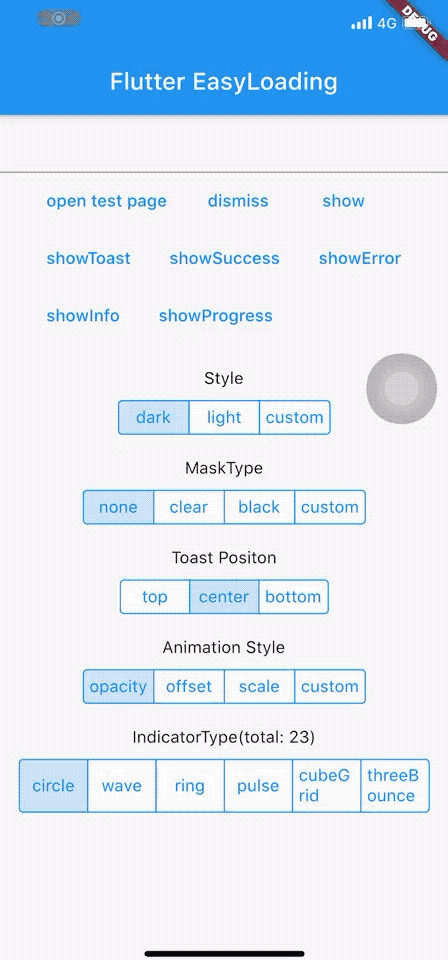
EasyLoading.show(status: 'loading...');

EasyLoading.showProgress(0.3, status: 'downloading...');

EasyLoading.showSuccess('Great Success!');

EasyLoading.showError('Failed with Error');

EasyLoading.showInfo('Useful Information.');

EasyLoading.showToast('Toast');

EasyLoading.dismiss();
添加 Loading 状态回调
EasyLoading.addStatusCallback((status) {
  print('EasyLoading Status $status');
});
移除 Loading 状态回调
EasyLoading.removeCallback(statusCallback);

EasyLoading.removeAllCallbacks();❗️注意:
-
textColor、indicatorColor、progressColor、backgroundColor仅对EasyLoadingStyle.custom有效。 -
maskColor仅对EasyLoadingMaskType.custom有效。
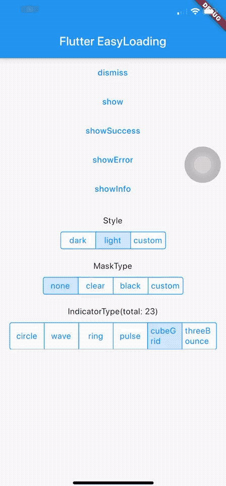
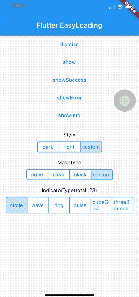
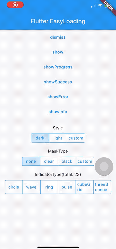
/// loading的样式, 默认[EasyLoadingStyle.dark].
EasyLoadingStyle loadingStyle;

/// loading的指示器类型, 默认[EasyLoadingIndicatorType.fadingCircle].
EasyLoadingIndicatorType indicatorType;

/// loading的遮罩类型, 默认[EasyLoadingMaskType.none].
EasyLoadingMaskType maskType;

/// toast的位置, 默认 [EasyLoadingToastPosition.center].
EasyLoadingToastPosition toastPosition;

/// 动画类型, 默认 [EasyLoadingAnimationStyle.opacity].
EasyLoadingAnimationStyle animationStyle;

/// 自定义动画, 默认 null.
EasyLoadingAnimation customAnimation;

/// 文本的对齐方式 , 默认[TextAlign.center].
TextAlign textAlign;

/// 文本的样式 , 默认 null.
TextStyle textStyle;

/// loading内容区域的内边距.
EdgeInsets contentPadding;

/// 文本的内边距.
EdgeInsets textPadding;

/// 指示器的大小, 默认40.0.
double indicatorSize;

/// loading的圆角大小, 默认5.0.
double radius;

/// 文本大小, 默认15.0.
double fontSize;

/// 进度条指示器的宽度, 默认2.0.
double progressWidth;

/// 指示器的宽度, 默认4.0, 仅对[EasyLoadingIndicatorType.ring, EasyLoadingIndicatorType.dualRing]有效.
double lineWidth;

/// [showSuccess] [showError] [showInfo]的展示时间, 默认2000ms.
Duration displayDuration;

/// 动画时间, 默认200ms.
Duration animationDuration;

/// 文本的颜色, 仅对[EasyLoadingStyle.custom]有效.
Color textColor;

/// 指示器的颜色, 仅对[EasyLoadingStyle.custom]有效.
Color indicatorColor;

/// 进度条指示器的颜色, 仅对[EasyLoadingStyle.custom]有效.
Color progressColor;

/// loading的背景色, 仅对[EasyLoadingStyle.custom]有效.
Color backgroundColor;

/// 遮罩的背景色, 仅对[EasyLoadingMaskType.custom]有效.
Color maskColor;

/// 当loading展示的时候,是否允许用户操作.
bool userInteractions;

/// 点击背景是否关闭.
bool dismissOnTap;

/// 指示器自定义组件
Widget indicatorWidget;

/// 展示成功状态的自定义组件
Widget successWidget;

/// 展示失败状态的自定义组件
Widget errorWidget;

/// 展示信息状态的自定义组件
Widget infoWidget;
因为 EasyLoading 是一个全局单例, 所以你可以在任意一个地方自定义它的样式:
EasyLoading.instance
  ..displayDuration = const Duration(milliseconds: 2000)
  ..indicatorType = EasyLoadingIndicatorType.fadingCircle
  ..loadingStyle = EasyLoadingStyle.dark
  ..indicatorSize = 45.0
  ..radius = 10.0
  ..progressColor = Colors.yellow
  ..backgroundColor = Colors.green
  ..indicatorColor = Colors.yellow
  ..textColor = Colors.yellow
  ..maskColor = Colors.blue.withOpacity(0.5)
  ..userInteractions = true
  ..dismissOnTap = false
  ..customAnimation = CustomAnimation();
更多的指示器类型可查看 👉 flutter_spinkit showcase
例子: 👉 Custom Animation
-
新增进度条指示器
-
新增自定义动画
感谢 flutter_spinkit ❤️
感谢 JetBrains Open Source 提供支持