
Learning Flexbox can be a pain in the butt. For most persons, it's not particularly fun at first. It challenges you to rethink how you've dealt with layouts in css.
Don't fret. I really would walk you through all you need to know. So, let's get started.
CSS has evolved a lot over the past few years. Designers loved the introduction of filters, transitions, and transforms. But something was missing. Something we all craved.
Crafting Intelligent page layouts with CSS seemed to have persisted for too long, and this got many of us writing hacky CSS.
We always had to deal with floats, table display hacks, and the consequences they brought. If you’ve written CSS for sometime, you can probably relate to this. And if not, welcome to a better world!
It seems like our prayers as designers and front-end developers have finally been heard. This time, in grand style.
Now we can all ditch those hacky CSS tricks. No more incessant use of floats, table-cell displays.
It’s time to embrace a cleaner modern syntax for crafting intelligent layouts. Welcome the CSS Flexbox model.
According to the specification, the flexbox model provides for an efficient way to layout, align, and distribute space among elements within your document, even when the viewport and the size of your elements is unknown and/or dynamic.
If that sound too formal, I understand the feeling. In just a bit, I'll explain what that means in plain English.
Whether you write css in your dreams or you're just getting started, you'll feel right at home.
This is the first question everyone asks, and the answer is much simpler than you may have expected. To start using the Flexbox model, all you need to do is first define a flex-container.
Okay, did I make you more confused there? Let me explain. In regular html, laying out a simple list of items takes this form.
<ul> <!--parent element-->
  <li></li> <!--first child element-->
  <li></li> <!--second child element-->
  <li></li> <!--third child element-->
</ul>
If you glanced at that, you must have seen that the unordered list houses the list elements. You'd call the ul the parent element, and the li the child element.
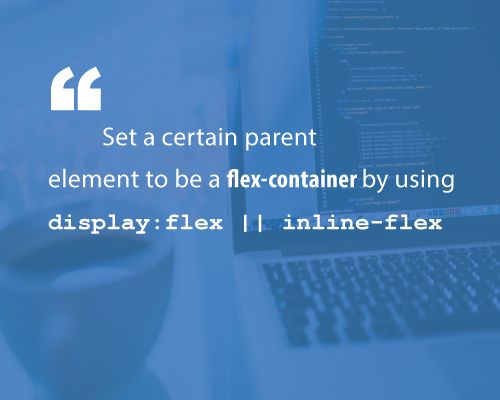
To use the flexbox model, you must make a parent element a flex container (aka flexible container). You do this by setting display: flex or display: inline-flex for the inline variation. It's that simple, and from there you're all set to use the Flexbox model. Told you it wasn't as difficult as you expected.
Using an unordered list and a bunch of list elements, this is what that would bring us to.
/*Make parent element a flex container*/
ul {
  display: flex; /*or inline-flex*/
}
I'm going to style the list items just a bit, so you may see what's going on here.
li {
  width: 100px;
  height: 100px;
  background-color: #8cacea;
  margin: 8px;
}
And here is what we have:
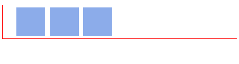
You may not have noticed, but something's happened already!
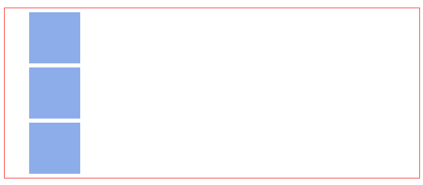
By default, "divs" in CSS stack vertically, from top to bottom.
The image above is the result you may have hoped for. However, with the inclusion of that simple one-liner, display:flex, a change in layout is immediately seen. The list elements are now stacked horizontally, from left to right. Just like they would if you used float
I really need you to follow along here. The Flexbox model kicks in as soon as you introduce the display property on any parent element. It's all started now.
You may not understand why that change in the orientation of the list elements came to be right now. I promise I'll go into the inner workings of that very soon. For now, blind trust would suffice. Simply understand that the inclusion of the display property starts off the Flexbox model.
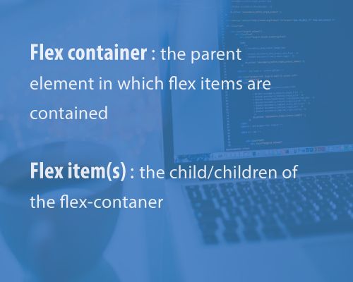
There's one more thing I need to call your attention to. As soon as you set the display property to flex, the unordered list automatically becomes the flex container and the child elements (in this case, the list elements li) become flex items. These terms would come up over and over again as I walk you through some more interesting things the Flexbox model has in place.
I have used two key words, and I'd like to lay more emphasis on them. They are vital to understanding what lies ahead.
- Flex container : The parent element you've set
display: flexon. - Flex items : The children elements within a Flex container.
This is the foundation for using the flexbox model, and as soon as that's understood, more interesting things lie ahead.
So, here is where I wrap up the Introduction to the Flexbox model.
Don't forget to spread the word on Twitter. Much appreciated!
Free PDF version available here.
Next Read: THE FLEX-CONTAINER PROPERTIES