| title |
|---|
Creating Line Charts |
This tutorial uses Google spreadsheets to create a line chart.
There is sample data for this tutorial here .
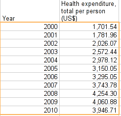
So let’s create a line chart. Let’s say we want to see how healthcare expenditure evolved in Luxembourg, our top spending country.
- Go back to your World Bank data sheet.
- Remove the filter for years and filter for a single country: Luxembourg (you can do so by clicking the “clear” label in the filtering menu - then type Luxem and you’ll see Luxembourg appear - select it).
- Now the only thing that’s left is sorting by years - so you have them in right order.
- Select all of it and copy it to a new sheet.
- Now move the columns year and “healthcare expenditure total per person” next to each other.
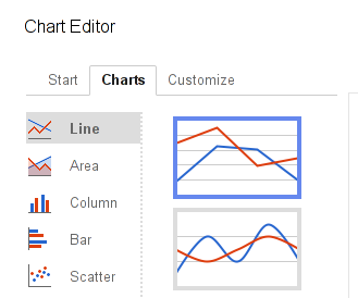
- Select both columns and select “Chart...” from the “insert” menu.
- Click on the “charts” tab and select the line chart you want to plot.
- You already know how to manipulate the look of a chart, so go and play around until it looks similar to the chart above!
Any questions? Got stuck? Ask School of Data!