Skip to content
New issue

Have a question about this project? Sign up for a free GitHub account to open an issue and contact its maintainers and the community.

By clicking “Sign up for GitHub”, you agree to our terms of service and privacy statement. We’ll occasionally send you account related emails.

Already on GitHub? Sign in to your account

New Collective Page V2 Feedback #2225

Closed
alanna opened this issue Jul 9, 2019 · 33 comments · Fixed by opencollective/opencollective-frontend#2230
Closed

New Collective Page V2 Feedback #2225

alanna opened this issue Jul 9, 2019 · 33 comments · Fixed by opencollective/opencollective-frontend#2230
Assignees
Labels
discussion This issue is being discussed, and is not ready for implementation profile page

Comments

@alanna
Copy link
Contributor

alanna commented Jul 9, 2019

This issue is where we will be collecting feedback from the team and community about the newly redesigned Collective page.

To see a preview of the new Collective page design, append "v2" to the end of any Collective URL.

Examples:

The person leading this implementation is @Betree - he will be monitoring this thread and taking feedback on board.

@alanna alanna added discussion This issue is being discussed, and is not ready for implementation profile page labels Jul 9, 2019
@alanna
Copy link
Contributor Author

alanna commented Jul 9, 2019

I have some comments myself...

  1. What will happen to the design when a Collective has multiple tags? I think we're going to be using tags more and more in the system going forward.

Screen Shot 2019-07-10 at 10 33 04 AM

  1. I seem to remember from the design that there is a 'short description' section at the top of the page, under the title and Collective tagline. Is that right? Because while I think it's good not to put a huge amount of text at the top, right now the "About" info is too hidden. Will we be telling Collectives to fill out the short description field to put a few sentences at the top?

  2. I don't think the "custom contribution" should be ordered as the first tier, because that means the very first text a potential contributor reads is "Nothing there for you?" which is kind of negative. Can we put that one at the end, so users first look at the Collective's suggestions and only goes custom if nothing fits.

  3. It would me more engaging if all the action buttons were colored in instead of white. (e.g. contribute, contact, submit expenses).

  4. For Collectives with Updates, "Updates" is the second nav menu item, but scrolling down the page it's actually the third section, under contributors. I think the order should match.

  5. Section headings should match menu items. So if the menu says "budget" the section should be "budget" not "transactions".

  6. Where is the "edit Collective" link?

  7. I assume the images in the tier cards will be changeable by Collectives? I think it would be more fun and engaging if we put default photos in there, instead of this grey money icon. It would also show Core Contributors ideas of what it can look like if they replace it with their own image.

Screen Shot 2019-07-10 at 10 44 27 AM

  1. I know we're planning to give each tier its own page. Is that coming in a future iteration? Right now it sends you straight to the contribution flow if you click a tier.

  2. The help text in the budget section could be improved. How about:

See where our money comes from and where it goes, transparently. Submit an expense to get paid for your contributions to [Collective].

  1. The test under "all of us" could also be improved. I think think claiming that this is "everyone who has supported the project" is accurate, and there's improper use of hyphens. I suggest:

[Collective] exists thanks to the work and support of all the contributors who believe in our purpose.

  1. I think the "all of us" section should actually default to showing core contributors first. Because right now the info displayed is redundant to the "Top contributors" section just above. I also think some people might not immediately get what "core contributor" means, but if they see the team members displayed first thing, they will get it.

@Betree Betree added this to Backlog in Collective page via automation Jul 9, 2019
@Betree
Copy link
Member

Betree commented Jul 10, 2019

Thanks for opening this @alanna! I'm assigning @raulgrafico as well because a lot of the feedback will involve the design team. I've added below replies for the points where I have some things to say and let aside pure design feedback for @raulgrafico or @cuiki.

  1. What will happen to the design when a Collective has multiple tags? I think we're going to be using tags more and more in the system going forward.

Right now we only show the "main tag", that is actually more a category.

Details about how we find out the main tag
  • If host is OSC ==> OPEN SOURCE
  • Otherwise if the collective has no tags ==> COLLECTIVE
  • If the collective has tags, we take the first one matching a value in the following map:
export const CollectiveCategory = {
  ASSOCIATION: 'association',
  COLLECTIVE: 'collective',
  CONFERENCE: 'conference',
  COOPERATIVE: 'coop',
  OPEN_SOURCE: 'open source',
  MEDIA: 'media',
  MEETUP: 'Meetup',
  MOVEMENT: 'movement',
  POLITICS: 'politics',
  TECH_MEETUP: 'Tech meetups',
  US_NONPROFIT: '501c3',
};
  1. I seem to remember from the design that there is a 'short description' section at the top of the page, under the title and Collective tagline. Is that right? Because while I think it's good not to put a huge amount of text at the top, right now the "About" info is too hidden. Will we be telling Collectives to fill out the short description field to put a few sentences at the top?

The tagline is in fact the short description. They may have been a longer on the design in the past but not in the current version. I agree that the about section is really not visible and that is going to be a problem for some collectives.

A possible answer that we can also give is the ability to change sections order in collective's settings (we're just missing the admin UI for it). With it collectives can bring the about section up.

  1. I don't think the "custom contribution" should be ordered as the first tier, because that means the very first text a potential contributor reads is "Nothing there for you?" which is kind of negative. Can we put that one at the end, so users first look at the Collective's suggestions and only goes custom if nothing fits.

100% agree. Also I think that an increasing number of collectives are going to need #2183 that solves the issue too.

  1. It would me more engaging if all the action buttons were colored in instead of white. (e.g. contribute, contact, submit expenses).

I wouldn't do that for all the buttons but I think too that the Contribute buttons should use the primary color as this is our main call to action. Also because collectives can now set a primary color for their page, this would create a real identity there.

Screenshot_2019-07-10 Collective - Open Collective(1)

  1. For Collectives with Updates, "Updates" is the second nav menu item, but scrolling down the page it's actually the third section, under contributors. I think the order should match.

Top contributors is actually not a real section, it's part of the "Contribute" section and has no entry in the NavBar. The real contributors section is after the budget.

  1. Where is the "edit Collective" link?

image

  1. I assume the images in the tier cards will be changeable by Collectives? I think it would be more fun and engaging if we put default photos in there, instead of this grey money icon. It would also show Core Contributors ideas of what it can look like if they replace it with their own image.

Yes, that's #1980. Can you provide examples of default photos that could illustrate tiers?

  1. I know we're planning to give each tier its own page. Is that coming in a future iteration? Right now it sends you straight to the contribution flow if you click a tier.

The Contribute button always sends you directly to the contribution flow. To reach the tier page, you have to click on Read more (only appears if the tier has a long description).

image

  1. I think the "all of us" section should actually default to showing core contributors first. Because right now the info displayed is redundant to the "Top contributors" section just above. I also think some people might not immediately get what "core contributor" means, but if they see the team members displayed first thing, they will get it.

Good point.

@piamancini
Copy link
Contributor

piamancini commented Jul 10, 2019

Adding @dodgepong's comments here as well for record.

The contrast in the top contributors section seemed hard on the eyes, felt noisy

image (4)

one user had this issue on the mobile view

image (5)

Generally it felt like the layout suffered from "designed on a wide monitor" syndrome. especially how you have to scroll horizontally to see all the tiers.

Some smaller displays had issues with the "Our Contributors" section, where it would not fit vertically or horizontally, meaning he had to scroll each direction constantly

Personally from a sales perspective, I felt like the "About" section being on the bottom was out of place, like making the sales pitch the least important part of the page

The "_____ is all of us" header seemed overly large

The overall impression was that it was "very white"

I do like that you can see the messages people left when contributing -- I didn't even know those existed with the old system. It would be nice if those messages were in the notification email we got when someone contributed

Companies/orgs that don't have square/circle logos seem to suffer as well as companies with white logos

@piamancini
Copy link
Contributor

piamancini commented Jul 10, 2019

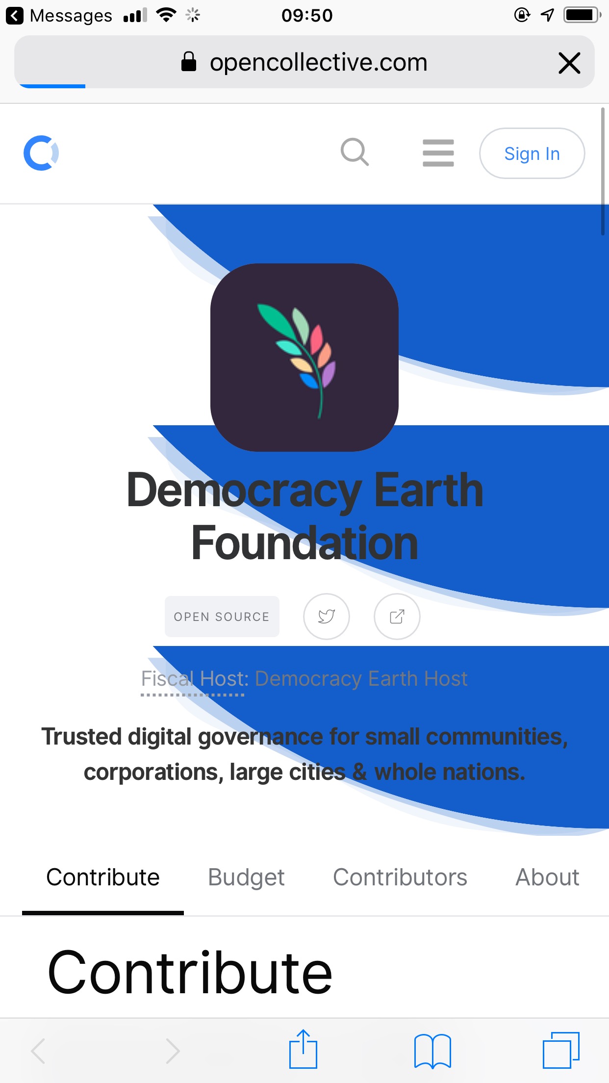
Feedback from Democracy Earth:

'Why we do what we' do seems out of alignment with the rest of the page. Everything is to the left and that's at the center.

Background image behind logo is broken in mobile

IMG_0785

@Betree
Copy link
Member

Betree commented Jul 10, 2019

Background image behind logo is broken in mobile

This one is fixed by opencollective/opencollective-frontend#2109 that will be deployed today.

@yellowwoods12
Copy link
Member

The number of contributors card in a row should be less and equal to the number that can fit in the screen along with a margin on the right. This will look much better.
Screenshot_2019-07-11 Collective - Open Collective

@Betree
Copy link
Member

Betree commented Jul 11, 2019

@yellowwoods12 The horizontal scroll is a choice that design team made to be able to see all the contributors of a collective, even when there are hundreds of them. If we only show a subset of them then we loose the ability to see all collective's contributors in one place. There may be things we can improve on the implementation side for this one, but I think the design for it is clever.

Peek 11-07-2019 08-23

A way to improve that would be to not show any padding on the left if the grid is full.

On your screenshot the navbar seems to appear on the middle of the screen, is it a bug you encountered or a problem with Firefox's integrated screnshot feature?

@yellowwoods12
Copy link
Member

yellowwoods12 commented Jul 11, 2019

@Betree Sure I get it. But can't we create paging instead of horizontal scrolling according to the time period in which a particular person became a contributor. That will be a more standard way to do this I guess, isn't it?
Also, removing padding on the left side is definitely a good option.
The navbar in the middle is just an issue with the Firefox's screenshot feature not a bug.

@alanna
Copy link
Contributor Author

alanna commented Jul 15, 2019

White logos are not showing up well.

Screen Shot 2019-07-15 at 12

Screen Shot 2019-07-15 at 12 18 06 PM

@alanna

This comment has been minimized.

@alanna
Copy link
Contributor Author

alanna commented Jul 15, 2019

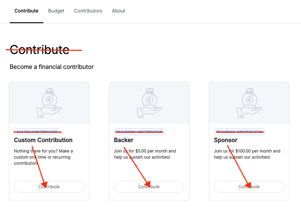
There's too much redundant language in the contribute section.

We could make "Become a financial contributor" the section title, delete the current section title, lose the blue 'contribution' badges, and make the tier title what goes on the button. Viola, a whole lot less text, a much simpler design, and no information lost.

Screen Shot 2019-07-15 at 4 48 54 PM


Edit by @Betree: #2280

@kthull

This comment has been minimized.

@staltz
Copy link

staltz commented Jul 16, 2019

Looks nice! Two things I noticed:

  • The sticky header is huge and is consuming space to read content
  • The hero picture is not entirely shown (I guess I could redesign the hero picture, though)

@NoWorries
Copy link

  • These cards are different heights across three tabs:

image

  • Core Contributors tab doesn't have background image:

image

  • Menu active state not working consistently

Jul-17-2019 10-16-37

@jfdh
Copy link

jfdh commented Jul 17, 2019

Very satisfied with the overall redesign.
Two things:

  • What about the redesign of host organisations? I can't see the collectives we are hosting on this screen
  • I am also missing the dashboard button. Is there a new design for the dashboard btw?
    Screenshot 2019-07-17 at 10 29 22

Thanks for the good work! I look forward to making the best out of it.

@Betree
Copy link
Member

Betree commented Jul 17, 2019

@NoWorries

These cards are different heights across three tabs

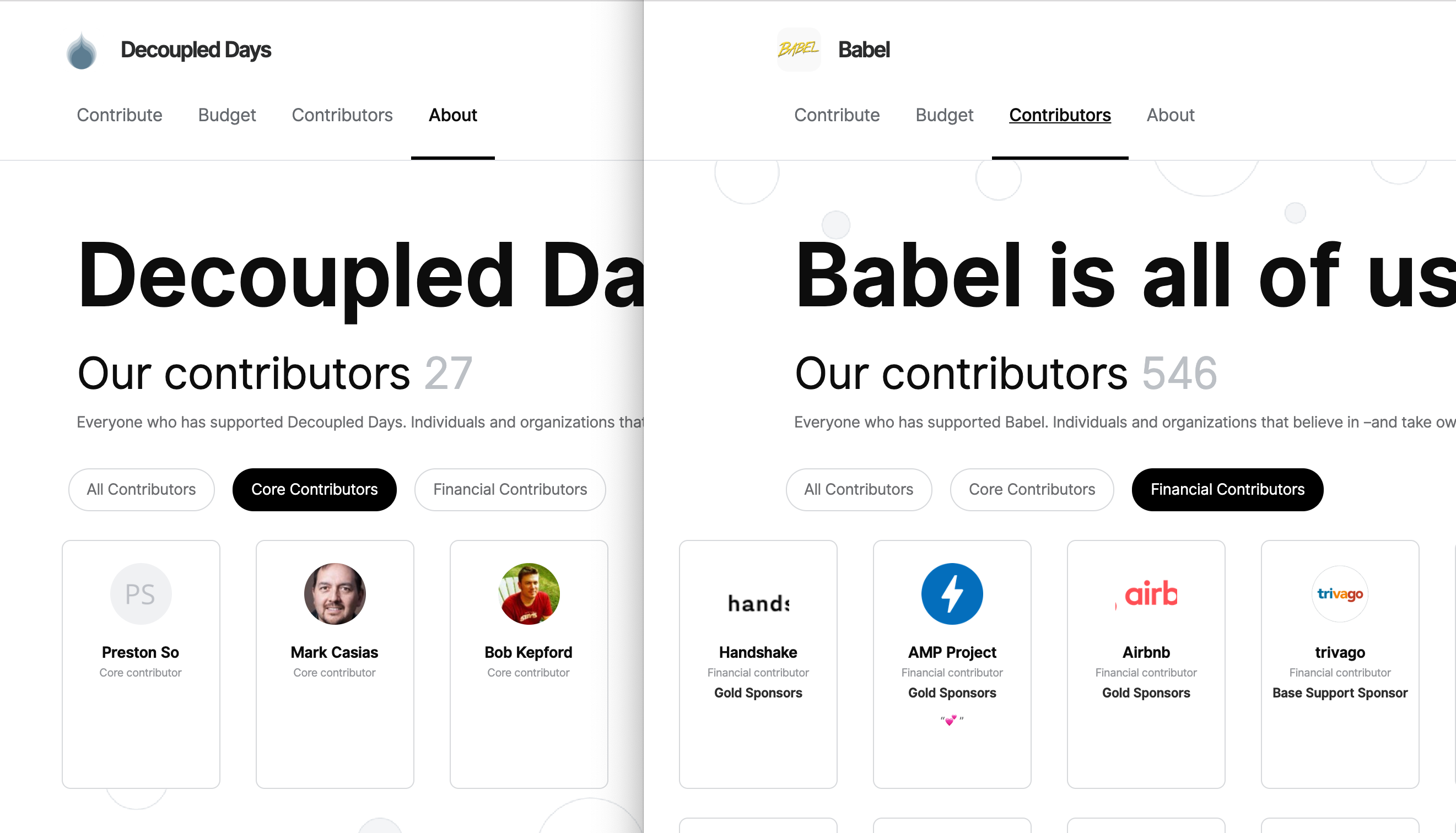
As we make all cards the same height, the longest one will define the size. In the case of babel, the last one has a long description:

image


@jfdh, thanks for mentioning these issues. I'll make sure we prioritize this so hosts don't loose precious info when we roll out the page.

@NoWorries
Copy link

@Betree

These cards are different heights across three tabs

Ah sorry ignore that one then, I was scrolling through the three side by side and didn't check the content across the carousels.

@alanna
Copy link
Contributor Author

alanna commented Jul 18, 2019

@Betree I am also interested in clarification about @jfdh 's question above about the design for host pages. I didn't think about how this would affect host and organization pages as the focus was on Collectives. There are a lot of issues that will need to be fixed for hosts before this goes live.

A few I noticed:

  • Should not include the 'budget' section (I would love for hosts to have full Collective budget functionality but I think it's out of scope for this project)
  • Must feature the "Apply" button
  • Where is the link to the dashboard?
  • Can hosts do Updates now? If not, remove that section.
  • Contributor section doesn't make much sense for a host page, as it's only going to show core contributors not financial contributors (Again I would love it if there was no need for a deperate default Collective for a host but right now that's where financial contributions go).
  • Needs to display the hosted Collectives

@Betree
Copy link
Member

Betree commented Jul 18, 2019

@alanna The design team already worked on this by providing a design that will work for Users/Organizations/Hosts: https://www.figma.com/file/e71tBo0Sr8J7R5n6iMkqI42d/OC.COM-04-%2F-Collectives-%E2%86%92-Create%2C-Edit?node-id=3889%3A145

But these two points remain:

  • Must feature the "Apply" button
  • Where is the link to the dashboard?

@raulgrafico

@piamancini
Copy link
Contributor

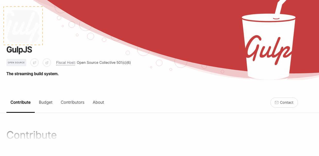
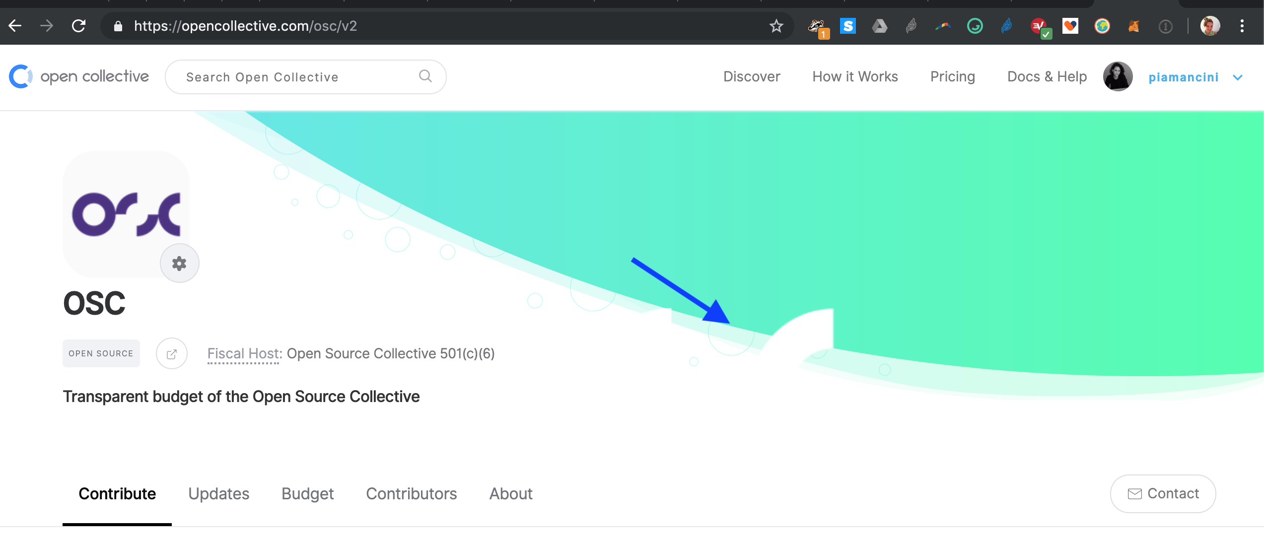
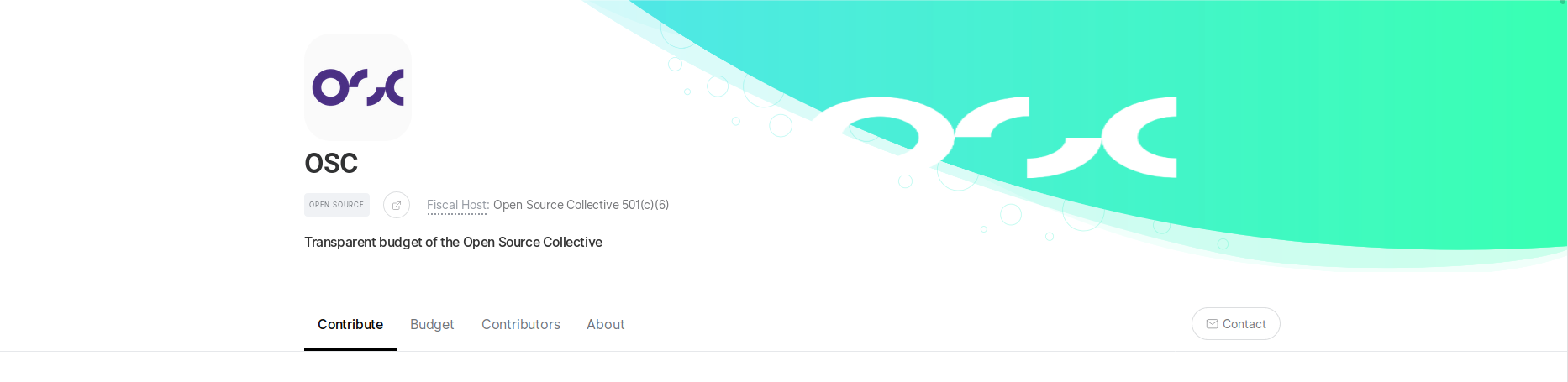
background image overflows designated space? opencollective.com/osc/v2
Screen Shot 2019-07-18 at 12 30 31 PM

@Betree
Copy link
Member

Betree commented Jul 18, 2019

@piamancini The background image don't have the same dimensions on this page that it used to, we'll have other cases like this (though this one looks really bad). Stretching to the size would not work because we'll end up with strange images:

image

What we've discussed with @raulgrafico to solve this one is to add the ability to change position/zoom/crop when you edit the image, similar to what you have on facebook/twitter:

Peek 18-07-2019 12-58

@alanna

This comment has been minimized.

@Betree

This comment has been minimized.

@alanna

This comment has been minimized.

@Betree

This comment has been minimized.

@alanna

This comment has been minimized.

@alanna alanna reopened this Jul 23, 2019
Collective page automation moved this from Testing to To do Jul 23, 2019
@Betree

This comment has been minimized.

@0xChez
Copy link

0xChez commented Aug 20, 2019

This is really good! Only one issue though, markdown is completely broken on tiers. Where you could actually use markdown in v1 of tiers, you can't now. Is that intentional?

v1:

v2:

Also it seems you can't view who has pledged to which tier anymore.

Thanks for the incredible work on OpenCollective over the years. I'm really digging v2.

@Betree
Copy link
Member

Betree commented Aug 20, 2019

This is really good! Only one issue though, markdown is completely broken on tiers. Where you could actually use markdown in v1 of tiers, you can't now. Is that intentional?

@CheesePwn The use of markdown in v1 was undocumented, I'll bring up the topic but there's good chances that we're going to get rid of this behavior to incentive a new way of presenting things: you can now attach goals and rich descriptions to tiers, which results in a page where you can add as much text as you want, images, a video -- everything you need to describe the contribution 🙂

image

localhost_3000_open-potatoes_tiers_to-the-moon-2807 (6)

Also it seems you can't view who has pledged to which tier anymore.

This one is yet to come, final design will look like this:

image

Thanks for the incredible work on OpenCollective over the years. I'm really digging v2.

Thank you so much, that's very kind! @opencollective/design and especially @raulgrafico worked hard on this 🙏

@0xChez
Copy link

0xChez commented Aug 20, 2019

Thank you so much, that's very kind! @opencollective/design and especially @raulgrafico worked hard on this 🙏

You're doing great work @Betree. Thanks for the updates. That's actually more than enough to what I was expecting!

@simonmichael
Copy link

Congrats in advance! Here's a bug I found:

  • using firefox 70 on mac
  • click Edit main color
  • in the colour field, start typing the color name "midnightgreen"
  • after the "g", you get a "crash": "Ooops, an unexpected error seems to have occurred 🤕"

and a feature request: the # suggests this field will only accept hex codes, it would be nice if it accepted color names (or full CSS color value syntax ?)

@Betree
Copy link
Member

Betree commented Sep 17, 2019

@simonmichael thanks for testing that! We'll make sure this gets fixed before the release

@piamancini
Copy link
Contributor

NCP has been released!
Closing this issue in favor of #2445.

Collective page automation moved this from To do to Testing Sep 23, 2019
Sign up for free to join this conversation on GitHub. Already have an account? Sign in to comment
Labels
discussion This issue is being discussed, and is not ready for implementation profile page
Projects
Collective page
  
Testing
Development

Successfully merging a pull request may close this issue.