Skip to content
New issue

Have a question about this project? Sign up for a free GitHub account to open an issue and contact its maintainers and the community.

By clicking “Sign up for GitHub”, you agree to our terms of service and privacy statement. We’ll occasionally send you account related emails.

Already on GitHub? Sign in to your account

x-index overflow in mobile view #52

Closed
afzalsayed96 opened this issue Nov 21, 2017 · 14 comments
Closed

x-index overflow in mobile view #52

afzalsayed96 opened this issue Nov 21, 2017 · 14 comments
Assignees

Comments

@afzalsayed96
Copy link
Contributor

The x index is scroll-able in mobile view. Need to fix this!

@rhyneav
Copy link
Member

rhyneav commented Nov 21, 2017

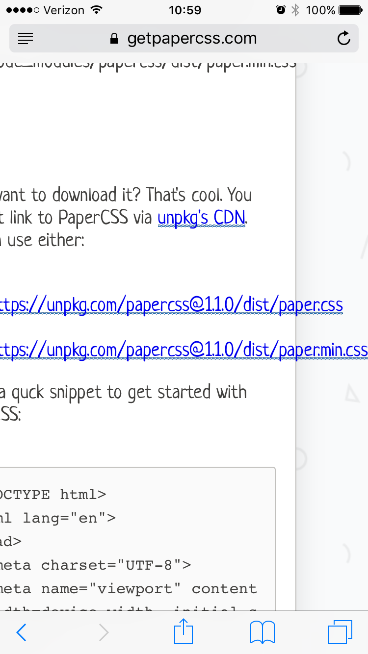
Ah dang. The culprit is the CDN url. Just a simple overflow-wrap: break-word; style should fix this.

img_5081

@TotomInc
Copy link
Contributor

So shouldn't this property be added to a component?

@afzalsayed96
Copy link
Contributor Author

We missed this...

image

@afzalsayed96 afzalsayed96 mentioned this issue Nov 22, 2017
11 tasks
@afzalsayed96
Copy link
Contributor Author

table tbody tr td {
    padding: 8px;
    line-height: 1.5;
    vertical-align: top;
    border-top: 1px dashed #d9d9d8;
}

The padding is the problem

@afzalsayed96
Copy link
Contributor Author

afzalsayed96 commented Nov 22, 2017

Proposed fix:

  • Padding for table tbody tr td must be in percentage
  • Adding !important in media query for container width
.container {
    width: 100%;
    max-width: 960px;
    position: relative;
    margin: 0 auto;
    @media @medium-screen {
        width: 85% !important;
    }
    @media @xsmall-screen {
        width: 90% !important;
    }

@rhyneav
Copy link
Member

rhyneav commented Nov 22, 2017

Good catch with the padding! And is the !important tag needed here?

@TotomInc
Copy link
Contributor

TotomInc commented Nov 22, 2017

@rhyneav I think the !important tag override the default width which is set upper.

@afzalsayed96
Copy link
Contributor Author

@rhyneav Yes it's needed

image

important

@TotomInc It does override only for the specified screen-size which is actually desired to achieve

@rhyneav
Copy link
Member

rhyneav commented Nov 22, 2017

Gotcha! Could this also be solved by changing the html from

<div class="container paper">

to

<div class="container">
  <div class="paper">

That way the paper width of 100% is within the container and not overriding it.

I'm just trying to find ways around using !important. This way it's easier for someone using PaperCSS to override the styles if need be.

@afzalsayed96
Copy link
Contributor Author

Great! Your fix works. I totally forgot about problem with overriding !important 😅

@afzalsayed96
Copy link
Contributor Author

Is anyone assigned to this issue?

@rhyneav rhyneav assigned rhyneav and unassigned rhyneav Nov 23, 2017
@rhyneav
Copy link
Member

rhyneav commented Nov 23, 2017

Nope! Do you want to take this one @afzalsayed96?

@afzalsayed96
Copy link
Contributor Author

I'm on it

@rhyneav
Copy link
Member

rhyneav commented Nov 23, 2017

You rock, thank you @afzalsayed96!

Sign up for free to join this conversation on GitHub. Already have an account? Sign in to comment
Labels
None yet
Projects
None yet
Development

No branches or pull requests

3 participants