SimpleList selected state moves the UI around #4085
Comments
|
cc @mceledonia |
|
Let's remove the bold style change, @gdoyle1 is this happening on click/active, or are the cards here selectable like a radio/checkbox? |
|
@mceledonia Both on click and when active - most of these links take you to another page so it's just a quick glimpse of the weirdness. But the ones in the middle column remain on the screen as selected since it just brings up the side panel for quick starts |
|
Gotcha, let's definitely remove that bold state change then. Was that a part of the original component design? It would be good to know why it is that way in the first place. |
|
I think that @lboehling worked on this originally. Do you see any problem removing the bold styling? |
|
The bold effect happens on focus but not on hover. Noticeable while navigating via keyboard. I'd expect focus and hover states to be the same. |
|
The designs did originally have the weight change for selected items to differentiate from the hover state (I think I pulled that treatment from the old light nav/accordion selected states). I agree we should remove the bold styling for selected. We should also consider just using the gray highlight for hover (instead of the current gray highlight + text color change) so that there is a difference between the hover & selected states. @mcarrano @mcoker @mceledonia @gdoyle1 |
|
🎉 This issue has been resolved in version 4.105.0 🎉 The release is available on: Your semantic-release bot 📦🚀 |
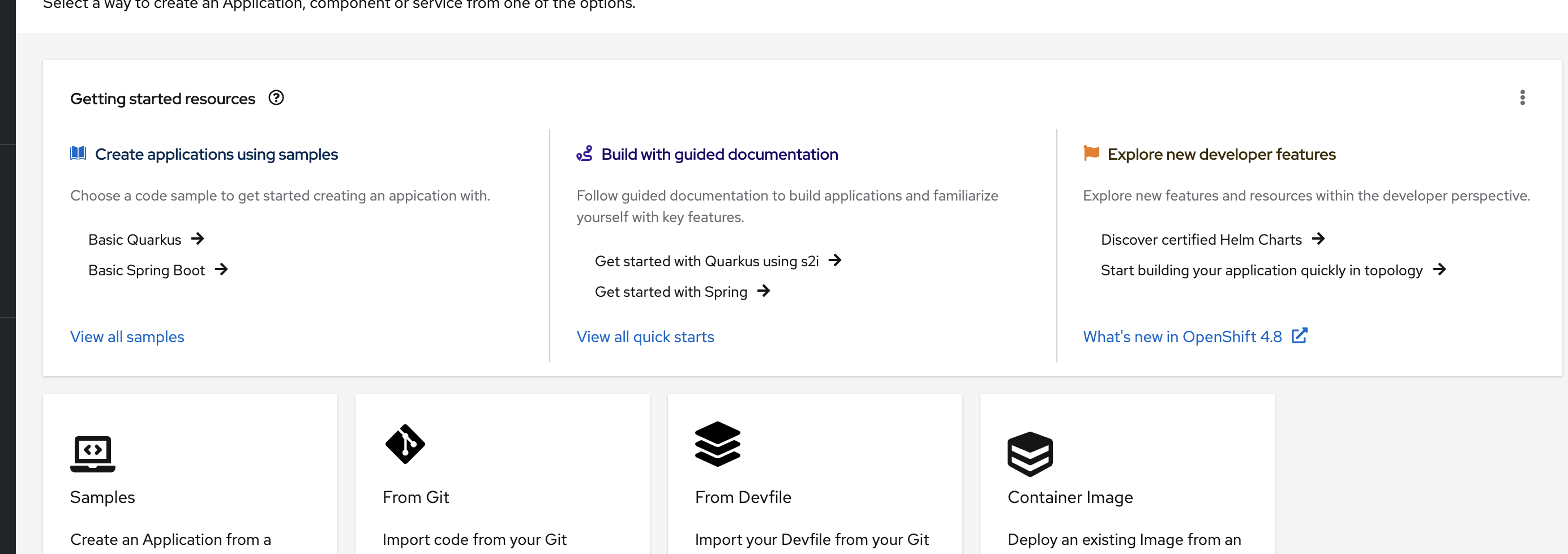
We are using the SimpleList in OpenShift within our Getting started card, and I've noticed that when you select an item, it makes the text bold which then moves stuff around depending on how long the string is.
Here's a screenshot of the card (don't mind the rest of the cards on that screen :) they are being fixed):
cc: @mcarrano
The text was updated successfully, but these errors were encountered: