| layout | title | subtitle | permalink | imageurl | state | tags | meta_description | popularity | actioncall |
|---|---|---|---|---|---|---|---|---|---|
two_column_layout |
Make a Line or Scatter Graph |
A Step by Step Guide to Line and Scatter Graphs |
/make-a-line-graph-or-scatter-plot |
/static/images/scatter-graph/thum-scatter-graph.png |
active |
basic |
A tutorial on how to make a line graph and a scatter plot online. Plotly is the easiest and fastest way to make and share graphs online. |
frontpage |
Make a Line or Scatter Graph |
#Make a Line or Scatter Graph
 <script data-plotly="cimar:195" src="https://plot.ly/embed.js" async></script>
###Step 1: Set up the grid
This is how you would set up Plotly’s grid to make the graph above (data here: https://plot.ly/~cimar/173 .|  Select “Line plot” from the MAKE A PLOT menu.|
 Click the blue plot button in the sidebar to create the chart. (For more help with the grid see: https://plot.ly/grid|
###Step 2: Setting the traces
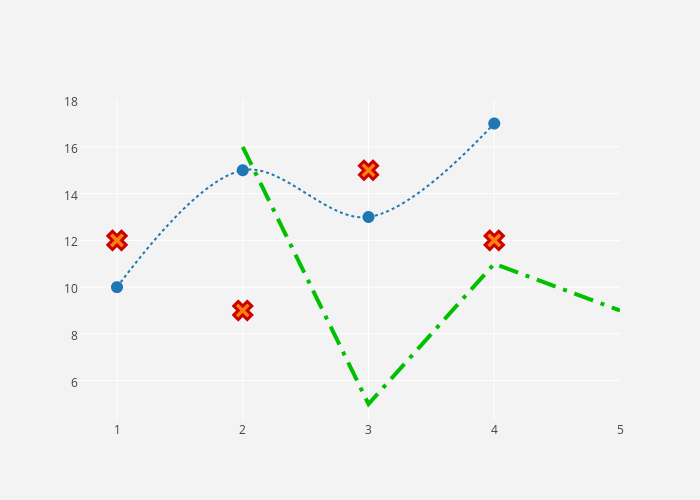
Your plot should look something like this. All the traces are line plots with markers. The first step to styling it into the mixed-type graph above is to open the TRACES popover in the toolbar.| 
 Here’s how the “Mode” tab of the TRACES popover for “trace 0” should look.|
 Here’s how the “Mode” tab of the TRACES popover for “trace 1” should look. Notice that we’ve selected the marker without a line option — this is how you get a scatter plot.|
 Here’s how the “Mode” tab of the TRACES popover for “trace 2” should look. Notice that we’ve selected the line without marker option.|
###Step 3: Style it!
Now your plot should look something like this: a mixed line and scatter plot. We still have some styling to do to get the plot at the top of this tutorial! Open TRACES again.|  This is how the “Style” tab of the TRACES popover on “trace 0” should look. We’ve smoothed the line, changed the stroke, and made the markers larger.|
  This is how the “Style” tab of the TRACES popover on “trace 1” should look. We’ve changed the stroke and its weight.|
  This is how the “Style” tab of the TRACES popover on “trace 2” should look. We’ve changed the shape of the marker and its outline.|
  This is how the LAYOUT popover should look. We’re giving the plot a grey background.|
  This is how the AXES popover should look. We’re giving the plot white gridlines.|
  We’re hiding our legend in the LEGEND popover.|
  Your finished chart should look something like this.|