| title | status | description | figma |
|---|---|---|---|
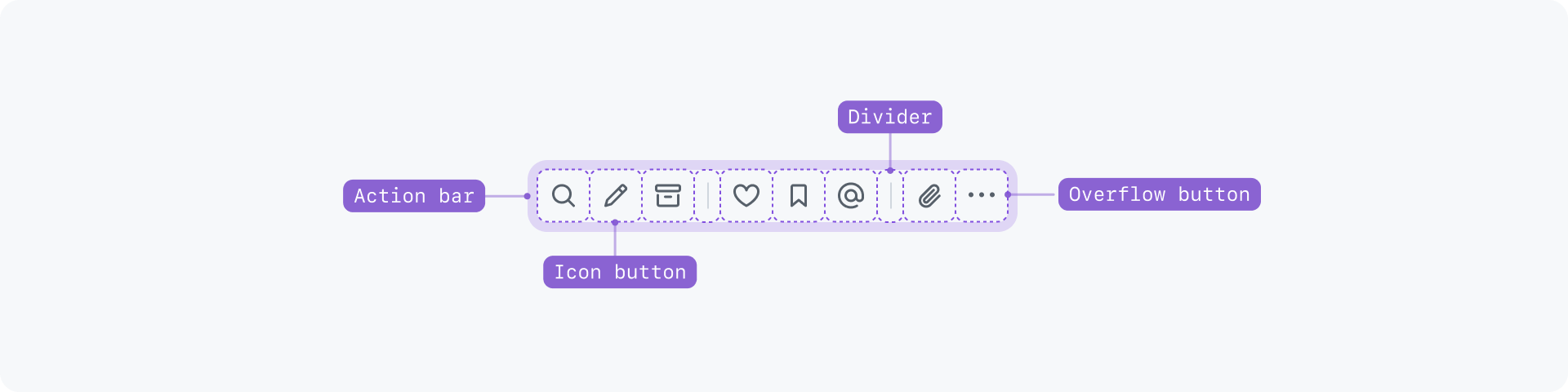
Action bar |
Experimental |
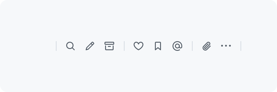
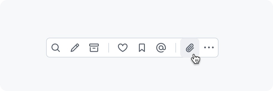
Action bar contains a collection of horizontally aligned icon buttons. |
import {Box, Text} from '@primer/react' import ComponentLayout from '~/src/layouts/component-layout' export default ComponentLayout
Use an action bar to render multiple icon buttons in a row. Buttons can be split into groups by adding a divider. When there is not enough space, buttons that don't fit will be added to an overflow menu.
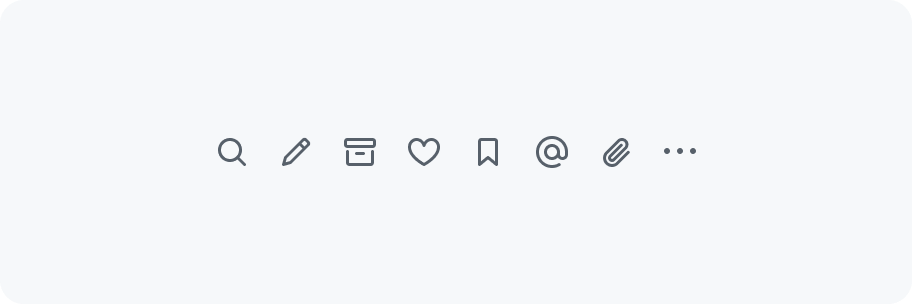
An action bar should only contain icon buttons with the invisible variant (no border/background).
Dividers can be added to visually group related buttons.

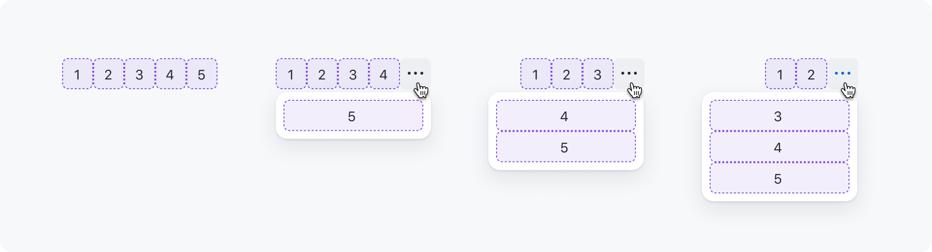
When the buttons don't fit in the available space, an overflow button ("kebab" icon) is added at the end of the action bar signaling that there are more actions available. Clicking on the overflow button opens a menu with the remaining actions that didn't fit.
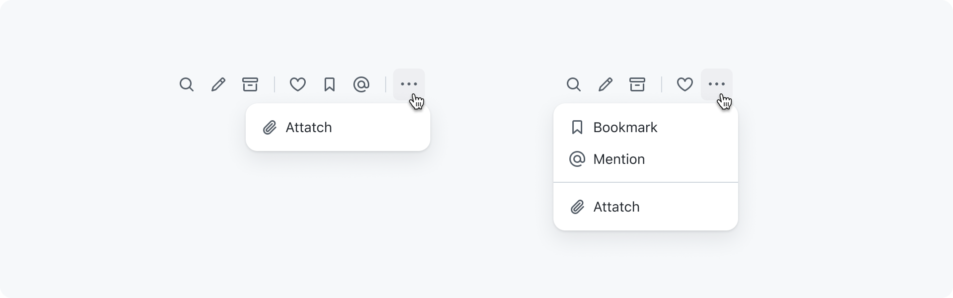
Buttons that don't fit are added to the top of the menu. Meaning that the last button in the action bar will also be the last button when inside the menu:
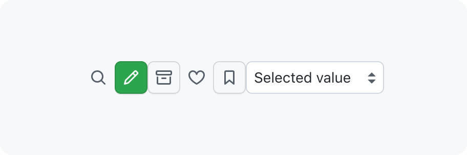
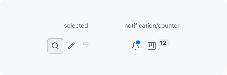
Buttons in action bars are solely used for triggering actions. Consider using a segmented control when a button should have a selected state.
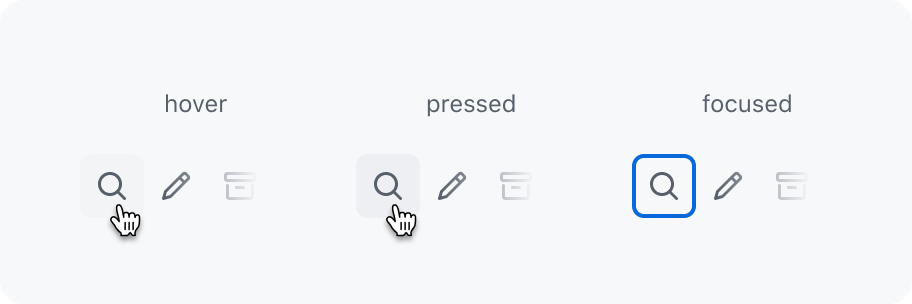
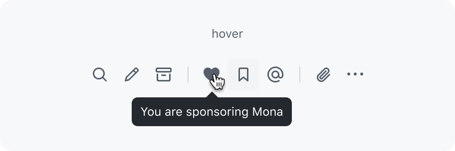
When hovering over a button, a tooltip will appear that describes the action.

Action bars can have 3 different sizes:
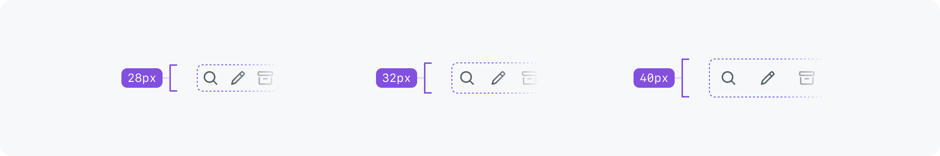
- Small (
28px) - Medium (
32px) (default) - Large (
40px)
Action bars can be used inline next to other content or also full width taking up the entire space.

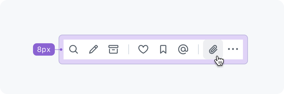
Make sure to add extra spacing around the action bar.
An action bar has an ARIA role of toolbar.
| Key | description |
|---|---|
Tab |
Moves focus into and out of the action bar. Note that there should only be one tab-stop and pressing tab again should focus the next focusable element after the action bar. Also the first button is focused if the action bar is receiving focus for the first time after page load. Otherwise, the most recently focused button receives focus. |
→ |
Right arrow moves focus to the next button. If the last button has focus, focus loops back to the first button. |
← |
Left arrow moves focus to the previous button. If the first button has focus, focus moves to the last button. |
Home |
Moves focus to the first button. |
End |
Moves focus to the last button. |
Enter or Space |
Triggers the button action. |
<Box as="figure" display="flex" flexDirection={['column-reverse', 'column-reverse', 'column-reverse', 'column-reverse', 'row']} m={0} mb={3} sx={{gap: 3}}
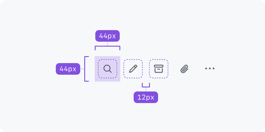
Ensure action bar buttons have a large enough touch target size (44px by 44px). The buttons should respond to hovers, clicks, and taps anywhere in the touch target area, even if it isn't directly on the control. To avoid overlapping of touch targets, additional space between each button is needed (for example a 12px gap for medium sized buttons).