[Tooltip + DropdownMenu] Tooltip hides and delayDuration property is ignored #1920
Comments
|
Actually I think it's behaving the right way..., when you hover the menu item you're focusing on it and making the tooltip open instantly. You can see this same behavior if you focus the button with the keyboard in the documentation. I've never seen a tooltip used together with a dropdown menu item 🤔 |
|
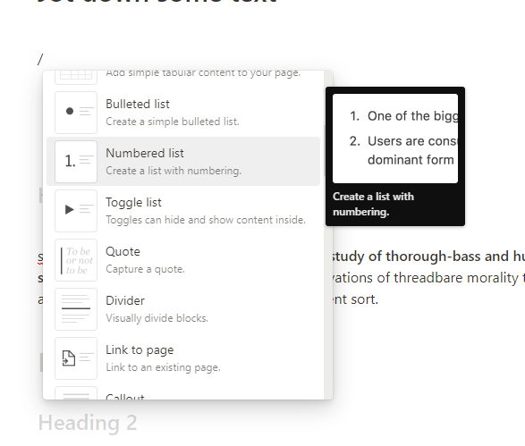
I was trying to do something similar to this in notion.
But i don't want the tooltip to appear immediately. Also I would like to put a link inside so I can click and navigate to other page. Not sure if Tooltip is the best primitive for this use case. |
|
Maybe a |
|
I tried with Here the demos: https://codesandbox.io/s/dreamy-williamson-hop03z?file=/App.js |
I think we need to distinguish between hovering and focusing here. Focusing something with the keyboard is not really the same as hovering over it with a mouse, and this behavior doesn't replicate in other components like buttons. In other components focusing and hovering are two different states and exhibit different behavior (e.g. different styling, delay vs instant tooltip). |
|
Sorry I guess I wasn't clear, it's by design in the dropdown that when you hover over a menu item that menu item is focused and because of that the tooltip opens instantly |
|
@joaom00 No, you were clear. My point was that in general, hovering does not cause UI elements to be focused (e.g. buttons), and so the intended design is unexpected and confusing. |
I feel that this rationale could apply just as well to my example of buttons. Take the Alert Dialog component, or the Navigation Menu components for example.
|

|
This is functioning as intended because hover means focus for menu items. |
|
For anybody looking for a way to work around this behavior in future, you can kinda get a delayed tooltip inside of a dropdown working by applying CSS animations which reveals the tooltip only after a delay. Radix still instantly mounts the tooltip, but it only appears after a bit. You'll probably want to wrap this in a component to apply the class names consistently, so it's kinda cumbersome, but it worked enough for us to get mostly unblocked on implementing a variant of the UX discussed in this issue. @keyframes fade-in {
from {
opacity: 0;
}
to {
opacity: 1;
}
}
[data-radix-menu-content] .TooltipContent {
&.--delayed {
&[data-state="instant-open"] {
opacity: 0;
animation-name: fade-in;
animation-fill-mode: forwards;
animation-delay: 500ms;
}
&[data-state="closed"] {
opacity: 0 !important;
}
}
} |
Bug report
Current Behavior
When combining DropdownMenuItem and Tooltip using
asChild, thedelayDurationproperty is ignored. The tooltip also hides as soon as the mouse approaches.demo.mp4
Expected behavior
The tooltip should appear after the configured number of seconds and it should not disappear while its hovered.
Reproducible example
CodeSandbox Template
Suggested solution
Probably controlling manually the visibility of the tooltip can be a workaround, but I don't think this is optimal.
Not sure what part of the code is affected, I've seen while debugging that instant-open property is set at the Tooltip.
Additional context
Maybe this also happen combining other primitives. I guess there is a strange behaviour combining DropdownMenuItem + Hover Card as well.
Your environment
The text was updated successfully, but these errors were encountered: