
import { List, ListItem } from 'react-native-elements'

const list = [
  {
    name: 'Amy Farha',
    avatar_url: 'https://s3.amazonaws.com/uifaces/faces/twitter/ladylexy/128.jpg',
    subtitle: 'Vice President'
  },
  {
    name: 'Chris Jackson',
    avatar_url: 'https://s3.amazonaws.com/uifaces/faces/twitter/adhamdannaway/128.jpg',
    subtitle: 'Vice Chairman'
  },
  ... // more items
]

<List containerStyle={{marginBottom: 20}}>
  {
    list.map((l, i) => (
      <ListItem
        roundAvatar
        avatar={{uri:l.avatar_url}}
        key={i}
        title={l.name}
      />
    ))
  }
</List>import { List, ListItem } from 'react-native-elements'
const list = [
{
title: 'Appointments',
icon: 'av-timer'
},
{
title: 'Trips',
icon: 'flight-takeoff'
},
... // more items
]
<List>
{
list.map((item, i) => (
<ListItem
key={i}
title={item.title}
leftIcon={{name: item.icon}}
/>
))
}
</List>import { List, ListItem } from 'react-native-elements'
const list = [
{
name: 'Amy Farha',
avatar_url: 'https://s3.amazonaws.com/uifaces/faces/twitter/ladylexy/128.jpg',
subtitle: 'Vice President'
},
{
name: 'Chris Jackson',
avatar_url: 'https://s3.amazonaws.com/uifaces/faces/twitter/adhamdannaway/128.jpg',
subtitle: 'Vice Chairman'
},
... // more items
]
renderRow (rowData, sectionID) {
return (
<ListItem
roundAvatar
key={sectionID}
title={rowData.name}
subtitle={rowData.subtitle}
avatar={{uri:rowData.avatar_url}}
/>
)
}
render () {
return (
<List>
<ListView
renderRow={this.renderRow}
dataSource={this.state.dataSource}
/>
</List>
)
}import { List, ListItem } from 'react-native-elements'
render () {
return (
<List>
<ListItem
roundAvatar
title='Limited supply! Its like digital gold!'
subtitle={
<View style={styles.subtitleView}>
<Image source={require('../images/rating.png')} style={styles.ratingImage}/>
<Text style={styles.ratingText}>5 months ago</Text>
</View>
}
avatar={require('../images/avatar1.jpg')}
/>
</List>
)
}
styles = StyleSheet.create({
subtitleView: {
flexDirection: 'row',
paddingLeft: 10,
paddingTop: 5
},
ratingImage: {
height: 19.21,
width: 100
},
ratingText: {
paddingLeft: 10,
color: 'grey'
}
})| prop | default | type | description |
|---|---|---|---|
| containerStyle | marginTop: 20, borderTopWidth: 1, borderBottomWidth: 1, borderBottomColor: #cbd2d9 | object (style) | style the list container |
| prop | default | type | description |
|---|---|---|---|
| avatar | none | object | left avatar (optional). Refer to React Native Image Source |
| avatarStyle | none | object (style) | avatar styling (optional) |
| chevronColor | #bdc6cf | string | set chevron color |
| component | View or TouchableHighlight if onPress method is added as prop | React Native element | replace element with custom element (optional) |
| containerStyle | none | object (style) | additional main container styling (optional) |
| wrapperStyle | none | object (style) | additional wrapper styling (optional) |
| underlayColor | white | string | define underlay color for TouchableHighlight (optional) |
| fontFamily | HelevticaNeue (iOS), Sans Serif (android) | string | specify different font family |
| hideChevron | false | boolean | set if you do not want a chevron (optional) |
| onPress | none | function | onPress method for link (optional) |
| onLongPress | none | function | onLongPress method for link (optional) |
| roundAvatar | false | boolean | make left avatar round |
| title | none | string, number or object | main title for list item, can be text or custom view (required) |
| titleNumberOfLines | 1 | number | Number of lines for Title |
| titleStyle | none | object (style) | additional title styling (optional) |
| titleContainerStyle | none | style (object) | provide styling for title container |
| subtitle | none | string, number or object | subtitle text or custom view (optional) |
| subtitleNumberOfLines | 1 | number | Number of lines for Subtitle |
| subtitleContainerStyle | none | style (object) | provide styling for subtitle container |
| subtitleStyle | none | object (style) | additional subtitle styling (optional ) |
| rightTitle | none | string | provide a rightTitle to have a title show up on the right side of the button |
| rightTitleNumberOfLines | 1 | number | Number of lines for Right Title |
| rightTitleContainerStyle | flex: 1, alignItems: 'flex-end', justifyContent: 'center' | object (style) | style the outer container of the rightTitle text |
| rightTitleStyle | marginRight: 5, color: '#bdc6cf' | object (style) | style the text of the rightTitle text |
| label | none | react native component | add a label with your own styling by providing a label={} prop to ListItem |
| leftIcon | none | object {name, color, style, type} (type defaults to material icons) OR React Native element |
icon configuration for left icon (optional) |
| leftIconOnPress | none | function | Attaches an onPress on left Icon |
| leftIconOnLongPress | none | function | Attaches an onLongPress on left Icon |
| leftIconUnderlayColor | string | white | Underlay color for left Icon |
| rightIcon | {name: 'chevron-right'} | object {name, color, style, type} (type defaults to material icons) OR React Native element |
icon configuration for right icon (optional). Shows up unless hideChevron is set |
| onPressRightIcon | none | function | Attaches an onPress on right Icon |
| switchButton | false | boolean | add a switch to the right side of your component |
| onSwitch | none | function | add a callback function when the switch is toggled |
| switchDisabled | boolean | If true the user won't be able to toggle the switch. Default value is false. | |
| switchOnTintColor | string | Background color when the switch is turned on. | |
| switchThumbTintColor | string | Color of the foreground switch grip. | |
| switchTintColor | string | Border color on iOS and background color on Android when the switch is turned off. | |
| switched | boolean | The value of the switch. If true the switch will be turned on. Default value is false. | |
| textInput | PropTypes.bool | Whether to have the right title area be an input text component. | |
| textInputAutoCapitalize | boolean | Can tell TextInput to automatically capitalize certain characters. | |
| textInputAutoCorrect | boolean | Can tell TextInput to automatically capitalize certain characters. | |
| textInputAutoFocus | boolean | If true, focuses the input on componentDidMount. The default value is false. | |
| textInputEditable | boolean | If false, text is not editable. The default value is true. | |
| textInputKeyboardType | string | Can be one of the following: 'default', 'email-address', 'numeric', 'phone-pad', 'ascii-capable', 'numbers-and-punctuation', 'url', 'number-pad', 'name-phone-pad', 'decimal-pad', 'twitter', 'web-search' | |
| textInputMaxLength | number | Limits the maximum number of characters that can be entered. | |
| textInputMultiline | boolean | If true, the text input can be multiple lines. The default value is false. | |
| textInputOnChangeText | function | Callback that is called when the text input's text changes. Changed text is passed as an argument to the callback handler. | |
| textInputOnFocus | function | Callback that is called when the text input is focused. | |
| textInputValue | string | Manually set value of the input | |
| textInputSecure | boolean | If true, obscures the text entered so that sensitive text like passwords stay secure. | |
| textInputStyle | object (style) | Style for the input text | |
| textInputContainerStyle | object (style) | Style for the container surrounding the input text | |
| textInputOnBlur | function | Callback that is called when the text input is blurred. | |
| textInputSelectTextOnFocus | boolean | If true, all text will automatically be selected on focus. | |
| textInputReturnKeyType | string | Determines how the return key should look. For more info see the React Native docs |
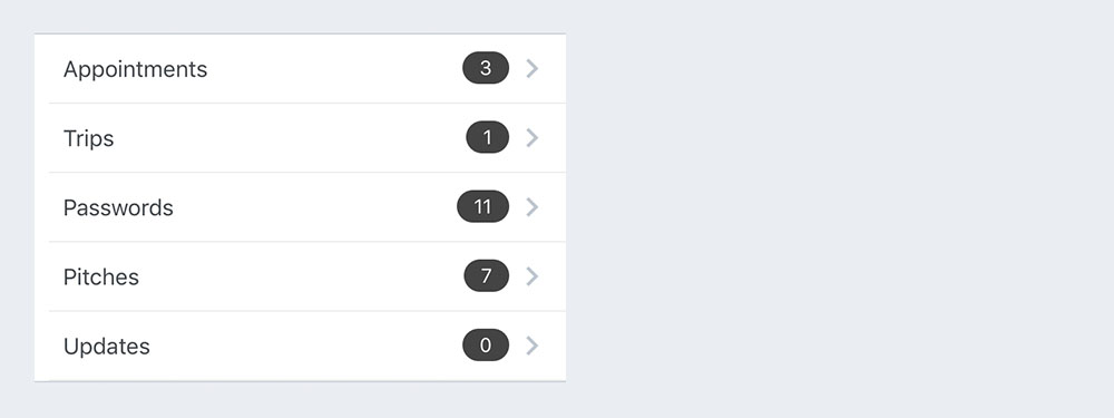
Example badge usage
<ListItem
  ...
  badge={{ value: 3, badgeTextStyle: { color: 'orange' }, badgeContainerStyle: { marginTop: -20 } }}
/>

<ListItem
  ...
  badge={{ element: <MyCustomElement> }}
/>| prop | default | type | description |
|---|---|---|---|
| badge | none | object, accepts the following properties: value (string), badgeContainerStyle (object), badgeTextStyle (object). You can override the default badge by providing your own component with it's own styling by providing badge={{ element: }} | add a badge to the ListItem by using this prop |