Traditional correlation heatmaps generated from Seaborn or Plotly are good at using color to distinguish positive from negative correlations. However, they aren't very good at drawing your eyes towards the strongest correlations. Especially with large datasets containing many variables, the chart gets cluttered with weak correlations that you don't care about.
Dynamically sized marks make large heatmaps like the one below far easier to read. Your eyes go straight to the most significant correlations.
import chart_tools as ct
df = ct.load_data('ames_mini')
ct.set_style(15)
ct.superheat(df.corr(), half_mask=False, mark_scale=8, grid=False);
Unfortunately, this chart is impossible to build with the "heatmap" or equivalent function provided in most popular graphing libraries, so instead, we have to build a scatterplot that looks and works like a heatmap. This is extremely awkward to do, and requires more code than anyone would normally want to write in their typical visualization workflow. Source code can be found here.
Important: Remember to place a semicolon at the end of the function call to avoid the "Figure size ..." annotation printout.
Required Parameters
corr: Correlation dataframe (usedf.corr()). Must have equal number of rows and columns.
Optional Parameters
title- str: Chart title. Default: Nonethresh_avg- float: Removes any variable whose average correlation to all others is below threshold. Default: Nonethresh_mask- float: Masks any individual correlations that are below threshold. Default: Nonehalf_mask- bool: Masks half the chart, hiding duplicate correlations. Default: Trueself_mask- bool: Masks correlations between variables and themself. Default: Truecbar- bool: Include colorbar. Default: Truemark_scale- int: Change the scale of all marks. Default: 5grid- bool: Show grid. Default: Truepalette- sns.diverging_palette: Color palette to use on marks. Default:(20, 220, n_colors)size- int: Set chart height and width. Default: Nonemarker- char: Marker shape. Default 's'. Click here for a list of all marker shapes.bar_ticks- int: Number of tick marks on color bar. Default: 5n_colors- int: Number of colors to include in color palette. Default: 128- **kwargs: Any additional keyword arguments will go to the matplotlib
plt.scatterfunction
Wrapper for
seaborn.set_theme()that applies defaults to save you time
Required Parameters - None
Optional Parameters
size- int or tuple: Declares chart size. Int will set width and height to the same value. Use tuple,(width, height)to set custom values. Default: 12
Parameters passed to sns.set_theme(), but with defaults
palette: str: Default: "pastel"style: str: Default: "whitegrid"font_scale: float: Default: 1.5- **kwargs: Any additional keyword arguments will go into
sns.set_theme()
All of the following examples will start with this code:
import chart_tools as ct
df = ct.load_data('ames_mini').drop(columns=['YrSold', 'Id', 'GarageCars', 'Fireplaces', 'ScreenPorch', 'BsmtUnfSF', 'Bathrooms'])set_style(): Easiest way to set chart size and apply a color preset. Pass an integer (like in the above example) to create a square, or pass a tuple, (width, height) for custom dimensions.
ct.set_style(10) # Sets charts to 10x10 square, with chart-tools defualt styling
ct.superheat(df.corr());
ct.set_style(6) # Decrease chart size to keep proportions
ct.superheat(df.corr(), thresh_avg=0.19);
ct.superheat(df.corr(), thresh_mask=0.19);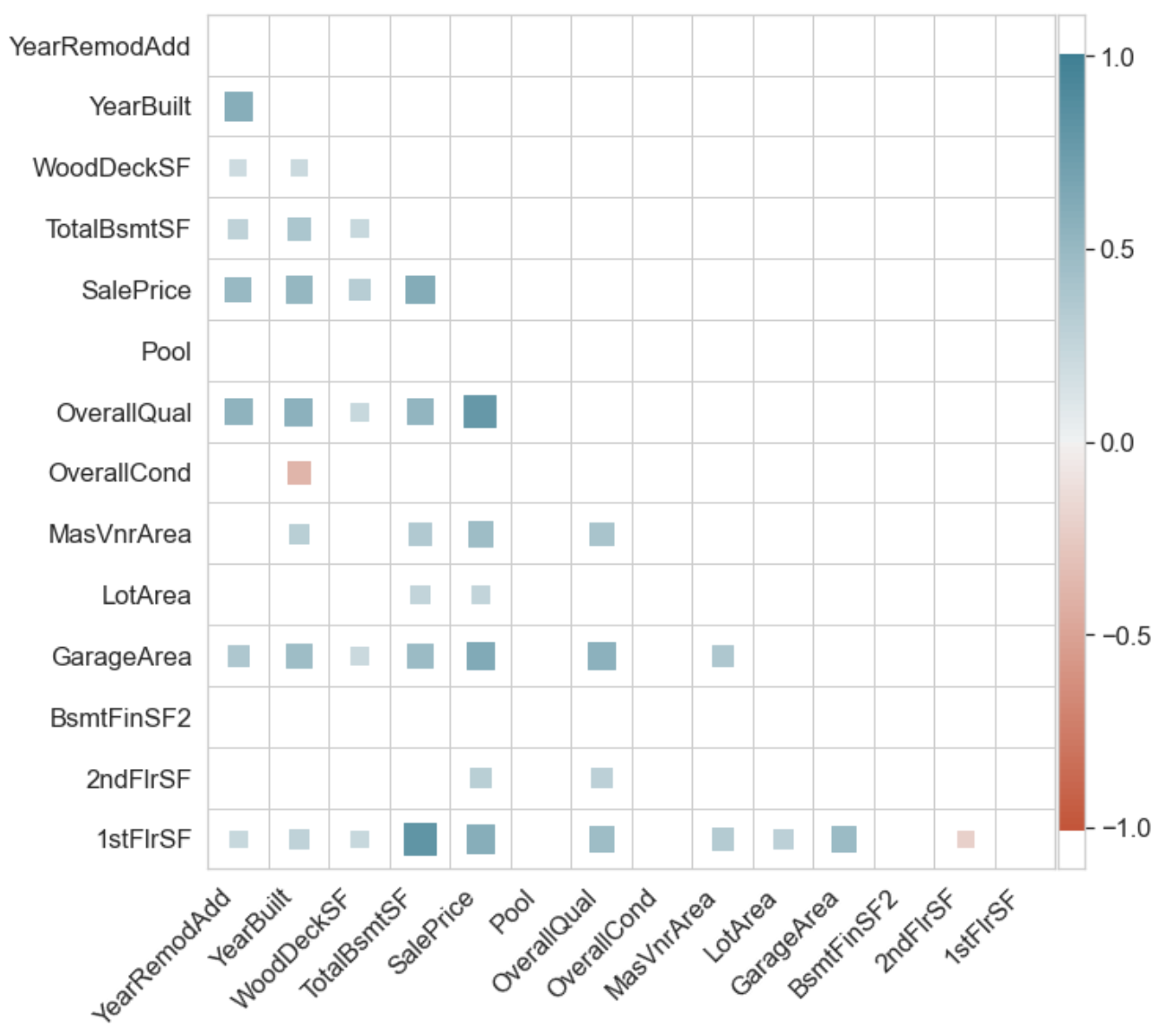
ct.superheat(df.corr(), half_mask=False);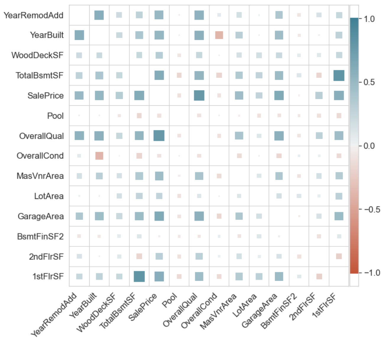
ct.superheat(df.corr(), self_mask=False);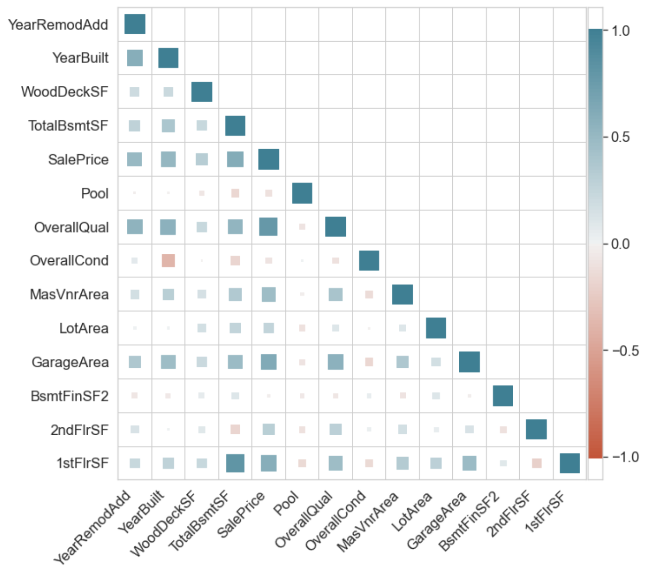
ct.superheat(df.corr(), marker='o');
ct.superheat(df.corr(), mark_scale=8); # Notice the marks are slightly larger. Default was 5
ct.superheat(df.corr(), n_colors=12); # Look at colorbar to see what's changed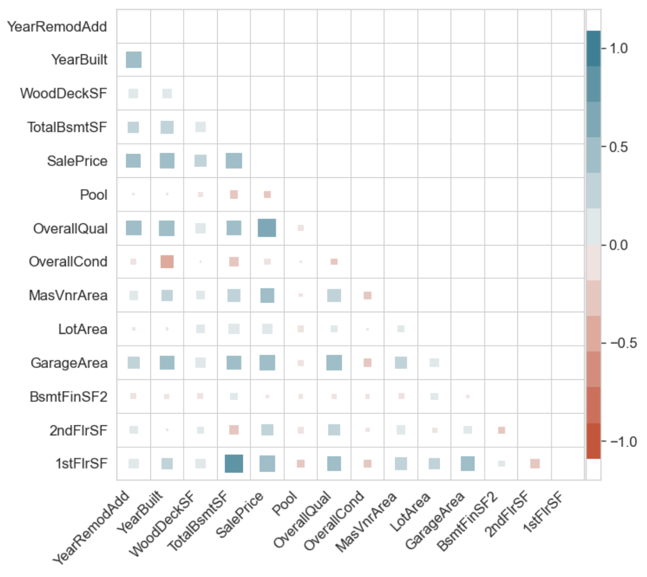
ct.superheat(df.corr(), grid=False, marker='o');
Because with a dataset this large, the less you see, the better
This function is based on Drazen Zaric's "Better Heatmaps" in this article, and his heatmaps package.