Custom Table in Block Content Example? #19
Comments
|
Note for reference, I've looked at the default TablePreview component included with the module, as well as tried several variations of preview components in the field definition for table. Here's our complete content schema definition import { TableWithCaptionPreview, ExperimentalTablePreview } from "../components/TablePreview"
/**
* This is the schema definition for the rich text fields used for
* for this studio. When you import it in schemas.js it can be
* reused in other parts of the studio with:
* {
* name: 'someName',
* title: 'Some title',
* type: 'blockContent'
* }
*/
export default {
title: 'Block Content',
name: 'blockContent',
type: 'array',
of: [
{
title: 'Block',
type: 'block',
// Styles let you set what your user can mark up blocks with. These
// correspond with HTML tags, but you can set any title or value
// you want and decide how you want to deal with it where you want to
// use your content.
styles: [
{ title: 'Normal', value: 'normal' },
{ title: 'H1', value: 'h1' },
{ title: 'H2', value: 'h2' },
{ title: 'H3', value: 'h3' },
{ title: 'H4', value: 'h4' },
{ title: 'Quote', value: 'blockquote' },
],
lists: [
{ title: 'Bullet', value: 'bullet' },
{ title: 'Number', value: 'number' }
],
// Marks let you mark up inline text in the block editor.
marks: {
// Decorators usually describe a single property – e.g. a typographic
// preference or highlighting by editors.
decorators: [
{ title: 'Strong', value: 'strong' },
{ title: 'Emphasis', value: 'em' },
{ title: 'Code', value: 'code' }
],
// Annotations can be any object structure – e.g. a link or a footnote.
annotations: [
{
name: 'link',
type: 'object',
title: 'Link',
fields: [
{
name: 'href',
type: 'url',
title: 'URL',
},
{
name: 'external',
title: 'External',
description: 'Is this an external link? i.e. a link to another site?',
type: 'boolean',
},
{
name: 'blank',
title: 'Open in new tab',
description: 'This option will force the link to open in a new tab.',
type: 'boolean',
},
],
},
{
name: 'internalLink',
type: 'object',
title: 'Internal link',
fields: [
{
name: 'reference',
type: 'reference',
title: 'Reference',
to: [
{ type: 'guide' },
// other types you may want to link to
],
weak: false,
},
],
icon: () => 'Ref'
},
],
},
},
// You can add additional types here. Note that you can't use
// primitive types such as 'string' and 'number' in the same array
// as a block type.
{
title: 'Table',
name: 'inlineTable',
type: 'object',
components: {
preview: TableWithCaptionPreview, // Add custom preview component
},
fields: [
{
name: 'table',
title: 'Table',
type: 'table', // Specify 'table' type
components: {
preview: ExperimentalTablePreview,
}
},
{
name: 'caption',
type: 'string',
title: 'Caption',
},
],
},
{
title: 'Image',
name: 'image',
type: 'image',
options: {
hotspot: true,
metadata: [
'blurhash', // Default: included
'lqip', // Default: included
'palette', // Default: included
'exif', // Default: not included
'location', // Default: not included
],
},
fields: [
{
name: 'caption',
type: 'string',
title: 'Caption',
},
{
// Editing this field will be hidden behind an "Edit"-button
name: 'alt',
type: 'string',
title: 'Alt text',
},
],
},
],
} |
 58bits
changed the title
58bits
changed the title
|
Lastly, a simple table component without any fields defined as ... {
title: 'Table',
name: 'inlineTable',
type: 'table',
},.. works fine but I'm not able to add my custom caption field as defined above. The above definitely works fine when editing, including the table and caption - but the preview does not. If I try to add a field to the 'table' type as show in this comment - for example as - {
title: 'Table',
name: 'inlineTable',
type: 'table',
fields: [
{
name: 'caption',
type: 'string',
title: 'Caption',
},
],
},I receive the following error... "Error: Cannot override Hope some of this helps. |
|
Okay - success - albeit hacky for now... Here's the composite table, caption type defined as an additional type in the 'blockContent' schema... {
title: 'Table',
name: 'inlineTable',
type: 'object',
components: {
preview: TableWithCaptionPreview, // Add custom preview component
},
fields: [
{
name: 'table',
title: 'Table',
type: 'table', // Specify 'table' type
},
{
name: 'caption',
type: 'string',
title: 'Caption',
},
],
preview: {
select: {
table: 'table',
caption: 'caption'
}
}
},What was missing was the preview select. And here's the import {TablePreview} from '@sanity/table'
import {PreviewProps} from 'sanity'
import type {TableRow} from '@sanity/table'
interface Table {
rows?: TableRow[]
title?: string
}
interface ValueProps {
table?: Table
caption?: string
}
export function TableWithCaptionPreview(props: ValueProps & PreviewProps) {
const {table, caption, title, ...rest} = props
const tablePreviewProps = {...rest, rows: table?.rows || []}
return (
<>
<TablePreview {...tablePreviewProps} />
<div style={{border: '1px solid green'}}>
<div className="caption">{caption}</div>
</div>
</>
)
}Hope this helps. |
|
could u share the complete example |
|
If you use the table type directly and later want to add custom settings (make an object block type) is there any way to get existing table cell content into the new structure??? |
Sanity.io is an amazing project - and we're all in - but sheesh - sometimes it's tough.
This is a good example.
The README for this plugin explains exactly how to use the @sanity/table plugin as a field. Excellent.
But we'd really like to give our editors a table in the block content editor - aka - portable text.
This is as far as I've gotten (definded in a blockContent definition file as an array with 'block' and 'types')...
Which appears in the editor as this...
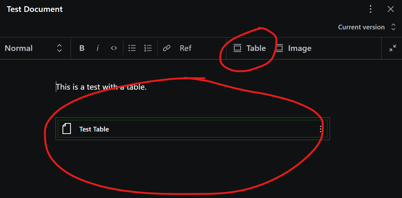
I have a very simple preview component
TablePreview- which simply wraps the object in a div and gives it a border for now...I'm totally okay with the concepts of portable text, and custom render components - but after reading the docs for a couple of hours now, I have absolutely no idea how to take this further and create a custom preview component in Studio, and custom render component (formerly serializers) in our published document.
Any suggestions, pointers, example code etc., greatly appreciated
The text was updated successfully, but these errors were encountered: