Better UI #2440
Comments
|
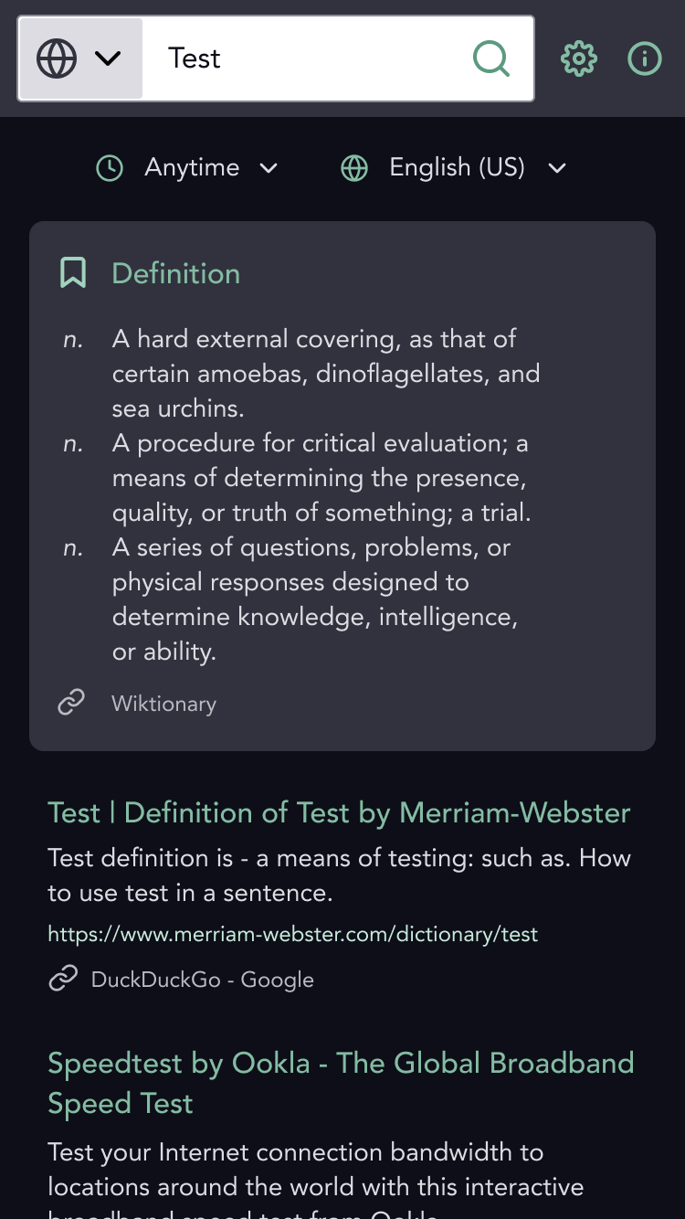
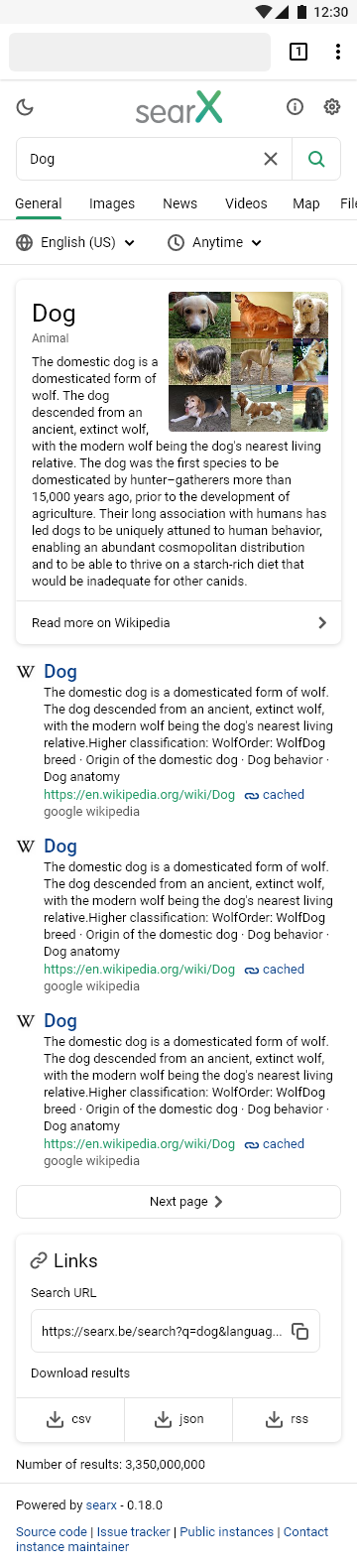
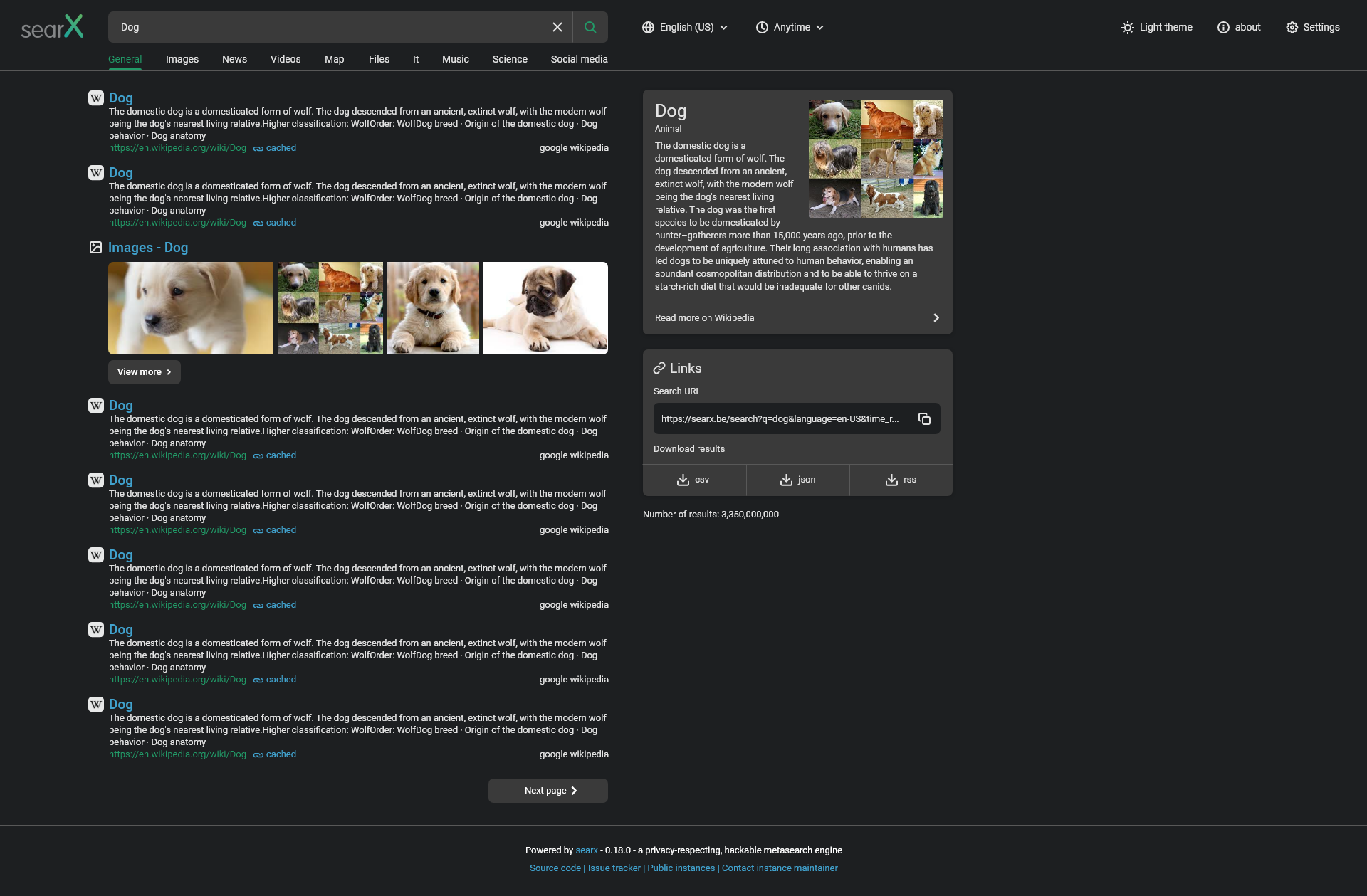
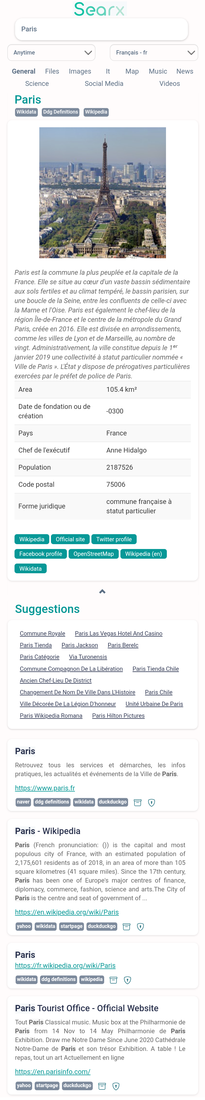
If you compare Penguin at Duckduckgo and Penguin at Searx,then you see a couple of things that in my opinion look better in Duckduckgo,here are the things from "general" I want: Now that is all I would like for "general" in Searx,now the images things I like more in Duckduckgo,here is how it looks in duckduckgo and here how it looks in Searx. "Video" for Duckduckgo and Searx: Now,how "news" look like for Duckduckgo and Searx. For "Maps", Duckduckgo and Searx. Now that are all the features I want from Duckduckgo and Google to Searx,but I also have some ui features from Searx that could be enhanced: For "files",all the things I want from "general" would be cool there too (so things like bigger boxes etc.) For "Science",all the things from "general". For "Social Media",I don't know,I can't say something about that,I just get that error if I search for a youtuber or something. For "Music",in Searx,it looks like this: So now that's all I would consider to look like a futuristic ui. |
|
I would be +1 to a theme option based around how DuckDuckGo looks. I also have suggested in the past user side appearance customization similar to how DuckDuckGo has. Font, font size, page width, center alignment, background color/background image, header behavior, header color, results colors, favicons, page break numbers, page break lines. The ability to add spaces between the tabs (General. files, images, etc) I think the ability for the user to customize in detail to their liking, without relying on the instance host to do so can create a personalized experience for them. I don't feel just having themes is enough. I do think some attempts at improving responsiveness would help immensely. Buttons feel flat and hovering over them feels doesn't feel like it. Maybe some highlighting when hovering over them. Some light animations. And the ability to store whatever can be in a way that makes it easy to copy to other instances, like thr search url. |
|
I think this thread topic is perfectly valid. However, describing exactly how to improve something aesthetic is pretty tough sometimes, but I think an easy way to do this is to create a simple design framework for your theme. This is basically a set of font styles, font sizes, colour values, font weights, open source icon library etc. And also turning various elements into repeatable components with considered padding, margins, etc. Ensuring things match accessibility requirements. I just spent 30 mins drawing up something new, with a layout based on the existing oscar theme, and whilst it still needs a lot of work, I think it's closer to what @Toadfield and @grravity are looking for. Desktop view
Mobile View
You should definitely find a designer (or multiple) that is willing to contribute to the project; to create a style guide for searx and prototypes of how new and existing features could work. |

|
@mattcoxonline Nice mockup! I wish we had some web designers working voluntarily for the project but those are hard to find, just like developers. If anyone knows one we would gladly accept a revamp of the oscar theme. |
|
What about allowing users to customize via css? As in just offer a css box for customization in preferences. |
|
Related to #226 |
|
@unixfox what do you think, should we better move this issue into discussions? I mean here are mentioned many things worth to consider, but not a real issue which can be fixed. |
|
Well it's a good feature request and from my point of view I still want to revamp of the Searx interface one day. So I would like to keep it as an issue. |
|
I would also like to suggest my version of the redesign. Made it based on two themes, probably more on the basis of a simple theme. I have made it more similar to popular search engines to not scare new users and be more user friendly. But also kept all the features. The only thing I removed was the advance settings button from the main page. It duplicates buttons and tabs from the results page and to my mind only confuses users. You can check out interactive prototypes here (you can click and drag): It still needs work, but even this will solve many problems. Update: I've added some new pages and edited a few things. Mobile light theme
Mobile dark theme
Desktop light theme
Desktop dark theme
|
|
Looks nice, I personally still like how DuckDuckGo does things where they give the end user a massive amount of customization options, while also offering them premade themes. I would like to add no matter which direction SearX takes though, I do hope we still maintain an option for a "legacy" theme. |
|
@BurlyMynah How does the image and video page look like with your theme? |
|
@Toadfield This is a concept, if developers want to implement it, I would be happy to do the rest of the pages. |
|
How about a design like that? It's the one I'm currently using |
|
Great suggestions! I personally prefer the mockup by @mattcoxonline, it is clean, minimal and well structured. I'd love to see an up-to-date the UI, but I am really untalented in UI/aesthetic topics, so I'd appreciate any help in the implementation. How should we proceed? What about a poll with the different mockups to see which one is preferred by the community? |
|
Could they not just be added as themes? |
more concepts should be presented, the 2 shown are good, but not optimal. |
|
Favicon support for search results would be awesome to improve the UI :) |
I'd like to volunteer Icon Horse for this, I built it for this very purpose. |
|
Hmm. I know one of the major criticisms of DuckDuckGo was how they retrieved favicons, (querying a server, potentially bad for privacy). |
This comment was marked as resolved.
This comment was marked as resolved.
|
Yandex does their image search page beautifully imo, the way the images pop out, and are organized are very nice, as is their menus when clicked on. I feel SearX could also use some light, smooth but fast animations options too. As far as themes in general, maybe we can get a community tab added to searx's main site where users can submit their themes, and users can browse and grab the source for their instance or something. |
I tried out searx cuase duckduckgo isn't open source and I only wanna use open source software,but the problem is that searx's ui doesn't look good,I tried all the themes,but it looks like an ancient search engine.
The text was updated successfully, but these errors were encountered: