Miscellaneous examples of bad and terrible statistics. This is neither a systematic collection of statistical errors nor a pillory for the sources from which the examples originated. The mistakes and problems outlined below are pretty common and I just happened to stumble across them in the publications I often read. The fact that you see a lot of bad examples from Swiss media outlets does not meand that Swiss journalists are particularly bad at statistics. It just means that I read Swiss newspapers more often than foreign ones.
Did you stumble across a good example for bad stats? Then send me an e-mail or a pull request with a quick explanation of why you believe it’s bad statistics.
Circles are bad for representing numbers as their area doubles with only a √2 increase of the radius:
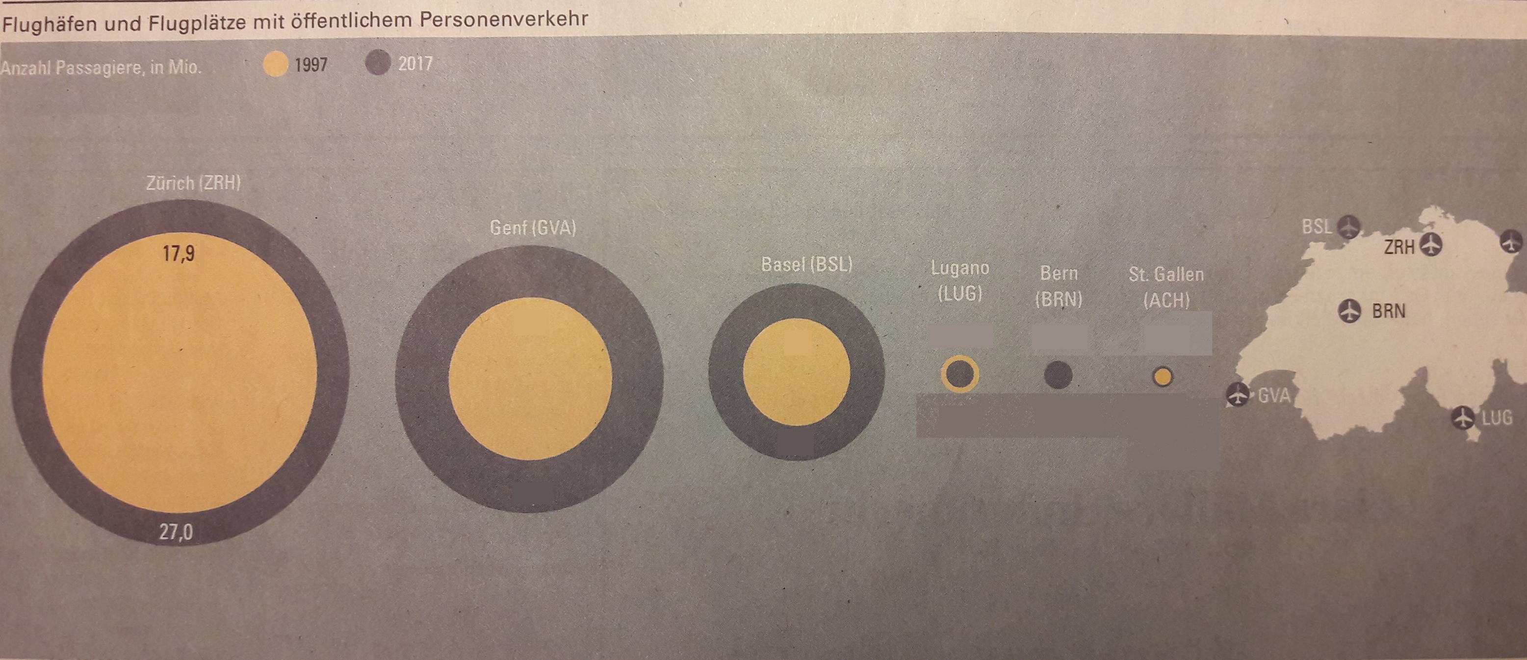
Image source: NZZ, "Die grossen Flugplätze wachsen, die kleinen schrumpfen"

Image source: Al Gore/TED 12:15
Incidentally, this is the reason why you should refrain from using pie charts in most scenarios.
When making comparisons between different units (population groups, countries etc.), it is important to pick the correct variables to compare them with each other.
In the following example, percentage of smokers in a countries are plotted against the price of a pack of cigarettes in those countries. At first glance, the plot seems to indicate that cigarette prices are not correlated to percentages of smokers in a country. However, the prices are not adjusted for purchasing power, hence making the comparison between the different countries pretty much pointless. After all, $5 for a pack of cigarettes might be not much for a Swiss smoker, but is rather expensive for a Tanzanian smoker.
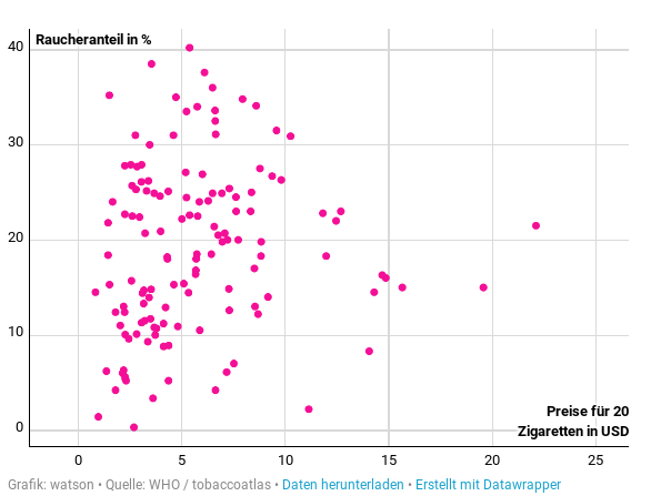
Image source: Watson, "Diese Weltkarte zeigt, in welchem Land am meisten geraucht wird"
Many scatter plots often contain a regression line to highlight the supposed trend of the data. Often, this comes down to a linear regression line---even in cases in which the data does not warrant a linear fit.
The following scatter plot shows the percentage of childern entering highschool in a given community plotted against the respective "Sozialindex", a metric used by the canton of Zurich to measure the social burden within a given community. The regression fit could be visibly improved if a quadratic and not a linear fit would be used.
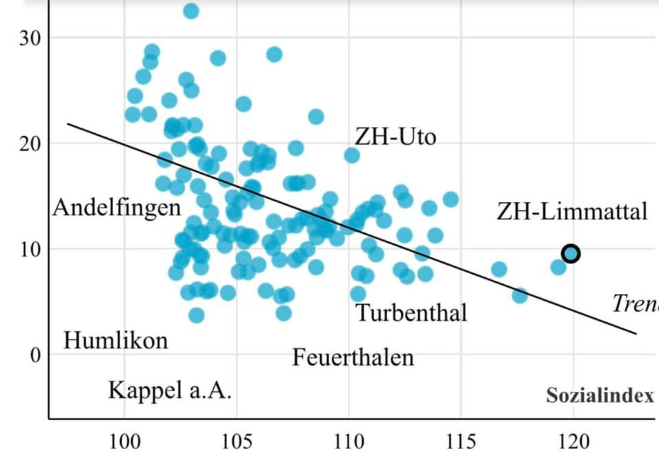
Image source: Tages-Anzeiger, "Wo es viele Kinder ans Gymi schaffen" / Philippe Wampfler via FB
For more terrible data visualisations, see WTF Visualisations