Sendbird UIKit for React

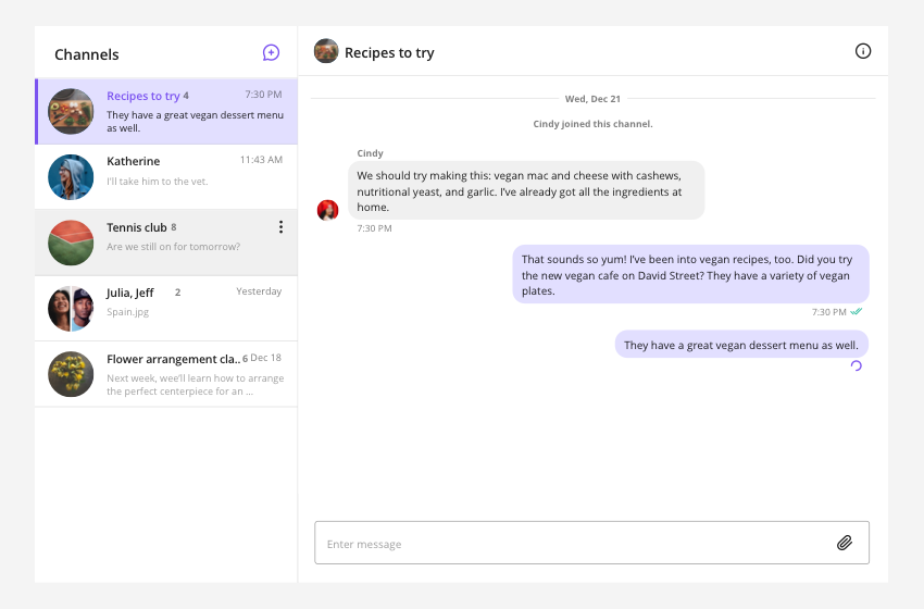
Sendbird UIKit for React is a development kit that enables fast and easy integration of standard chat features into new or existing applications. From the overall theme to individual styles such as colors and fonts, components can be fully customized to create an in-app chat experience unique to your brand identity.
Note: Currently, UIKit for React now supports both group channels and open channels.
- Easy installation
- Fully-featured chat with a minimal amount of code
- Customizable components, events, and views
- Customizable user list to enable chat among specified users
Find out more about Sendbird UIKit for React on UIKit for React doc. If you have any comments or questions regarding bugs and feature requests, visit Sendbird community.
This section shows the prerequisites you need to check to use Sendbird UIKit for React.
The minimum requirements for Sendbird UIKit for React are:
React 16.8.0+React DOM 16.8.0+Sendbird Chat SDK for JavaScript 3.0.115+css-vars-ponyfill 2.3.2date-fns 2.16.1
This section gives you information you need to get started with Sendbird UIKit for React.
Our sample app has all the core features of Sendbird UIKit for React. Download the app from our GitHub repository to get an idea of what you can build with the actual UIKit before building your own project.
Enter the following on the command line with npm to install Sendbird UIKit.
Note : The minimum requirements for UIKit must be installed on your system to use
npm.
npm install sendbird-uikit --saveor with yarn.
yarn add sendbird-uikitImplement UIKit to your web app by either using the App component or combining smart components to build a chat service customized to your needs.
import { SendBirdProvider, withSendBird, App ... } from "sendbird-uikit";
import "sendbird-uikit/dist/index.css";
To use the App component, add the following pattern:
import { App as SendBirdApp } from "sendbird-uikit";
import "sendbird-uikit/dist/index.css";

const App = () => (
    <Route id={'/chat'}>
        <App appId={appId} userId={userId} />
    </Route>
)
To use smart components, add the following pattern:
import {
    SendBirdProvider,
    ChannelList,
    ChannelSettings,
    Channel,
} from "sendbird-uikit";
import "sendbird-uikit/dist/index.css";

const App = () => (
    <SendBirdProvider>
        ... other components
        <Route id={'/chat'}>
            <LeftPane>
                <ChannelList onChannelSelect={channel => setCurrentChannel(channel.url)}/>
            </LeftPane>
            <CenterPane>
                <Switch case={currentChannel}>
                    <Route id={channelUrl1}>
                        <Channel channelUrl={channelUrl1} />
                    </Route>
                    <Route id={channelUrl2}>
                        <Channel channelUrl={channelUrl2} />
                    </Route>
                </Switch>
            </CenterPane>
            <RightPane>
                <ChannelSettings channelUrl={currentChannel} />
            </RightPane>
        </Route>
    </SendBirdProvider>
)
To show a list of channels or change channels based on routes, implement as below:
import {
    SendBirdProvider,
    ChannelList,
    Channel,
} from "sendbird-uikit";
import "sendbird-uikit/dist/index.css";

const App = () => {
    <SendBirdProvider appId={appId} userId={userId} ...>
        <Router>
            <Route>
                <Sidebar>
                    <Channel />
                </Sidebar>
                <Route id={yourApp/channelUrl1}>
                    <MainPanel>
                        <Channel channelUrl={yourApp/channelUrl1} />
                    </MainPanel>
                </Route>
                <Route id={yourApp/channelUrl2}>
                    <MainPanel>
                        <Channel channelUrl={yourApp/channelUrl2} />
                    </MainPanel>
                </Route>
            </Route>
            ...
        </Router>
    </SendBirdProvider>
}Here is a list of components included in the UIKit.
| Component | Description |
|---|---|
| SendBirdProvider | The context provider that stores Chat SDK for JavaScript and user information. |
| withSendBird | The higher-order component to access data from SendBirdProvider. |
| ChannelList | The UI component that renders channel components in a list. |
| Channel | The UI component that allows close interaction among a limited number of users. |
| ChannelSettings | The UI component that enables customized settings to be configured to each channel. |
| App | The app component that combines all of the above components. |
| Light Theme variables | Values | Dark Theme variables | Values |
|---|---|---|---|
--sendbird-light-primary-100 |
--sendbird-dark-primary-100 |
||
--sendbird-light-primary-200 |
--sendbird-dark-primary-200 |
||
--sendbird-light-primary-300 |
--sendbird-dark-primary-300 |
||
--sendbird-light-primary-400 |
--sendbird-dark-primary-400 |
||
--sendbird-light-primary-500 |
--sendbird-dark-primary-500 |
||
--sendbird-light-secondary-100 |
--sendbird-dark-secondary-100 |
||
--sendbird-light-secondary-200 |
--sendbird-dark-secondary-200 |
||
--sendbird-light-secondary-300 |
--sendbird-dark-secondary-300 |
||
--sendbird-light-secondary-400 |
--sendbird-dark-secondary-400 |
||
--sendbird-light-secondary-500 |
--sendbird-dark-secondary-500 |
||
--sendbird-light-information-100 |
--sendbird-dark-information-100 |
||
--sendbird-light-error-100 |
--sendbird-dark-error-100 |
||
--sendbird-light-error-200 |
--sendbird-dark-error-200 |
||
--sendbird-light-error-300 |
--sendbird-dark-error-300 |
||
--sendbird-light-error-400 |
--sendbird-dark-error-400 |
||
--sendbird-light-error-500 |
--sendbird-dark-error-500 |
||
--sendbird-light-background-50 |
--sendbird-dark-background-50 |
||
--sendbird-light-background-100 |
--sendbird-dark-background-100 |
||
--sendbird-light-background-200 |
--sendbird-dark-background-200 |
||
--sendbird-light-background-300 |
--sendbird-dark-background-300 |
||
--sendbird-light-background-400 |
--sendbird-dark-background-400 |
||
--sendbird-light-background-500 |
--sendbird-dark-background-500 |
||
--sendbird-light-background-600 |
--sendbird-dark-background-600 |
||
--sendbird-light-background-700 |
--sendbird-dark-background-700 |
||
--sendbird-light-overlay-01 |
 rgba(0, 0, 0, 0.55) rgba(0, 0, 0, 0.55) |
--sendbird-dark-overlay-01 |
rgba(0, 0, 0, 0.55) |
--sendbird-light-overlay-02 |
 rgba(0, 0, 0, 0.32) rgba(0, 0, 0, 0.32) |
--sendbird-dark-overlay-02 |
rgba(0, 0, 0, 0.32) |
--sendbird-light-onlight-01 |
 rgba(0, 0, 0, 0.88) rgba(0, 0, 0, 0.88) |
--sendbird-dark-onlight-01 |
rgba(0, 0, 0, 0.88) |
--sendbird-light-onlight-02 |
 rgba(0, 0, 0, 0.50) rgba(0, 0, 0, 0.50) |
--sendbird-dark-onlight-02 |
rgba(0, 0, 0, 0.50) |
--sendbird-light-onlight-03 |
 rgba(0, 0, 0, 0.38) rgba(0, 0, 0, 0.38) |
--sendbird-dark-onlight-03 |
rgba(0, 0, 0, 0.38) |
--sendbird-light-onlight-04 |
 rgba(0, 0, 0, 0.12) rgba(0, 0, 0, 0.12) |
--sendbird-dark-onlight-04 |
rgba(0, 0, 0, 0.12) |
--sendbird-light-ondark-01 |
 rgba(255, 255, 255, 0.88) rgba(255, 255, 255, 0.88) |
--sendbird-dark-ondark-01 |
rgba(255, 255, 255, 0.88) |
--sendbird-light-ondark-02 |
 rgba(255, 255, 255, 0.50) rgba(255, 255, 255, 0.50) |
--sendbird-dark-ondark-02 |
rgba(255, 255, 255, 0.50 |
--sendbird-light-ondark-03 |
 rgba(255, 255, 255, 0.38) rgba(255, 255, 255, 0.38) |
--sendbird-dark-ondark-03 |
rgba(255, 255, 255, 0.38) |
--sendbird-light-ondark-04 |
 rgba(255, 255, 255, 0.12) rgba(255, 255, 255, 0.12) |
--sendbird-dark-ondark-04 |
rgba(255, 255, 255, 0.12) |
--sendbird-light-shadow-message-input |
0 1px 5px 0 rgba(33, 34, 66, 0.12), 0 0 1px 0 rgba(33, 34, 66, 0.16), 0 2px 1px 0 rgba(33, 34, 66, 0.08), 0 1px 5px 0 rgba(0, 0, 0, 0.12) |
--sendbird-dark-shadow-message-input |
0 1px 5px 0 rgba(33, 34, 66, 0.12), 0 0 1px 0 rgba(33, 34, 66, 0.16), 0 2px 1px 0 rgba(33, 34, 66, 0.08), 0 1px 5px 0 rgba(0, 0, 0, 0.12) |
| Key | Value |
|---|---|
--sendbird-add-reaction-button-border-hover |
|
--sendbird-selected-reaction-button-border-hover |
|
--sendbird-iconbutton-color |
|
--sendbird-message-input-border-active |
|
--sendbird-tooltip-background |
|
--sendbird-tooltip-text-color |
rgba(255, 255, 255, 0.88) |
--sendbird-button-border-focus |
|
--sendbird-file-message-icon-background |
|
--sendbird-font-family-default |
'Open Sans', sans-serif |
--sendbird-message-balloon-width |
404px |