| Updated |
|---|
| July 17, 2017 |

Official Font:
- LL Circular + LL Brown https://lineto.com/The+Fonts/Font+Categories/Text+Fonts/Circular/
Note: It's not free, its price is around $930 (family package)
Alternatives:
- Lato https://fonts.google.com/specimen/Lato
- Futura https://www.myfonts.com/fonts/linotype/futura/
- Nunito https://fonts.google.com/specimen/Nunito
- Campton http://www.myfonts.com/fonts/rene-bieder/campton/
- Cabin https://fonts.google.com/specimen/Cabin
- Buttons
- Inputs
- Labels
- Navbar
- Subnav
- Others Components
- Helper classes
- Resources used
- Feedback
- Donate fo another ☕
- License
In order to override the default styles provided by Boostrap (if you are using it), it's necessary to use the class: .ma-btn, we recommend not to use the classes provided by Boostrap for the buttons since you would have style conflicts, and you would have to work extra trying to overwrite them.
The buttons have modifiers of type and size:
- Size:
--small, --default, --large, --block - Type:
--primary, --primary-without-bg, --secondary, --secondary-without-bg, --minimal
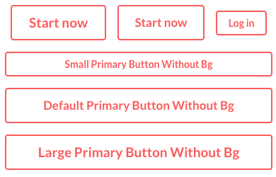
The modifier of a primary button is --primary which determines the buttons with the primary color of the project. Next to this modifier you can use size modifiers:

<button class="ma-btn ma-btn--small ma-btn--primary">Start Now</button>
<button class="ma-btn ma-btn--default ma-btn--primary">Start Now</button>
<button class="ma-btn ma-btn--large ma-btn--primary">Log in</button>
<button class="ma-btn ma-btn--small ma-btn--primary ma-btn--block">Small Primary Button</button>The modifier of a secondary button is --secondary which determines the buttons with the secondary color of the project. Next to this modifier you can use size modifiers:

<button class="ma-btn ma-btn--small ma-btn--secondary">Start Now</button>
<button class="ma-btn ma-btn--default ma-btn--secondary">Start Now</button>
<button class="ma-btn ma-btn--large ma-btn--secondary">Log in</button>
<button class="ma-btn ma-btn--small ma-btn--secondary ma-btn--block">Small Secondary Button</button>The modifier of a primary button without background is --primary-without-bg. Next to this modifier you can use size modifiers:
<button class="ma-btn ma-btn--small ma-btn--primary-without-bg">Start Now</button>
<button class="ma-btn ma-btn--default ma-btn--primary-without-bg">Start Now</button>
<button class="ma-btn ma-btn--large ma-btn--primary-without-bg">Log in</button>
<button class="ma-btn ma-btn--small ma-btn--primary-without-bg ma-btn--block">Small Primary Without Bg Button</button>The modifier of a secondary button without background is --secondary-without-bg. Next to this modifier you can use size modifiers:

<button class="ma-btn ma-btn--small ma-btn--secondary-without-bg">Start Now</button>
<button class="ma-btn ma-btn--default ma-btn--secondary-without-bg">Start Now</button>
<button class="ma-btn ma-btn--large ma-btn--secondary-without-bg">Log in</button>
<button class="ma-btn ma-btn--small ma-btn--secondary-without-bg ma-btn--block">Small Secondary Without Bg Button</button>The block buttons, are the ones that adapt their width dynamically, that is to say, they occupy the space from end to end inside the container in which they are, in other words, they do not have a fixed width.
To use this type of buttons, simply add the size modifier: --block, this will add a width of 100% and allow it adapt its width responsively.
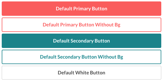
<button class="ma-btn ma-btn--default ma-btn--primary ma-btn--block">
	Default Primary Button
</button>There are also special types of buttons that have a special design and different from the traditional buttons. Among them, we have the Social Buttons (ma-btn--facebook, ma-btn--google) and Helpful buttons (ma-btn--helpful).
The social buttons are composed of the text and an icon allusive to the respective social network.
In addition, social buttons also have size modifiers: --small, --default y --large
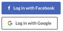
<! Default Facebook button >
<button class="ma-btn ma-btn--default ma-btn--facebook">
    <div class="ma-btn__content">
        <div class="ma-btn__content__icon-container">
            <i class="fa fa-facebook" aria-hidden="true"></i>
        </div>
        <div class="space-left-2">
            <span>Log in with Facebook</span>
        </div>
    </div>
</button>

<! Default Google button >
<button class="ma-btn ma-btn--default ma-btn--google">
    <div class="ma-btn__content">
        <div class="ma-btn__content__icon-container">
            <! Google icon SVG >
            <svg viewBox="0 0 18 18" role="presentation" aria-hidden="true" focusable="false" style="display: block; height: 18px; width: 18px;"><g fill="none" fill-rule="evenodd"><path d="M9 3.48c1.69 0 2.83.73 3.48 1.34l2.54-2.48C13.46.89 11.43 0 9 0 5.48 0 2.44 2.02.96 4.96l2.91 2.26C4.6 5.05 6.62 3.48 9 3.48z" fill="#EA4335"></path><path d="M17.64 9.2c0-.74-.06-1.28-.19-1.84H9v3.34h4.96c-.1.83-.64 2.08-1.84 2.92l2.84 2.2c1.7-1.57 2.68-3.88 2.68-6.62z" fill="#4285F4"></path><path d="M3.88 10.78A5.54 5.54 0 0 1 3.58 9c0-.62.11-1.22.29-1.78L.96 4.96A9.008 9.008 0 0 0 0 9c0 1.45.35 2.82.96 4.04l2.92-2.26z" fill="#FBBC05"></path><path d="M9 18c2.43 0 4.47-.8 5.96-2.18l-2.84-2.2c-.76.53-1.78.9-3.12.9-2.38 0-4.4-1.57-5.12-3.74L.97 13.04C2.45 15.98 5.48 18 9 18z" fill="#34A853"></path><path d="M0 0h18v18H0V0z"></path></g></svg>
        </div>
        <div class="space-left-2">
            <span>Log in with Google</span>
        </div>
    </div>
</button>The helpful buttons are buttons that Airbnb uses to rate the reviews and comments given by its users on the platform. It has a label and a counter.
In addition, the helpful buttons also have modifiers of type: --minimal, --primary y --secondary
So far we only include the size modifier: --small, later we'll work a little more in detail on this type of components, and we'll add more modifiers.
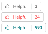
<! Minimal Helpful button >
<button class="ma-btn ma-btn--helpful ma-btn--helpful--small ma-btn--helpful--minimal">
    <span>
        <i class="fa fa-thumbs-o-up" aria-hidden="true"></i>
        <div class="ma-btn--helpful__text">Helpful</div>
        <div class="ma-btn--helpful__count">3</div>
    </span>
</button>

<! Primary Helpful button >
<button class="ma-btn ma-btn--helpful ma-btn--helpful--small ma-btn--helpful--primary">
    <span>
        <i class="fa fa-thumbs-o-up" aria-hidden="true"></i>
        <div class="ma-btn--helpful__text">Helpful</div>
        <div class="ma-btn--helpful__count">24</div>
    </span>
</button>

<! Secondary Helpful button >
<button class="ma-btn ma-btn--helpful ma-btn--helpful--small ma-btn--helpful--secondary">
    <span>
        <i class="fa fa-thumbs-o-up" aria-hidden="true"></i>
        <div class="ma-btn--helpful__text">Helpful</div>
        <div class="ma-btn--helpful__count">590</div>
    </span>
</button>The buttons have a modifier that allows us to change the styles to the disabled buttons easily. This does not require a modifier class, simply by setting the button to disabled, this will take the styles we have provided by default to the buttons disabled.
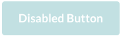
<button class="ma-btn ma-btn--default ma-btn--secondary" disabled>
    Disabled Button
</button>In order to override the default styles provided by Boostrap (if you are using it), you need to use: .ma-input, we recommend not to use the classes provided by Boostrap for the buttons since you would have style conflicts, and you would have to work extra trying to overwrite them.
The use very similar to the button component, the only difference is that they do not have modifiers of type, only of size:
- Size:
--small, --default, --large, --block

<! small input >
<input type="text" class="ma-input ma-input--small">

<! default input >
<input type="text" class="ma-input ma-input--default">

<! large input >
<input type="text" class="ma-input ma-input--large">

<! input with help text >
<input type="text" class="ma-input ma-input--default">
<p class="ma-p ma-p--small font-weight-normal space-top-1">
    The magical day you were dropped from the sky
    by a stork. We use this data for analysis and
    never share it with other users.
</p>
It also includes two very useful modifiers when adding validations to each field, these are: --invalid and disabled:
--invalid: By adding the--invalidmodifier, it will alter the colors of the input to show the user that he did not pass the validation required by the component:
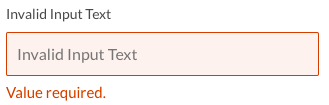
<input class="ma-input ma-input--default ma-input--invalid">
<p class="ma-p ma-p--small ma-p--alert font-weight-normal">
	Value required.
</p>disabled: This does not require a modifier class, simply by setting the input to disabled, this will take the styles we have provided by default to the inputs disabled.

<input class="ma-input ma-input--default" disabled>It's necessary for the Select and Textarea components to use the .ma-input class to inherit base classes from an input (e.g. focus effect, disabled, etc.).
The select component uses .ma-select as a base class, but the select component is a bit more complex in their structure, since they have a .ma-select-container (which is the one that will contain .ma-select and .ma-select-arrow).
The select component also have size modifier:
- Size:
--small, --default, --large, --block
Important note: .ma-select-containerand the .ma-select element must contain the same size modifier, that is, if .ma-select-container is --small, the child element .ma-select should also be --small and use the same modifier.
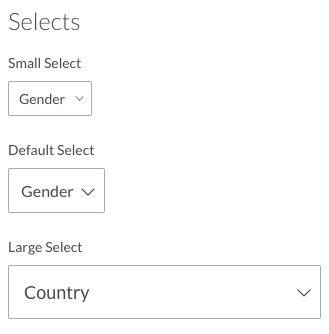
<! select container >
<div class="ma-select-container ma-select-container--small">

	<! select component >
	<select class="ma-input ma-select ma-select--small">
		<option value="" disabled selected>Gender</option>
		<option value="Male">Male</option>
		<option value="Female">Female</option>
		<option value="Other">Other</option>
	</select>

	<! arrow >
	<span class="ma-select-arrow">
		<i data-feather="chevron-down" class="ma-select-arrow__icon"></i>
	</span>

</div>
The select components also have modifier: --invalid and disabled.

<div class="ma-select-container ma-select-container--default">
	<select class="ma-input ma-select ma-select--default ma-select--invalid">
        <option value="" disabled selected>Language</option>
        <option value="Bahasa Indonesia">Bahasa Indonesia</option>
        <option value="Español">Español</option>
        <option value="English">English</option>
        <option value="Italiano">Italiano</option>
        <option value="Other">Other</option>
    </select>
    <span class="ma-select-arrow">
        <i data-feather="chevron-down" class="ma-select-arrow__icon"></i>
    </span>
</div>
<p class="ma-p ma-p--small ma-p--alert font-weight-normal space-top-1">
	Language required.
</p>
<div class="ma-select-container ma-select-container--default">
<select id="select5" class="ma-input ma-select ma-select--default" disabled>
<option value="" disabled selected>Language</option>
<option value="Bahasa Indonesia">Bahasa Indonesia</option>
<option value="Español">Español</option>
<option value="English">English</option>
<option value="Italiano">Italiano</option>
<option value="Other">Other</option>
</select>
<span class="ma-select-arrow">
<i data-feather="chevron-down" class="ma-select-arrow__icon"></i>
</span>
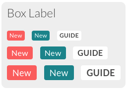
</div>Labels are tags generally used to highlight something, (e.g. a new section, you will be accustomed to place the tag NEW).
The main class of label is .ma-label, which are separated in two groups, the label simple --simple and label box --box, which have modifiers of type and size:
-
Size:
--small,--default,--large -
Type:
--primary,--secondary,--white(label box only)
Each modifier must be bound to its group, either --simple or --box, (e.g. --simple--small, --box--primary).
<! small primary label box >
<span class="ma-label ma-label--box ma-label--box--primary ma-label--box--small">New</span>

<! default secondary label box >
<span class="ma-label ma-label--box ma-label--box--secondary ma-label--box--default">New</span>

<! large white label box >
<span class="ma-label ma-label--box ma-label--box--white ma-label--box--large">New</span>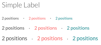
<! small primary simple label >
<div class="ma-label ma-label--simple ma-label--simple--primary ma-label--simple--small">2 positions</div>

<! default secondary simple label >
<div class="ma-label ma-label--simple ma-label--simple--secondary ma-label--simple--default">2 positions</div>

<! large simple label >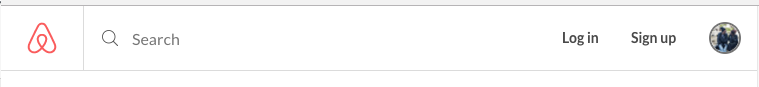
<div class="ma-label ma-label--simple ma-label--simple--large">2 positions</div>The navbar or header is the top bar that allows the user to have constant access to section like Edit Profile, Log in, Sign up, Setting, etc.
It has become a trend that many sites include a search bar in its header or navbar in order that users can more easily access the products or services that the site is offering.
To use this component we use the class: .ma-header, with the --large modifier for medium and large screens, and the modifier --small for small screens and small devices.
Within the navbar we can find: the logo, navigation buttons (e.g. Log in, Sign up, Edit Profile, etc.), and the search bar.
<header class="ma-header ma-header--large">

    <! Logo >
    <div class="ma-header__logo-container">
        <a class="link-reset">
            <div class="content">
                <div class="ma-logo temporal-logo">
                    <! your own logo >
                </div>
            </div>
        </a>
    </div>

    <! Search box >
    <div class="ma-header__search-container">
        <form class="form-content hidden-xs">
            <div class="ma-search-bar">
                <i class="ma-search-bar__icon" data-feather="search"></i>
                <label class="screen-reader-only" aria-hidden="true">Search</label>
                <input class="ma-search-bar__input" placeholder="Search" type="text">
            </div>
        </form>
    </div>

    <! Navigation Container >
    <div class="ma-header__nav-container">
        <nav>
            <ul class="ma-nav-list">
                <! Log in button >
                <li class="ma-nav-list__item">
                    <button class="ma-nav-list__item__btn">Log in</button>
                </li>
                <! Sign up button >
                <li class="ma-nav-list__item">
                    <button class="ma-nav-list__item__btn">Sign up</button>
                </li>
                <! Avatar button >
                <li>
                    <a class="ma-nav-list__item__btn link-reset" href>
                        <div class="content">
                            <div class="ma-avatar ma-avatar--tiny ma-avatar--border-minimal round">
                                <img width="32" height="32" src="path/to/avatar">
                            </div>
                        </div>
                    </a>
                </li>
            </ul>
        </nav>
    </div>

</header>
Subnav is a navigation bar that allows you to navigate within the same page, contains simpler options, and usually, it named: tabs.
We use the class: .ma-subnav to make use of this component, which is separated into two groups, the simple subnav and the subnav tabs.
To use a simple subnav you have to add the modifier --simple to the .ma-subnav class. To add a new subnav option, add a div element with the .ma-subnav__item class.

<! Subnav Simple >
<div class="ma-subnav ma-subnav--simple">
    <nav class="container">
        <div class="ma-subnav__item">
            <div class="content">
                <a href>Overview</a>
            </div>
        </div>

        <span class="space-right-1 space-left-1"> · </span>

        <div class="ma-subnav__item">
            <div class="content">
                <a href>Review</a>
            </div>
        </div>

        <span class="space-right-1 space-left-1"> · </span>

        <div class="ma-subnav__item">
            <div class="content">
                <a class="active" href>The Host</a>
            </div>
        </div>

        <span class="space-right-1 space-left-1"> · </span>

        <div class="ma-subnav__item">
            <div class="content">
                <a href>Location</a>
            </div>
        </div>

    </nav>
</div>To use a subnav tabs you have to add the modifier --tabs to the .ma-subnav class. To add a new subnav option, add a div element in the same way as in subnav simple.

<! Sub Nav Tabs >
<div class="ma-subnav ma-subnav--tabs">
    <nav class="container">
        <div class="ma-subnav__item space-right-4">
            <div class="content">
                <a class="link-reset" href>FOR YOU</a>
            </div>
        </div>

        <div class="ma-subnav__item space-right-4">
            <div class="content active">
                <a class="link-reset" href>HOMES</a>
            </div>
        </div>

        <div class="ma-subnav__item space-right-4">
            <div class="content">
                <a class="link-reset" href>EXPERIENCES</a>
            </div>
        </div>

        <div class="ma-subnav__item">
            <div class="content">
                <a class="link-reset" href>PLACES</a>
            </div>
        </div>

    </nav>
</div>There are components that we have not documented here, either by time or because they are so simple that it is not worth making this guide more extensive.
This is the list of other components that are included the Airbnb theme:
- Typograph
- Titles
- Paragraph
- Forms
- Basic form
- Horizontal form
- Checkbox
- Searchbox alternative
- Box component
- Rate stars
- Profile avatars
We have added some classes that save a lot of time and code lines, here are some of the helper classes that you will love:
.link-reset: reset base link styles (browser and boostrap styles)..margin-reset: Put your element with margin 0..padding-reset: Put your element with padding 0.
.space-*: Add bottom margin to the element (use from 1 to 10 scale: e.g..space-3)..space-top-*: Add top margin to the element (use from 1 to 10 scale: e.g..space-top-10)..space-left-*: Add left margin to the element (use from 1 to 10 scale: e.g..space-left-1)..space-right-*: Add right margin to the element (use from 1 to 10 scale: e.g..space-right-8).
.text-shadow: Add a subtle and cute text shadow..line-through: Add a line through text..text-italic: Add text italic style to the text with this class..strong: Add a font-weight of 700 to the text with this class..font-weight-normal: Reset the font weight to normal text.
.round: Round a element modifing its border radius to 50%..ma-separator: Add a cute separator line.
<hr class="ma-separator">To help make the project look much more professional and cute, we included the following third-party resources:
- feather icons: Beautiful open sources icons, really are so beautiful. https://feathericons.com/
- fontawesome: Well known open sources icons. http://fontawesome.io/
- google font: A set of fonts from google. For the Airbnb theme, we used 'Lato font family'. https://fonts.googleapis.com/css?family=Lato
Do not forget to sign up in our Steroidesign weekly newsletter to receives the updates about this theme and news about new themes.
Any suggestion you have, or if you want to contribute some help, idea or improvement you can write us to our twitter: @rosa7082 & @seruda, do not hesitate to follow us and receive all the updates weekly by subscribing to our newsletter. Weekly we'll be uploading theme updates and new themes.

Important: Themes are not a copy, we write styles and structure from scratch, based on our own file structure and our own way of organizing styles (based n the BEM methodology), what we want with this is to create a 'skeleton' that can be used, edited, modified and replaced in any project.
We are not responsible for misinterpretation or inappropriate use of this content and information. In the same way, we will not be responsible for the damages caused directly or indirectly by the using of this material. In no way are we liable for the consequences of the improper or negligent use of this material.