Support "Next" and "Previous" button labels in Paginator #710
Comments
 MarthinusBosman
added
the
feature request
MarthinusBosman
changed the title
MarthinusBosman
added
the
feature request
MarthinusBosman
changed the title
@MarthinusBosman I'm going to ask you keep your feedback kind and constructive. Everyone here is a volunteer. Remember the folks building this are people. Please treat their work with respect. ;) That said, I agree with your point and I think this is something we can support. We offer similar solutions in other components to support translation to other languages. I don't think this will be a problem to add. I'll also remind you this is open source, so a PR is welcome! Here's a reference to draw from if someone gets to this before me: |
endigo9740
added
good first issue
|
Hay sorry, updated the issue to remove "comes off as ugly". I'll try and get a PR in for this myself tomorrow. |
|
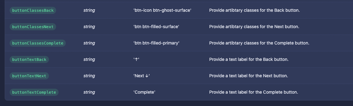
No worries, I appreciate the edit. It's my work you were talking about and I've got thick skin heh. But we definitely don't want to discourage other folks. I'm actually working through small issues this afternoon so I've just updated to include these changes: Paginator
Note I've also replaced the hardcoded "Amount" text in the select drop down, so it now read "X Items" by default. Plus I replaced Stepper
Additionally I expanded the way the classes are set per buttons on both components, which provides a lot more customization. These changes be merged into dev branch shortly. Expect to see them in the next release. Thanks! |

Describe what feature you'd like. Pseudo-code, mockups, or screenshots of similar solutions are encouraged!
The Paginator component has a few built-in buttons for "previous" and "next" that just have left and right arrows defined as default, with no built in way to override them.
Either have optional slots for
previousandnext, with theon:clickfunctionality moved to a parent div, or I guess another solution would be to just add optional props to Paginator to specify the label of each button.This is also an issue for the buttons for Steppers. If there was an opinionated icon system, then fine you could use that, but the literal ↓↑→← arrows should definitely be override-able without doing some sort of workaround.
With class overrides already supported for all these, I think being able to just override the label would be a satisfying solution instead of needing a slot for it, which seems like overkill.
What type of pull request would this be?
Enhancement
Any links to similar examples or other references we should review?
No response
The text was updated successfully, but these errors were encountered: