feat(docs): add usage example with Tooltip for the actionable elements #1636
Conversation
 mnajdova
requested review from
dvdzkwsk,
kuzhelov,
layershifter,
levithomason and
miroslavstastny
as code owners
mnajdova
requested review from
dvdzkwsk,
kuzhelov,
layershifter,
levithomason and
miroslavstastny
as code owners
Codecov Report
@@           Coverage Diff           @@
##           master    #1636   +/-   ##
=======================================
  Coverage   71.28%   71.28%
=======================================
  Files         852      852
  Lines        7045     7045
  Branches     2029     2008   -21
=======================================
  Hits         5022     5022
  Misses       2017     2017
  Partials        6        6
Continue to review full report at Codecov.
|

docs/src/examples/components/Toolbar/Usage/ToolbarExampleWithTooltip.shorthand.tsx
Show resolved
Hide resolved
I think |
|
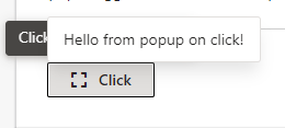
@sophieH29 I tried adding example for the Popup with tooltip, but it seems that accessibility is broken in this case: With escape, the tooltip is only closed, we cannot close the Popup with escape... Not sure if we should add this example until we have working solution. Here is the code I tried: |
|
As oppose to the prev comment for the issues of the |
There was a problem hiding this comment.
Let's solve Popup and Tooltip attached to the same trigger in a separate issue, discussing desired behavior first. As you described, accessibility is broken and there are some other problems I have found so far:
PopupandTooltipare not spreading props to trigger- both have
z-index: 1000, my gut feeling is Tooltip should have higher z-index than Popup
-updated changelog
|
Thanks everyone, will add steps for the new screens and will merge it |
This PR is adding usage example for the
Button,MenuItemandToolbarItemcomponents for usingTooltipOpen questions:
Should we add tooltip for the disabled elements? - there is an example of this in the Toolbar example
Should we add tooltip examples of any other components, like Slider, or Popup and Dialog - as they have usually Button as a trigger