This repository has been archived by the owner on Mar 4, 2020. It is now read-only.
feat(Button): add loading prop #1662
Merged
Conversation
This file contains bidirectional Unicode text that may be interpreted or compiled differently than what appears below. To review, open the file in an editor that reveals hidden Unicode characters.
Learn more about bidirectional Unicode characters
 mnajdova
requested review from
dvdzkwsk,
kuzhelov,
layershifter,
levithomason and
miroslavstastny
as code owners
mnajdova
requested review from
dvdzkwsk,
kuzhelov,
layershifter,
levithomason and
miroslavstastny
as code owners
Codecov Report
@@            Coverage Diff             @@
##           master    #1662      +/-   ##
==========================================
- Coverage   71.28%   71.25%   -0.03%
==========================================
  Files         852      852
  Lines        7045     7049       +4
  Branches     2008     2033      +25
==========================================
+ Hits         5022     5023       +1
- Misses       2017     2020       +3
  Partials        6        6
Continue to review full report at Codecov.
|

Codecov Report
@@            Coverage Diff             @@
##           master    #1662      +/-   ##
==========================================
- Coverage   69.89%   69.76%   -0.13%
==========================================
  Files         867      867
  Lines        7338     7353      +15
  Branches     2147     2158      +11
==========================================
+ Hits         5129     5130       +1
- Misses       2201     2215      +14
  Partials        8        8
Continue to review full report at Codecov.
|
mnajdova
changed the title
mnajdova
commented
Jul 23, 2019
mnajdova
commented
Jul 23, 2019
docs/src/examples/components/Button/States/ButtonExampleLoading.shorthand.tsx
Show resolved
Hide resolved
added 2 commits
July 26, 2019 14:02
-improved styles in the teams theme
added 2 commits
August 8, 2019 12:04
# Conflicts:
#	packages/react/src/components/Button/Button.tsx
#	packages/react/src/themes/teams/components/Button/buttonStyles.ts
packages/react/src/lib/accessibility/Behaviors/Loader/loaderBehavior.ts
Outdated
Show resolved
Hide resolved
layershifter
approved these changes
Aug 9, 2019
Sign up for free
to subscribe to this conversation on GitHub.
Already have an account?
Sign in.
Add this suggestion to a batch that can be applied as a single commit.
This suggestion is invalid because no changes were made to the code.
Suggestions cannot be applied while the pull request is closed.
Suggestions cannot be applied while viewing a subset of changes.
Only one suggestion per line can be applied in a batch.
Add this suggestion to a batch that can be applied as a single commit.
Applying suggestions on deleted lines is not supported.
You must change the existing code in this line in order to create a valid suggestion.
Outdated suggestions cannot be applied.
This suggestion has been applied or marked resolved.
Suggestions cannot be applied from pending reviews.
Suggestions cannot be applied on multi-line comments.
Suggestions cannot be applied while the pull request is queued to merge.
Suggestion cannot be applied right now. Please check back later.
We need to allow user to define loading state of the Buttons. This is a common thing already defined in many UI libraries, like:
Usually, the way it is implemented is, either with showing the loader indicator before the content of the button, or replacing the content of the button with loader:
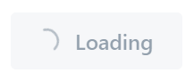
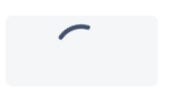
In Teams theme, we need the first behavior - showing the loader indicator before the content (instead of the icon).
Proposed API
For showing the loading indicator, we may add
loadingprop in the Button component, that will show the indicator before the content.Furthermore, if we want to allow the users to customize this, we may add loaderPosition:
'start' | 'end' | 'center', which will position the loader before, after the content, or replace it if center is provided. Not sure if we want to add this right-away, but it's just an idea of how we may extend the API in the future.Alternative API
As we already have the icon slot, we may reuse that slot for rendering the
Loadercomponent if the loading prop is introduced. Some open questions here are, whether we want to change the component rendered there, in means of instead ofIcon.create(...), should we haveLoader.create(...)and this applies then, do we want to reuse the icon slot for theLoader's props as well, or introduce additional slot here...In the styles, conditionally we may apply different margins if the loading prop is provided, but at least the anatomy of the component will be clear.
Blockers
Currently this is blocked by the Loader component, as we don't have two variations for the loader that we may use for default and primary Button. The issues is tracked here: #1663