Text widget in Supervisely is used to display text with different styles, such as "text", "info", "success", "warning", or "error". Content and style of the text can be easily changed drom code. The Text widget is useful for presenting informative messages or status updates to users, and can be combined with other widgets to create more complex interfaces.
Text(
    text=None,
    status="text",
    widget_id=None,
)
| Parameters | Type | Description |
|---|---|---|
text |
str |
Determine displayed text |
status |
Literal["text", "info", "success", "warning", "error"] |
Message status |
color |
str |
Text color in hex format |
font_size |
int |
Size of the font in pixels |
widget_id |
str |
ID of the widget |
Determine displayed text.
type: str
default value: None
text = Text(text="My text")Text status.
type: str
default value: text
text = Text(text="My text", status="text")
text_info = Text(text="My info text", status="info")
text_success = Text(text="My success text", status="success")
text_warning = Text(text="My warning text", status="warning")
text_error = Text(text="My error text", status="error")
Text color in hex format.
type: str
default value: None
colored_text = Text(
    text="Yellow",
    status="text",
    color="#FFC107",
    font_size=22,
)
Size of the font in pixels.
type: int
default value: 14
text14 = Text(text="Font size: 14", status="text", font_size=14)
text32 = Text(text="Font size: 32", status="text", font_size=32)
ID of the widget.
type: str
default value: None
| Attributes and Methods | Description |
|---|---|
text |
Get or set text property. |
status |
Get or set status property. |
color |
Get or set color property. |
set() |
Set text value and status to widget. |
You can find this example in our Github repository:
ui-widgets-demos/text elements/001_text/src/main.py
import os

import supervisely as sly
from dotenv import load_dotenv
from supervisely.app.widgets import Button, Card, Container, Text
Init API for communicating with Supervisely Instance. First, we load environment variables with credentials:
load_dotenv("local.env")
load_dotenv(os.path.expanduser("~/supervisely.env"))
api = sly.Api()button_show_text = Button(
text="Text",
button_type="primary",
button_size="small",
icon="zmdi zmdi-comment-text",
)
button_show_info = Button(
text="Info",
button_type="info",
button_size="small",
icon="zmdi zmdi-info-outline",
)
button_show_success = Button(
text="Success",
button_type="success",
button_size="small",
icon="zmdi zmdi-check",
)
button_show_warning = Button(
text="Warning",
button_type="warning",
button_size="small",
icon="zmdi zmdi-alert-circle-o",
)
button_show_error = Button(
text="Error",
button_type="danger",
button_size="small",
icon="zmdi zmdi-minus-circle-outline",
)Create Container widget for all buttons.
buttons_container = Container(
    widgets=[
        button_show_text,
        button_show_info,
        button_show_success,
        button_show_warning,
        button_show_error,
    ],
    direction="horizontal",
)text = Text(
text="Lorem ipsum dolor sit amet... anim id est laborum.",
status="text",
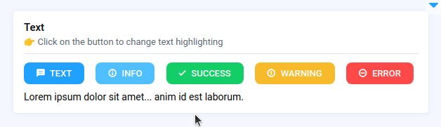
)Prepare a layout for app using Card widget with the content parameter and place 2 widgets that we've just created in the Container widget. Place order in the Container is important, we want the message text to be displayed below the buttons.
card = Card(
    title="Text",
    description="👉 Click on the button to change text highlighting",
    content=Container(widgets=[buttons_container, text]),
)
layout = Container(widgets=[card], direction="vertical")
Create an app object with layout parameter.
app = sly.Application(layout=layout)Our app layout is ready.
Use the decorator as shown below to handle button click. Text will be updating it status after pressing corresponding button.
@button_show_text.click
def show_text():
text.status = "text"@button_show_info.click
def show_info():
text.status = "info"@button_show_success.click
def show_success():
text.status = "success"@button_show_warning.click
def show_warning():
text.status = "warning"@button_show_error.click
def show_error():
text.status = "error"