Selected/Diff highlight is hard to read #34
Comments
|
No idea how you got that but I cannot reproduce it with any variant of the theme, make sure you don't have something interfering with it. Also running on 2022.2.3 Build #IU-222.4345.14, built on October 5, 2022 with Catppuccin 2.0.3 Frappé
Macchiato
Mocha
That is the purpose of a palette and ports related to it, yep |


|
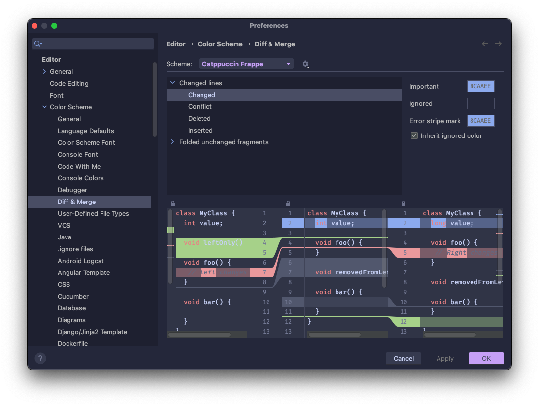
@kkrypt0nn thank krypt, I get problem only with Frappe, other variants seem to be fine, could you please share your Color Scheme of DIff & Merge?
|

|
Sure thing, these are the settings for Frappé that I have after installing the plugin: Changed linesChanges
Conflict
Deleted
Inserted
Folded unchanged fragmentsBackground
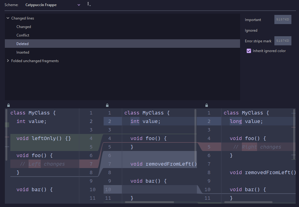
I've updated in the meantime to 2.0.4, maybe you can try to do that and see if it fixes your issue. |


|
I noticed that the color scheme name of mine is different than yours, at first. It's was bold and violet.
I then tried to reset the scheme to default and everything is fine now.
It's weird that uninstalling/reinstalling the plugin doesn't fix the scheme, we need to explicitly reset it to default. |


Catppuccin plugin version: 2.0.3
IntelliJ IDEA 2022.2.3 - Build #IU-222.4345.14
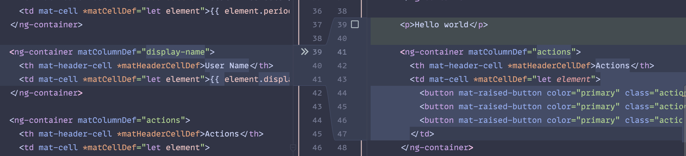
This is screenshot from my project's Diff Viewer.
Do we need to strictly stick to Catppuccin's pallete?
The text was updated successfully, but these errors were encountered: