functional and modern harmonious vehicle popup #4879
Comments
|
Doesn't this only solve problem when attribute is too long and gets wrapped on the next line? Like address, for example. |
|
it's just a suggestion of the layout, the attributes would have to be repositioned, it would be better because it wouldn't cover the map vertically as the attributes increase in the popup |
|
Re-positioned? You mean multiple columns? |
|
focusing only on the popup, it would be something like this but it doesn't need to support as many attributes but a larger amount than the standard format without compromising the visibility of the map or attributes
|
|
It's supposed to be a previews with a small number of details. You shouldn't include a large number of attributes there. We have a separate screen if you want to see everything. |
|
I just see that it would be much more modern and functional by simplifying the immediate visualization of what is needed, both on the map and some more attributes to be added but ok I will try to implement this for my use |
|
Can you please example "much more modern" a bit more. |
|
in terms of information readily displayed on the screen without much need to open menus, submenus or keep clicking buttons with links to other pages. The fleet managers I talk to want that. I believe that modernization should also bring |
|
There's always a balance between simplicity and displaying information. You can't say that displaying everything is better in every single case. Anyway, let's see what other think. Maybe it make sense to split the popup at least into 2 columns. |
|
yes, it could be one just for the address and one or two more for other information Thank you for your attention Anton |
|
Hi! |
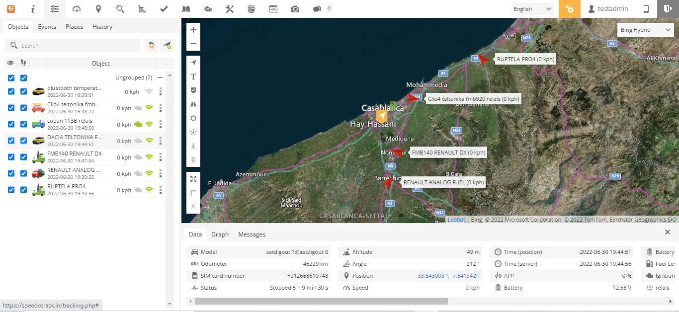
The vehicle popup is good at first but if we add more attributes it gets much bigger obstructing the view of the map and vehicles.
A horizontal popup like the link image will be much better, allowing you to place more attributes without compromising visibility in addition to giving the new interface a more modern look, as this is the proposal.
https://uploaddeimagens.com.br/imagens/wl0ZaEo
The text was updated successfully, but these errors were encountered: