Choice of Accent color may not be ideal on macOS #2205
Comments
|
OK, so this is actually because the system tint is "multicolour" (https://512pixels.net/2020/11/big-sur-accent-highlight-colors/). But is it a deliberate choice of Transmission to go for “bright red” as a preferred tint? In dark mode in particular, it really sticks out. |
|
But is it a deliberate choice of Transmission to go for “bright red” as a preferred tint? |
|
I've been editing the plist file for months, to the extent that I don't even close the document window because another build will be around the corner, the cursor even appears at the correct position in line 92 - Adjust, save, quit, reopen....
|

|
I believe crimson red is Transmission's signature color, if you look at the website and t-handle on the icon. Whether it's a good choice for the UI I'll let @livings124 weigh in. |
|
Um, as someone with a lot of experience with accessibility, it's not. |
|
For some UI elements, like the "magnet", red on red becomes almost invisible… |
|
I thought this red would be a nice tint color, but sounds like I might be in the minority here. Thoughts on what would be a better tint color (would need one for light mode and one for dark mode). |
|
I checked and most apps I have on my laptop specify no specific tint color, which is allowed and defaults to “blue” (i.e., same as pre-macOS 11). |
|
In a former life I was part of my country's web standards setting and implementation across government. Simply, white on black text is still the best and the default should be monochromatic. If that's too rough? An even darker blue for increased contrast with the white text. I'd love a monochrome version where the highlight colour on the mac is black, and then in night mode it is white. While we're on the subject, can someone, perhaps @ckerr or @nevack politely ask for this man's code for increasing and decreasing font sizes? He's done a lovely job with complex text and an inspector panel like Transmission's. I'm often squinting on my Macbook Air. @livings124 One of the many reasons not to use red https://en.wikipedia.org/wiki/Color_blindness |
|
Black tint for highlights is not one of the “standard” choices of macOS, and might be weird to users. It also would need to redo some icons, which have black element and would become almost invisible on a black background:
|

|
To be fair, the main menu does this already (black and white) without a highlight colour, and each of those windows in the inspector is completely unique. For example, I am never confused between the views of each of those options when clicking on them, they are all unique data views. Another thought, something i just noticed and could be helpful with what we are discussing, there is no text popup when the mouse hovers over each of those options in the inspector menu as there is with the main menu. |

|
Speaking of hover-data, is this useful any longer? Bytes?
Could someone please put me in touch with whomever designs or designed the icons for the main window and inspector for MacOS? |

Icons can be updated with SFSymbols, like it was done for other placed when updated to Big Sur |
|
First tab could be
Second one is harder to find. Maybe a puzzle piece?
Third one could be
Fourth could be
Fifth could be
And sixth
|


|
I recommend opening a new ticket if you don't want this icon discussion lost. Re: ascent color, I'm open for other colors, but using black and white seems less like an accent color that matches the branding of Transmission (the designed intent of ascent colors) and more like a hack around theming the system towards personal ascetics. |
I think it's possible to use different shades of accent color for different situations. I agree that branding is important, but we can change color for situations when this color attracts too much attention. Maybe it's better to use another marker for selected rows? Like some border, dot, checkmark, etc. |
You can select one color for light mode and one for dark (and they should be roughly the same, just adjusted slightly to match light/dark elements).
Nope, not how ascent color works. A single color (per light/dark mode) can be set and cannot be changed at runtime.
We won't be diverging from the standard system behavior. |
But it's possible to adjust NSColor value afterward, isn't it? I mean, on a per control basis. |
This value is hard coded in the plist and is not designed to be per-control. |
Ouch. The context of my original point was with regard to accessibility, red is just not a good colour to use when text is involved. A monochromatic option would be great for users who have various sight issues. It is also why i pointed out that having the option to increase font sizes would also help dramatically (it's my 51st birthday today, and the font size on this macbook air, for the 'Seeding to' information has my eyes constantly moving focus as i glance at other information, and that is partially to do with the font size and accent colour options). In my professional work? I work in branding, web comms, accessibility, UX/UI design across platforms and hardware. Which of these windows is no longer on brand? Ascetically yours,
|

|
Happy birthday! A monochromatic option seems like something that should be at the system level with the other accessibility options. With specific regard to accent color, the color should of course not cause accessibility issues, but should highlight the app's brand/theme. Perhaps a softer red? Here's a blog post about accent color, since I think there might be some disconnect on what we're talking about. |
|
Thank you. I agree, but no platform has ever integrated a full accessibility matrix at the system level, and the majority rely on developers to provide the basis for doing it, there is no magic bullet. If I could increase font size at a system level on a per application basis i'd do it, but i cannot which is why I suggested looking at the increase/decrease code for Cog. It has a similar look and feel to Transmission and deals with font increases/decreases, I think, elegantly, across both the main window and an inspector window. I should make clear, I'm not proposing two changes necessarily, but if you must keep red, allow for the increase in font sizes - or change the default colour. For purely accessibility (colour-blindness) reasons and legibility purposes, red is not a good colour. As I pointed out, I think, if your concern is branding, I think you need to have a full discussion with the other contributors about the current state of what the brand is, because post-3.0 it is not consistent anymore. And certainly not across platforms. I think that's okay to a certain extent. For example, an accent colour is not a branding issue if the accent colour can be chosen. The branding issue/hill I would hold on to is the look and feel of the main window and the inspector window. That is unique to Transmission. That image I posted? There is only one inconsistent window and it is not the preferences or main windows. I read the blog post, but it's not particularly relevant to what I have been talking about in that users have for a long time wanted to control system-level colour changes. It is apples and oranges, Transmission does not allow this, and as I have mentioned elsewhere, I keep the plist open in my txt-editor of choice and regularly change line 92 to 'Blue'. Night or day modes it offers the best contrast for reading the text. I think @nevack actually offered an elegant compromise/solution, what if there were a preference for accent colour and one of those was a dot-view? I think that would entirely be within the bounds of keeping look and feel brand if instead of a colour a series of dashes were used. It would certainly be easier for day and night views on macos. Some rudimentary UTF might even work. https://jrgraphix.net/r/Unicode/2500-257F With more elegance.
|

|
I fear that some of that discussion is going away in tangents, and actually not relevant to the existing macOS UI (or existing possibilities). macOS has many options for accessibility, and the goal of achieving greater accessibility of Transmission should be achieved by leveraging those, rather than reinvent the wheel.
Some of the discussion on Accent color seems to misunderstand what it is. Every app has one accent color (with two “variants”, for light and dark UI). That Accent color is used only if the user has not specific their own system-wide accent color. So whatever is given in Transmission is not override users choice, and in particular if a user has specific concerns about Accent color, they will surely have set it in a way suitable to them. |
|
100% @fxcoudert We should keep this a ticket about improving accent color, which does include improving readability but not re-inventing accessibility on Mac platforms. If someone could propose an accent color that is easier to read when used as a highlight color that also fits with Transmission's branding (primarily red, but open to other possibilities) I think we can move forward with this issue. |
Please tell me how this can be enabled.
Yes, but this is a system-wide option, yes? It applies to all applications and can't be used on a per-application basis. |
|
Hello. I'm going to put aside the text, contrast, accessibility issues, etc. aside since I believe they are off topic, I think transmission handles them pretty well, and I don't think its this project's concern to manually handle them anyways. I quite liked the theme-ing transmission used previously (default/blue). It was unified across platforms (e.g. mac and the web client looked similar). Since no one has suggested it yet, would it be possible to just revert the accent color added since (55e8833) ? I find myself missing the old aesthetic. I don't feel like many apps use their brand's accent color for menu selection and in just my subjective opinion it looks tacky with the color everywhere. Just an idea.
|

|
@mangosplat You can have the previous blue by setting that as the ascent in the general section of System Preferences. I am hoping to find an exact color that makes the most sense as the ascent color for Transmission, which I don't believe is an explicit blue unfortunately. |
|
@livings124 Sure I can understand that. If you are set on adding an accent colour and would like red, here are some other apps I know that use various shades of red as an accent colour for reference: apple music, apple calendar, openemu I think a similarity to note is that they don't overuse it |
|
The accent colour can't be changed in the preferences, only in the .plist (on OSX) at line 92. The 'Groups' colour can be changed in the preferences, but that's something else. |
You can disable per-app customizations in General preferences. |
|
As in? |

|
@GScottElshaw Yup, change accent from multicolor to a constant color |
|
That seems a bit overkill to do that at a system level, no? |
|
As opposed to having the app developer change it to your preference? I'm very openly asking for explicit suggestions (or even better, PRs) for an appropriate accent color for this app, but prefer not to use generic blue unless we're completely stuck here. |
|
Why not have a default accent colour and have the ability for users to change it in preferences as they can for groups? |
|
|
A run time ability to ad hoc individually colour files by group, but an inability to change an accent colour without a text editor or adjusting OS preferences. Got it. Thanks. |
|
There is no accounting for taste, and we have to respect the overall macOS UI, so there is limited choice. Options are:
In all cases, if the user has set a system-wide accent color, this will take precedence. My personal preference would be to keep the old behaviour, which will upset nobody ;) But since @livings124 doesn't favour that, if we use red, I suggest using macOS's own tint of red:
which would probably be the most consistent choice, UI-wise. I've opened a PR to do that: #2278 |

|
I've merged in the PR to match the system's red color. It seems less intense and should be more accessible. |
|
I'm afraid the shade of this colour makes no difference with regards to accessibility. It is red. http://web-accessibility.carnegiemuseums.org/design/color/ |
That site doesn't say to not use red as a highlight color; in fact it gives examples of different reds to use as background colors. The point made is to not use green-on-red or red-on-green. Also, this is the red Apple uses in Calendar and as the explicit red accent color in Settings. |
That's exactly what happens with seeding torrents, though:
|

|
Just to preface, I have worked in political marketing and web design (think PACs and nonprofits) for years. I focused on creating/rebuilding, highly legible, accessible (to ADA standards) sites to appeal to a wide range of demographics. I also work as an artist part-time in multiple media. Aside from the red being terrible for those with deuteranopia (red-green colorblindness), which affects about 4.5% of the total population, the change in accent color is a prime example of 'if it ain't broke, don't fix it.' When it comes to the the accent color, it is important to keep in mind basic color theory. Bright red takes the eye away from the important information as red is an intense/hot color that draws the user's eyes towards the background, making what is in the foreground less immediately legible. The order in which we focus ends up reversed. It also denotes something is wrong, an error, or an emergency, which will be confusing to some. It is a terrible irritant that I avoid in design with substantial text at all costs, even though red is my favorite color personally. The red accent color will do nothing for in-app branding regardless. The branding you really need to be concerned with is getting users to download the app in the first place. In-app branding is icing on the cake at best. What will keep people using this app and spreading the word is functionality and ease of use. The red detracts from that. The website is a far better focus in terms of branding. Right now it needs a complete redesign and would do far more good with far fewer headaches or conflict. The site visually screams 'not maintained' and it has also been a while since a major release, compounding the issue further. I would be willing to design/build/contribute to it, however this is not the thread for that. I beg you, eliminate this red monstrosity. |
|
@shatteredsite I'm not going to get between you and the main mac dev for the project about the macOS client's look and feel, but I do appreciate the other topic that you raised here about the website. If you want to start a discussion thread on that or file a separate issue to discuss that away from this topic, please do, because I agree with you there that it needs a refresh. FWIW the website's repo is at https://github.com/transmission/transmission.github.io if you'd like to start making pull requests too 😃 |
|
@shatteredsite I'm in if you are. |
|
Seems like the large majority consensus is to kill the tint, so it'll be removed before the next release. |
|
The accent color has now been removed in #2671 |
Using
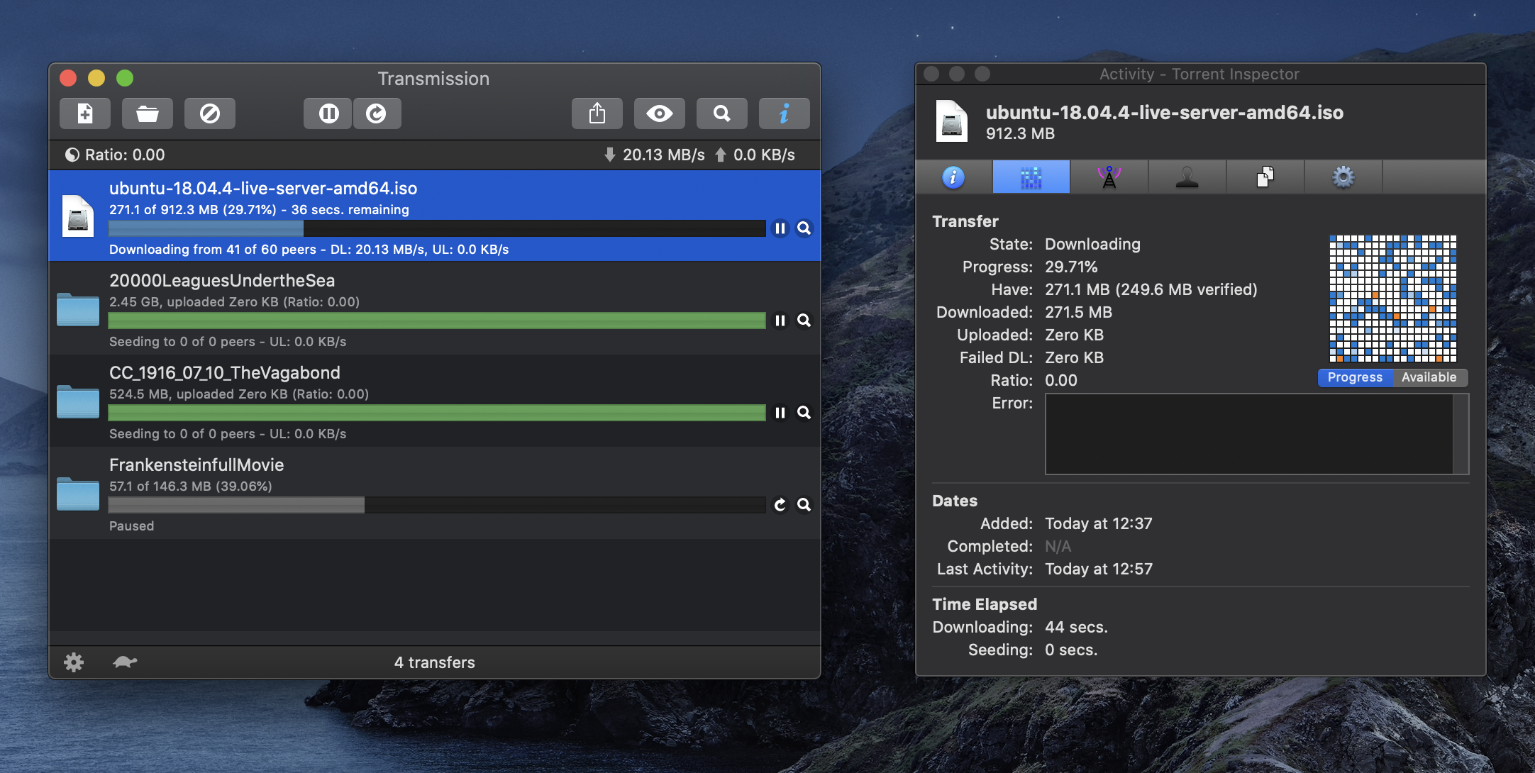
Transmission-1459220b5b.dmg(build #7379). Bug observed with both M1 and Intel modes.My system tint (highlight color) is blue, so in macOS UI, all highlights are blue (items selected, in particular). But in Transmission this tint is not obeyed: UI uses red to highlight selected torrent, open tab, etc.
and (torrent title obscured):
The text was updated successfully, but these errors were encountered: