Web client text unreadable in dark mode #3834
Comments
|
@ckerr Any tips on where i should start looking to help fix this? |
|
It's likely something in the scss file in |
|
@1100101 Because it can be weird, if you navigate to line 111 and change these values to transmission-app.scss, does it resolve your issue?
|
|
(Also to be clear, you have to rebuild the web app before the change will take effect. Sass converts the scss into css, which then gets webpacked up with the rest of the app) |
|
@GaryElshaw Yes, that worked. The text in those screens is now readable again. Since actually there isn't much difference in the overall appearance of the web interface between dark and light mode (the main window stays white, the menu bar does not change color etc), I decided to use the same values for primary/secondary/tertiary color as for |
|
@1100101 Frank can you please show me a screen shot of the change? At some point i want to pull apart the entire theme. Charles, is the change i've suggested something that should permanently change? |
IDK, let's see the screenshot 😸 |
|
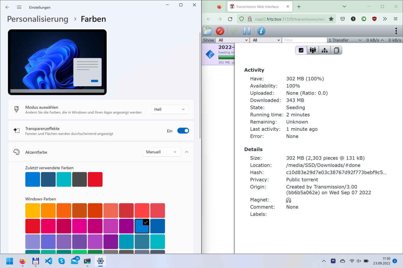
Here are the requested screenshots: Light mode
Dark mode (before the change)
Dark mode (after the change)
While the text on the details page is now quite readable, some of the other text values (# of torrents, up/down speed) are now less readable. |


|
Thanks for sharing those Frank. Essentially, dark mode is busted right now, and needs reworking for white text to appear on a black background. Thanks for bringing it to the project's attention, i'm not sure when it will be fixed, but it's on the list! Oh, and you're absolutely right to have copied over those 'day' values. If it can't be fixed in the short-term, those values should be there. Charles, your thoughts? |
|
Yeah, looks to me like the problem isn't the text color, but background color in dark mode should actually be dark |
|
@ckerr Yes, changing the background color is what will actually fix the issue. I've mocked up a web UI, showing what that should look like in the end:
Unfortunately, the bars and borders still look a bit too bright, because I did't know how that effect was achieved. I think Github's dark mode theme would be a great starting place to copy values from actually. |

|
Fixed by #3985 |
I'm using the latest Transmission from
develop, but for a while now I noticed that text in the web client's torrent details, or tracker page is unreadable. It's very light grey text on a white(ish?) background.I see this on a Windows 11 machine in dark mode (using Firefox or Edge), as well as on an iPad mini, also in dark mode.
Once I switch either device to light mode, the text becomes readable again.
I found #2609 which supposedly should've fixed this?
The text was updated successfully, but these errors were encountered: