- Definition: the design concept of making items represented resemble their real-world counterparts. (source)
- Objective: Familiarize users to digital interfaces by mimicking real-world objects.
- Examples:
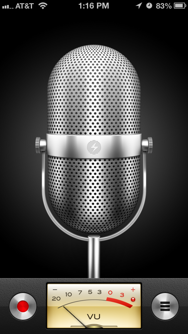
- Voice Memo app in iOS <7.
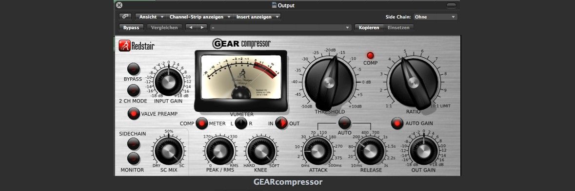
- Gear composer in some music-composing app.
- Notice that Skeuomorphism does not simply mean life-like visuals. Such anti-examples include:
- iOS <7 settings page: No real-time object works like that.
In the past decade or two, UI/UX design languages have seen trends of skeuomorphism -> flat design -> neumorphism. Examples/evidences:
| Seen in... | skeuomorphism | flat design | neumorphism |
|---|---|---|---|
| Microsoft Windows | Windows Media Player resembles the front panel of a DVD player. | Metro UI, later referred to as Microsoft design language. | Fluent Design, particularly because of its emphasis on "materials". |
| Google Android | Android 2 era: The clock widget is realistic; The handler on app drawers has "dots" for enhanced friction if it were in real life. | Android 4: Reminds me of Tron. | Material Design |
| Apple iOS | Pre-7 era | 7~12 era | iOS 13 |
It is hard to classify Metro UI and Material Design as flat design or neumorphism, mainly because both design languages make use of depths. Metro UI employed a heavy dose of parallax effect, which implied a sense of depth; Although parallax effects are also seen in Material Design, drop shadows are more often used to hint on the depths of objects in Google's design language. Drop shadow, since at least Windows XP era, has been around in Microsoft Windows operating systems. Since both of the design languages shared the metaphor of z-axis depth, usage of such property may not warrant a clear separation between flat design and neumorphism.
A better clue might be the use of materials. Designs in Android 4 favored outlines with a neon-like glow, while Windows 8 got rid of the Aero glass effect that Windows 7 boasted. In their successors, Fluent Design recommends the use of Acrylic translucency effects, and Material Design focuses on the idea of floating/overlapping pieces of papers. I decided to take the usage of material metaphor as the criteria on whether a design language should fall into the category of flat design or neumorphism.