This component is a dropdown that allows you to select one or more items from a list. It is fully customizable and can be used in any React project.
In addition to providing a great amount of classes and styles, the component also provides a lot of props to handle the dropdown behavior, such as onSelectionChange to handle the selection of an item, or a hidden input to store the selected items.
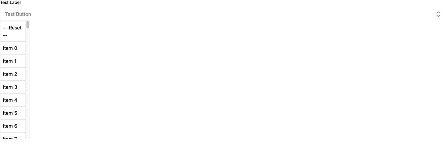
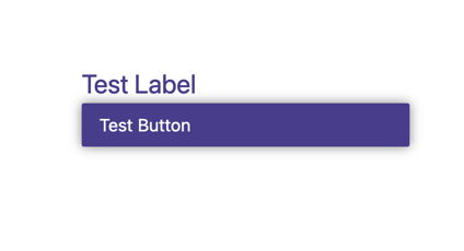
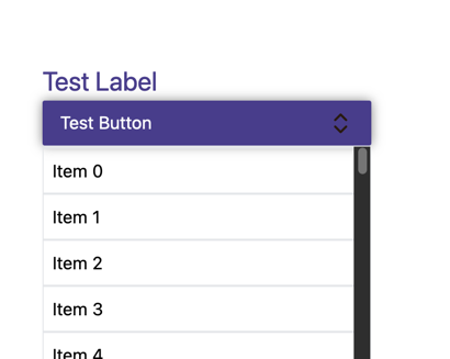
Here you have a preview of the most basic dropdown without any customization.
The component requires the following props:
items ({id: string; value: string;}[]): an array of objects containing the items to display in the dropdown.id (string): the id of the hidden input that will store the selected items.label (string): the label of the dropdown. Only required ifdisplayLabelis true.displayLabelis true by default meaning that the label is also required by default.
All available class:
| Code | Result |
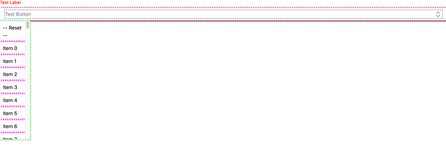
<DropDown
items={items}
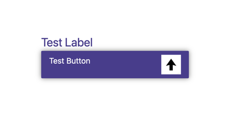
id={"id"}
label={"Test Label"}
placeholder={"Test Button"}
dropdownClass={"border-black"}
boxClass={"border-red"}
headerClass={"border-blue"}
listClass={"border-green"}
itemClass={"border-purple"}
labelClass={"color-red"}
/> |
|
In addition to their corresponding class, you can pass the same attribute with the style suffix instead of classto customize the dropdown more precisely (e.g boxStyle instead of boxClass).
| Code | Result |
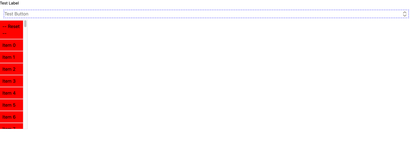
 <DropDown
  items={items}
  id={"id"}
  label={"Test Label"}
  placeholder={"Test Button"}
  headerClass={"border-blue"}
  itemStyle={{backgroundColor: "red"}}
/> |
|
| Code | Result |
|
JSX <DropDown
items={items}
id={"id"}
label={"Test Label"}
placeholder={"Test Button"}
dropdownClass={"dropdown"}
boxClass={"box"}
headerClass={"header"}
headerStyle={{opacity: 1}}
listClass={"list"}
itemClass={"item"}
labelClass={"label"}
labelStyle={{fontSize: "1.5rem"}}
/>CSS .dropdown{
width: 300px;
margin: 40% auto auto;
}
.box{
background: darkslateblue;
border-radius: 4px;
box-shadow: 0 0 10px rgba(0,0,0,0.5);
}
.header{
color: white;
}
.list{
width: 100%;
}
.label{
color: darkslateblue;
}
.item{
background: white;
} |
|
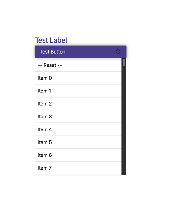
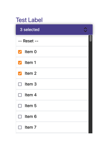
-
multiSelect (boolean): if true, the dropdown will allow multiple selection. If false, only one item can be selected at a time. The default value is false.multiSelect={true}:
-
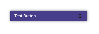
displayArrow (boolean): if true, the arrow icon will be displayed. If false, the arrow icon will be hidden. The default value is true.displayArrow={false}:
-
displayLabel (boolean): if true, the label will be displayed. If false, the label will be hidden. The default value is true.displayLabel={false}:
-
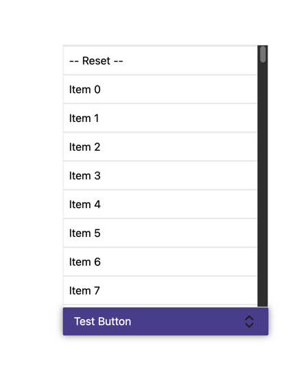
displayReset (boolean): if true, the reset button will be displayed. If false, the reset button will be hidden. The default value is true.displayReset={false}:
-
position ("top" | "bottom"): the position of the dropdown box. The default value is bottom.position={"top"}:
-
customImage (string): change the arrow icon.customImage={"./src/assets/arrow.png"}: