Skip to content
New issue

Have a question about this project? Sign up for a free GitHub account to open an issue and contact its maintainers and the community.

By clicking “Sign up for GitHub”, you agree to our terms of service and privacy statement. We’ll occasionally send you account related emails.

Already on GitHub? Sign in to your account

Bugs in .navbar-expand-(size) > .container/-fluid #25654

Closed
hispa2000 opened this issue Feb 18, 2018 · 5 comments
Closed

Bugs in .navbar-expand-(size) > .container/-fluid #25654

hispa2000 opened this issue Feb 18, 2018 · 5 comments

Comments

@hispa2000
Copy link

hispa2000 commented Feb 18, 2018

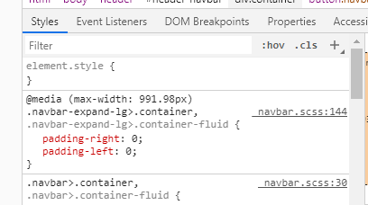
I think there is a bug in Bootstrap 4.0.0 with container and container-fluid paddings when container is into the navbar. The lateral paddings aren't right depending on the navbar-expand-(size).

With container-fluid: container-fluid paddings should be set to 0 when navbar is expanded and up.

With container: container paddings should be set to 15px in sizes smaller than the expand size, except xs.

I am solving this with this media queries for .navbar-expand-md, but I think there is a Bootstrap bug:

@media (min-width: 576px) and (max-width: 767px) {
	
	.navbar-expand-md > .container {
		padding-left: 15px !important;
		padding-right: 15px !important;
		}
	}

...

@media (min-width: 768px) {
	/* Solves bs4 bugs */
	.navbar-expand-md > .container-fluid {
		padding-left: 0px !important;
		padding-right: 0px !important;
		}
	}

And this is an example:

<div class="container">
	<div class="bg-light text-center">Available width in container</div>
</div>

<nav class="navbar navbar-expand-md navbar-dark bg-dark">
	
    <div class="container">
 
        <a class="navbar-brand bg-secondary" href="#">NAVBAR BRAND</a>
        
        <button class="navbar-toggler" type="button" data-toggle="collapse" data-target="#navbarNav" aria-controls="navbarNav" aria-expanded="false" aria-label="Toggle navigation">
        	<span class="navbar-toggler-icon"></span>
        </button>
        
        <div class="collapse navbar-collapse" id="navbarNav">
        	<ul class="navbar-nav ml-auto bg-secondary">
        		<li class="nav-item active">
        			<a class="nav-link" href="#">HOME</a>
        		</li>
        		<li class="nav-item">
        			<a class="nav-link" href="#">FEATURES</a>
        		</li>
        		<li class="nav-item ">
        			<a class="nav-link" href="#">ABOUT X</a>
        		</li>
        	</ul>
        </div><!-- /.navbar-collapse -->

	</div><!-- .container -->

</nav>

<div class="container-fluid">
	<div class="bg-light text-center">Available width in container-fluid</div>
</div>
@mdo
Copy link
Member

mdo commented Feb 19, 2018

Duplicate of #24726.

@mdo mdo closed this as completed Feb 19, 2018
@hispa2000
Copy link
Author

Hello. This issue refers to Bootstrap 4.0.0 final release. Please take note and solve it.

@iatek
Copy link
Contributor

iatek commented Mar 6, 2018

So, this is by-design? It's not going to be fixed?

@hispa2000
Copy link
Author

Hello, this is by-design and is reported since beta versions, without fixing.
I have fixed it with this media-queries:

`/* Styles in xs disposition */
@media (max-width: 575px) {
}

/* Styles in sm disposition and up /
@media (min-width: 576px) and (max-width: 767px) {
/
Solves bs4 bug */
.navbar-expand-md > .container, .navbar-expand-lg > .container, .navbar-expand-xl > .container {
padding-left: 15px !important;
padding-right: 15px !important;
}
}

@media (min-width: 576px) {
/* Solves bs4 bug */
.navbar-expand > .container {
padding-left: 15px !important;
padding-right: 15px !important;
}
.navbar-expand-sm > .container-fluid {
padding-left: 0px !important;
padding-right: 0px !important;
}

}

/* Styles in md disposition and up /
@media (min-width: 768px) and (max-width: 991px) {
/
Solves bs4 bug */
.navbar-expand-lg > .container, .navbar-expand-xl > .container {
padding-left: 15px !important;
padding-right: 15px !important;
}
}

@media (min-width: 768px) {
/* Solves bs4 bug */
.navbar-expand-md > .container-fluid {
padding-left: 0px !important;
padding-right: 0px !important;
}
}

/* Styles in lg disposition and up /
@media (min-width: 992px) and (max-width: 1199px) {
/
Solves bs4 bug */
.navbar-expand-xl > .container {
padding-left: 15px !important;
padding-right: 15px !important;
}
}

@media (min-width: 992px) {
/* Solves bs4 bug */
.navbar-expand-lg > .container-fluid {
padding-left: 0px !important;
padding-right: 0px !important;
}
}

/* Styles in xl disposition and up /
@media (min-width: 1200px) {
/
Solves bs4 bug */
.navbar-expand-xl > .container-fluid {
padding-left: 0px !important;
padding-right: 0px !important;
}
}`

@Alecto
Copy link

Alecto commented Apr 22, 2019

image
It is written that fixed, but why is this bug present in 4.3.1?

Sign up for free to join this conversation on GitHub. Already have an account? Sign in to comment
Labels
None yet
Projects
None yet
Development

No branches or pull requests

4 participants